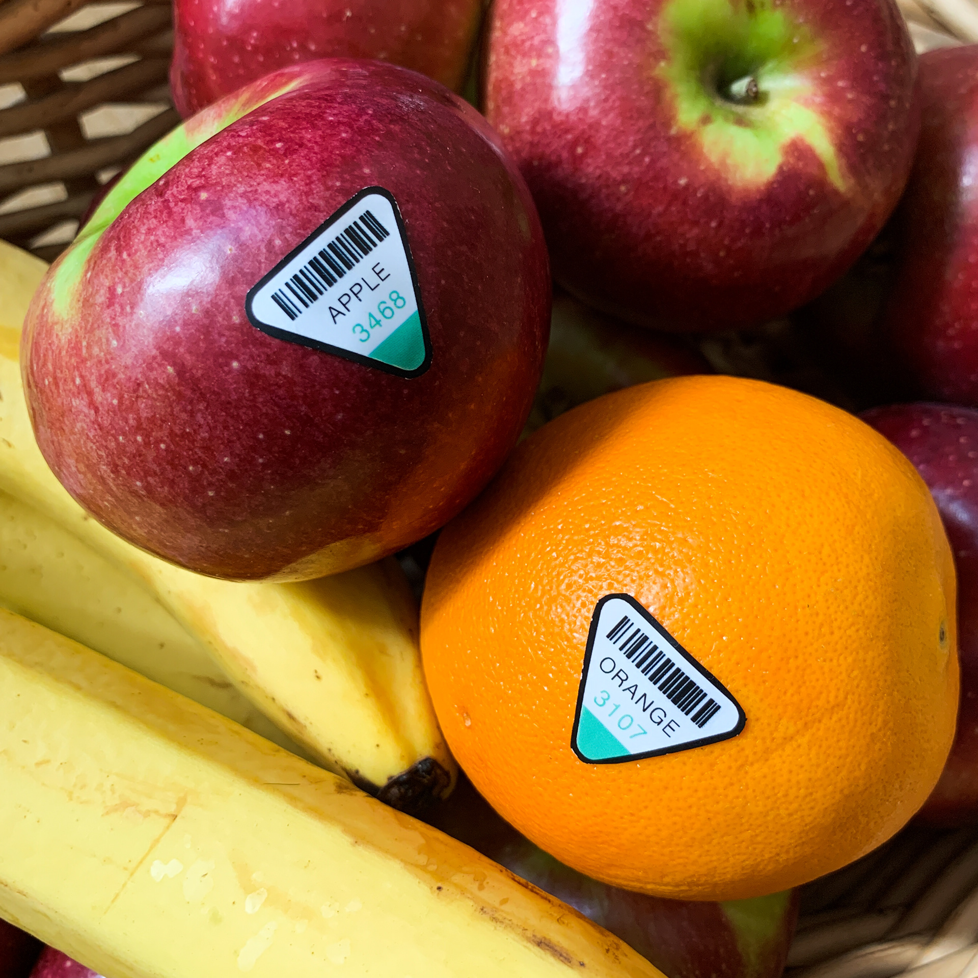
For Advanced Typography, I had to make a produce sticker. After doing some research, I took note of the common shapes of produce stickers. They were mostly circles or ovals. I thought it would be interesting to see a triangle, not only because it's not common, but also because the triangle shape would reference the food pyramid. I also thought about the "peel-ability" of my sticker, and decided that if one of the three corners of my sticker lacked adhesive, it would be easy to peel off.
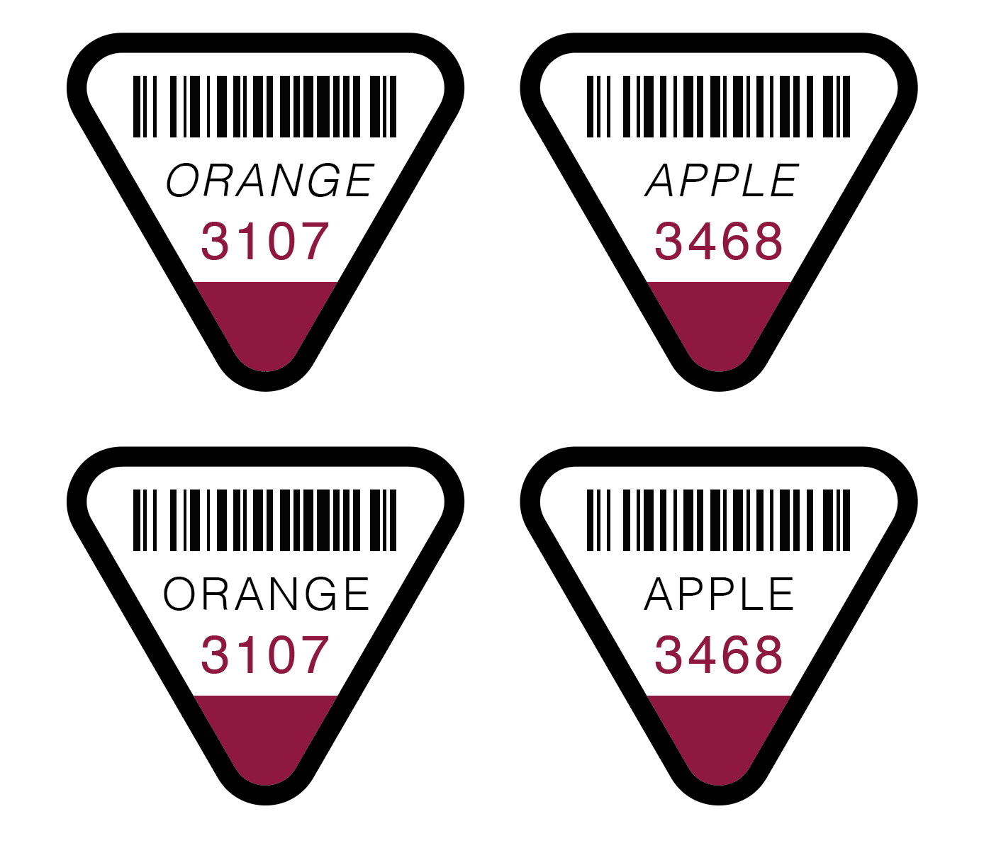
With that in mind, I began designing roughs in Illustrator where the non-adhesive corner had a color. I discovered many things through my digital sketches:
-Rounded edges look better, but also function better. No one wants a sharp corner jammed underneath their fingernail when they peel off their sticker.
-A stroke around the outside of the sticker helps to reference the barcode and the name of the fruit and frame all the assets within the sticker.
-A color that contrasts the actual fruit would help the sticker to pop out.
-Scalability is important, since this will be small, everything needs to be readable even when less than an inch big.
-Spacing would play a large role in scalability.
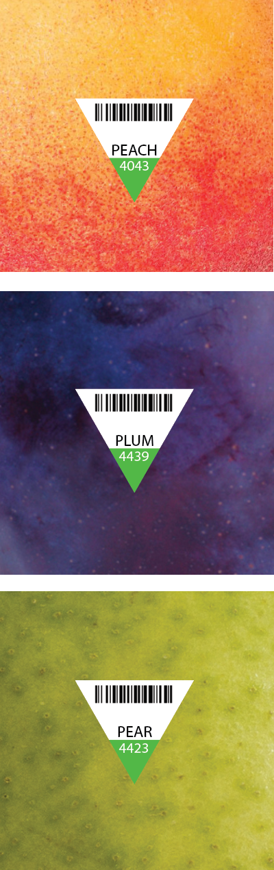

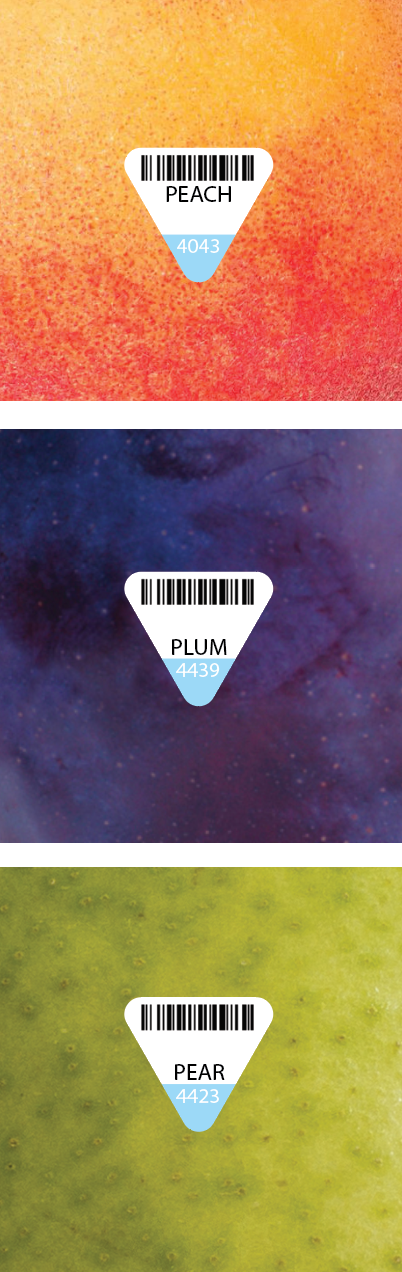
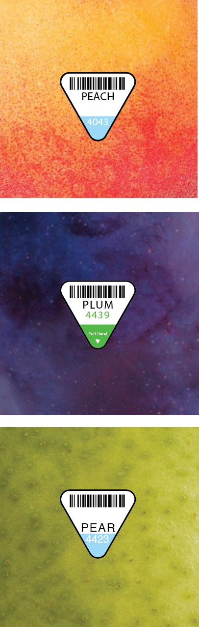
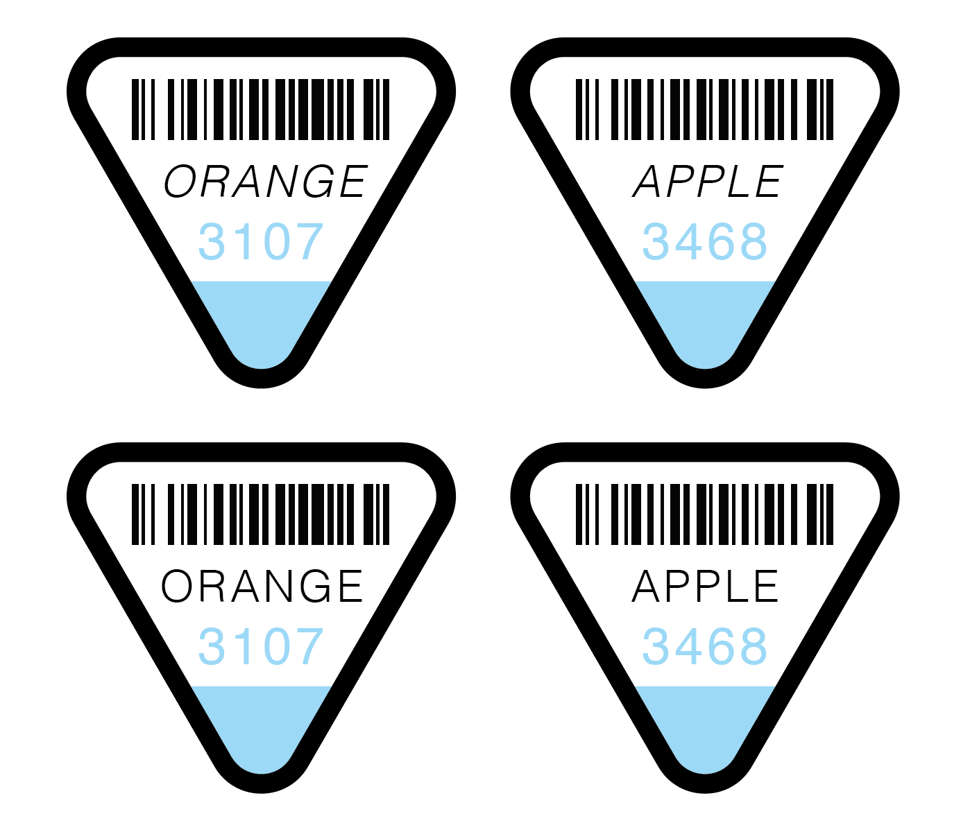
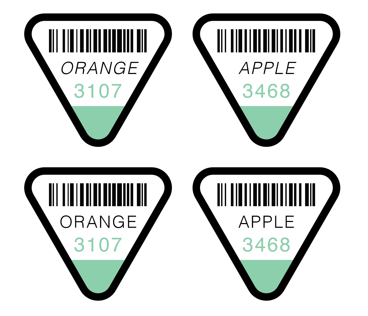
I found a barcode generator, and used actual PLU codes to make the stickers scan-able and functional. Once I had a final, I needed to decide on a color. I tried to go with unnatural colors so that the colors would contrast all fruits and vegetables they were placed on. I wanted to go with the light blue, but it caused trouble with readability when scaling down. So I went for a blueish green as the final.
I then printed the stickers on glossy vinyl sticker paper, cut them out, and placed them on actual fruits.