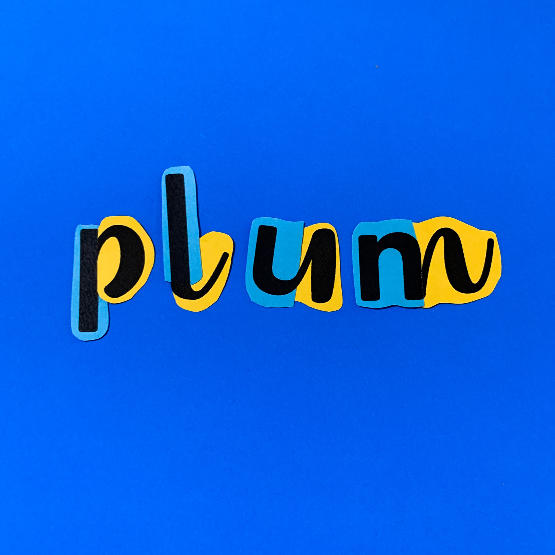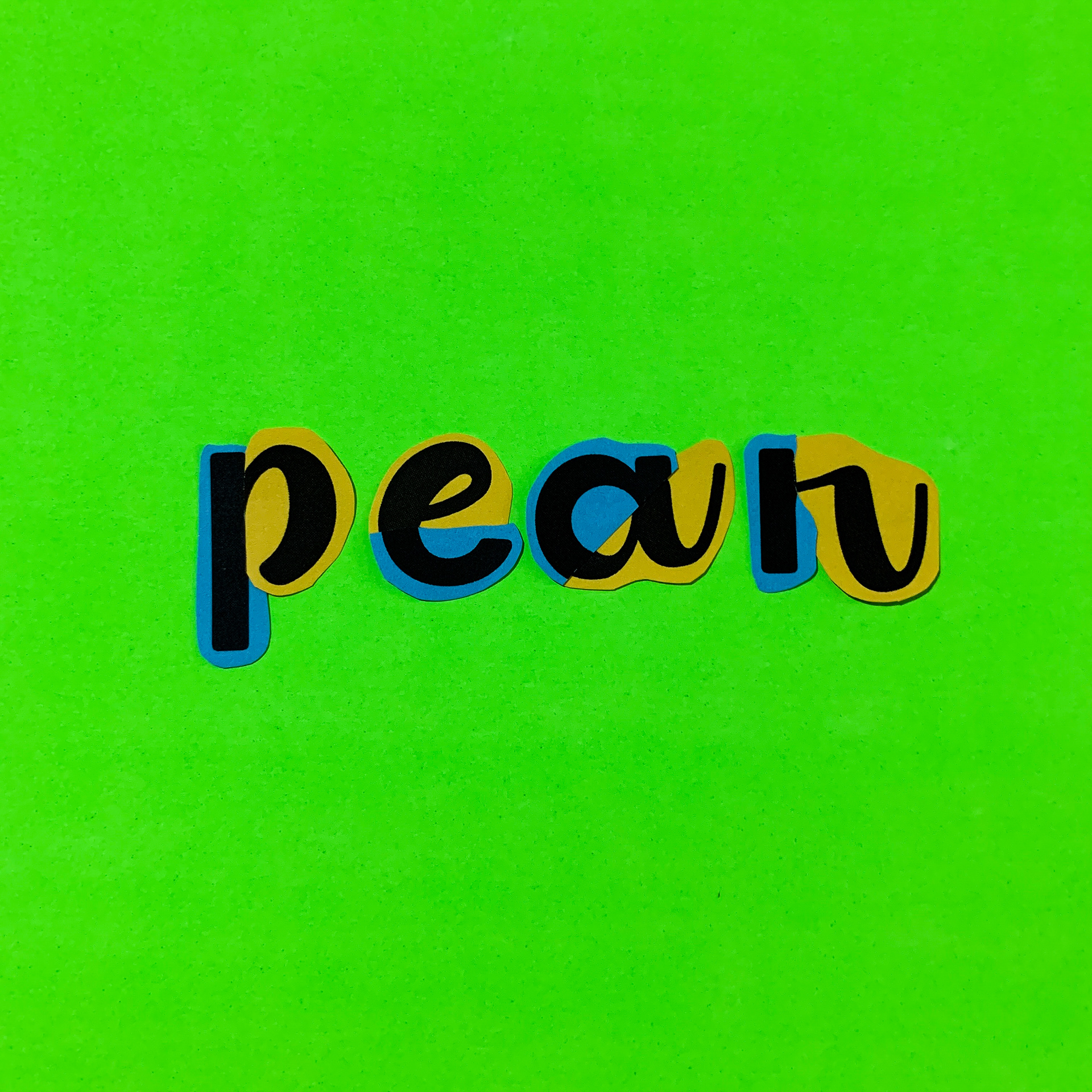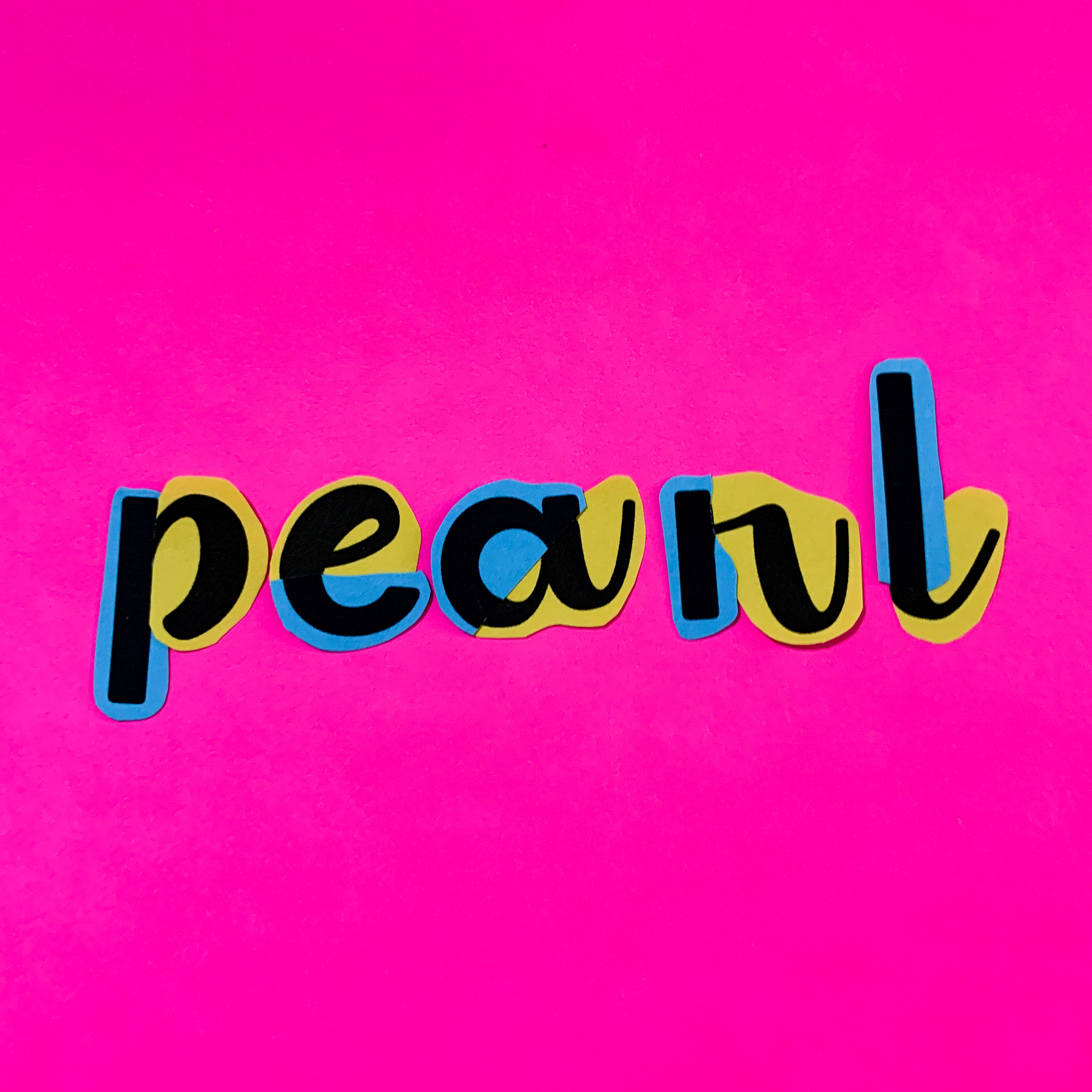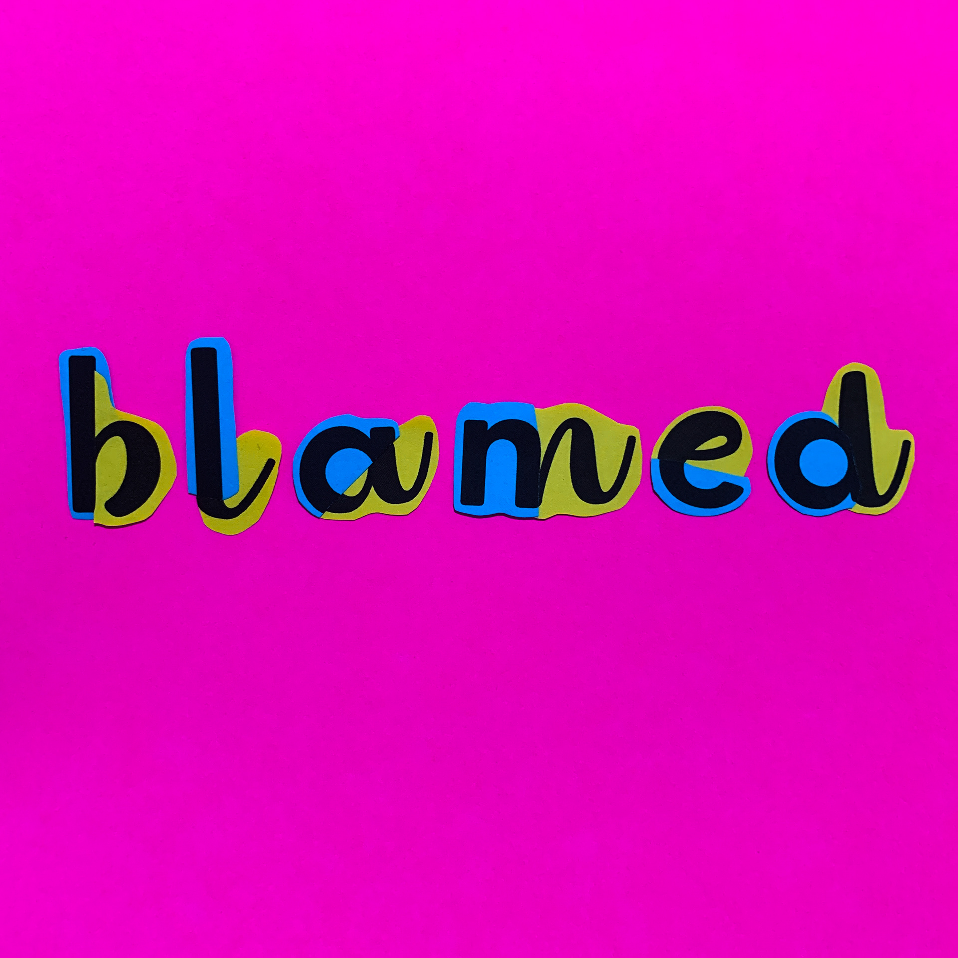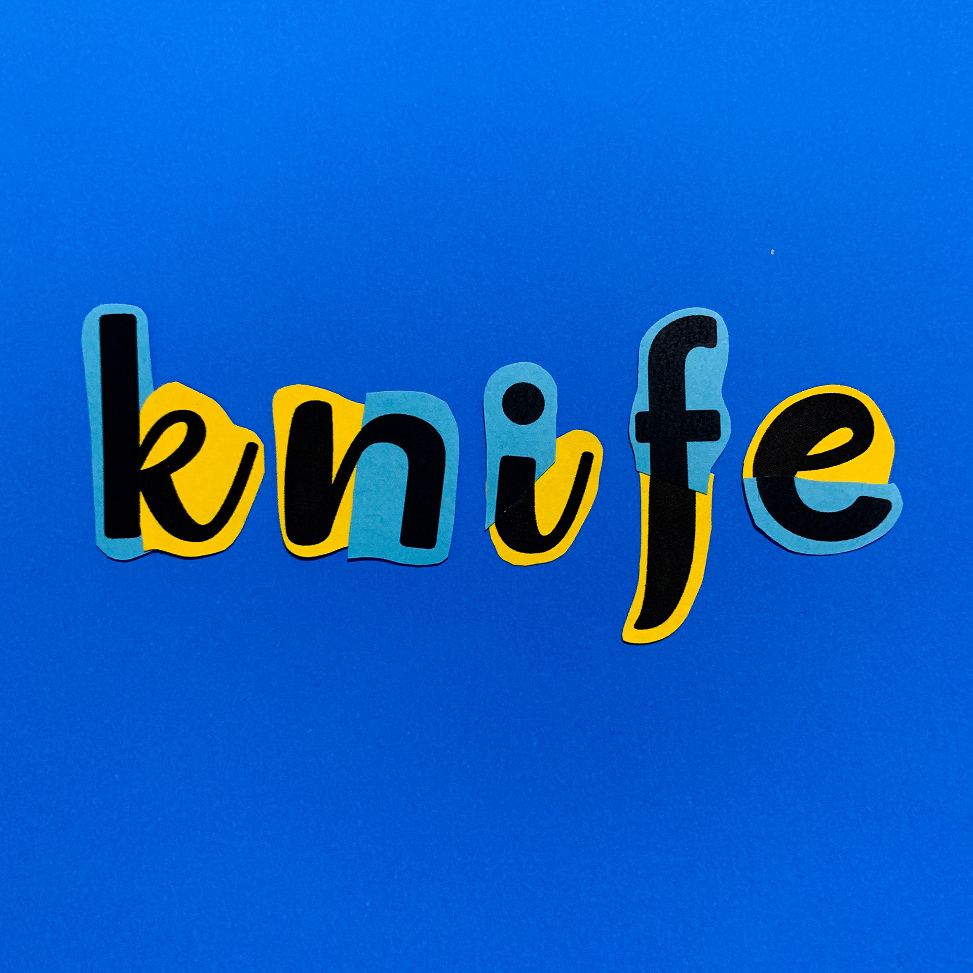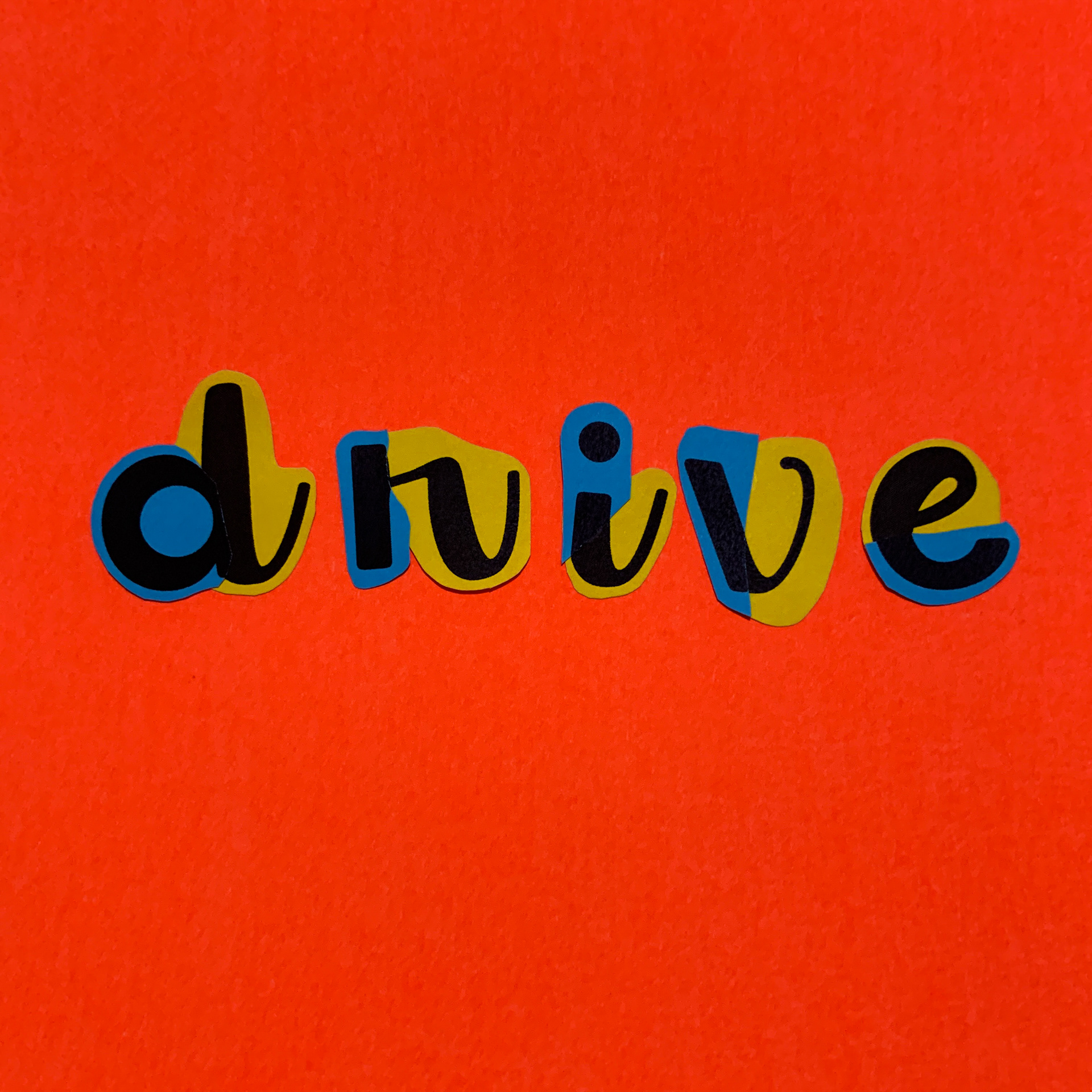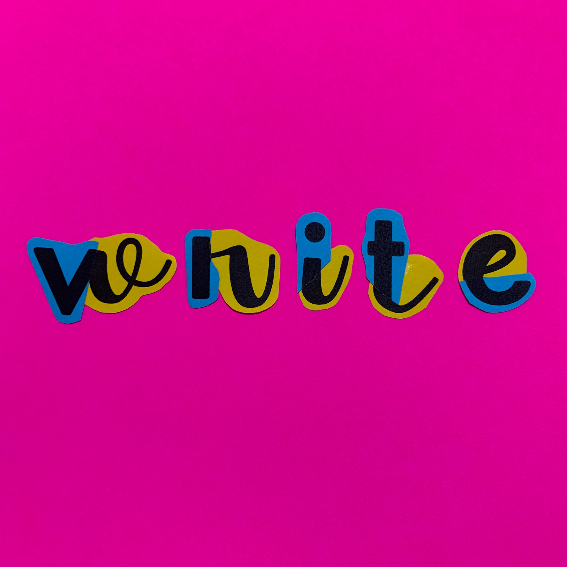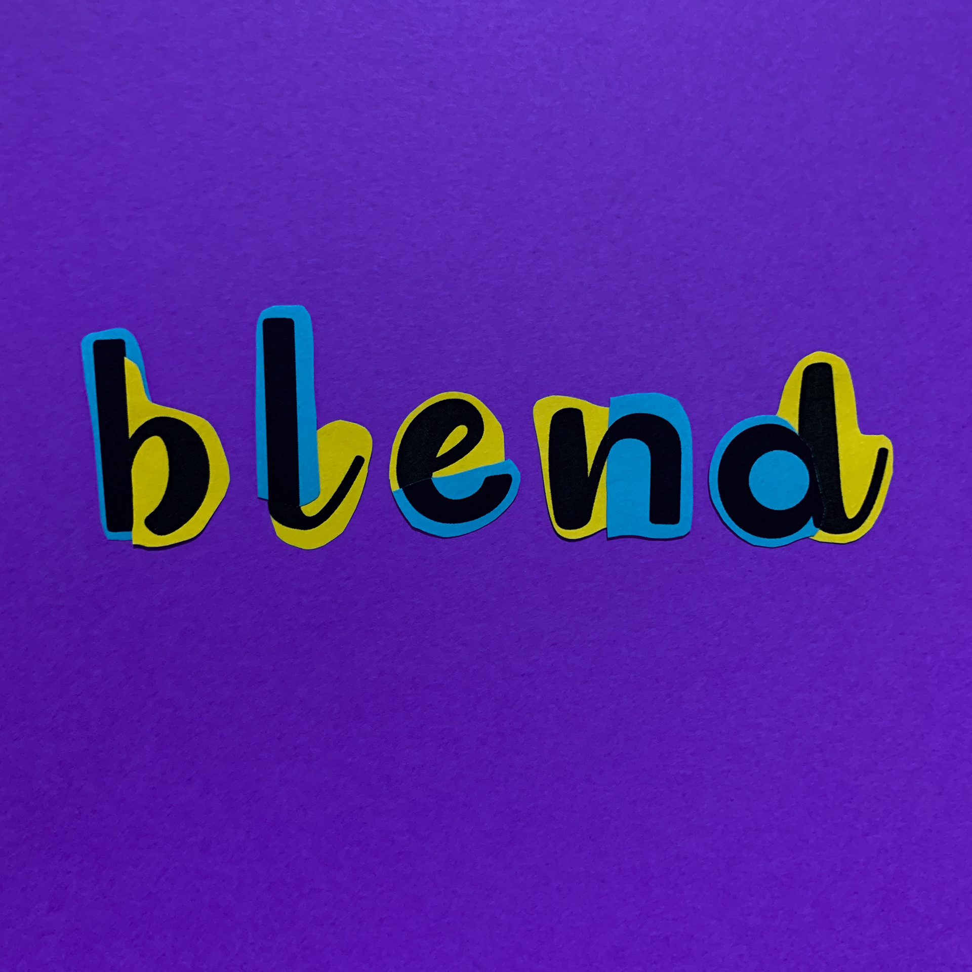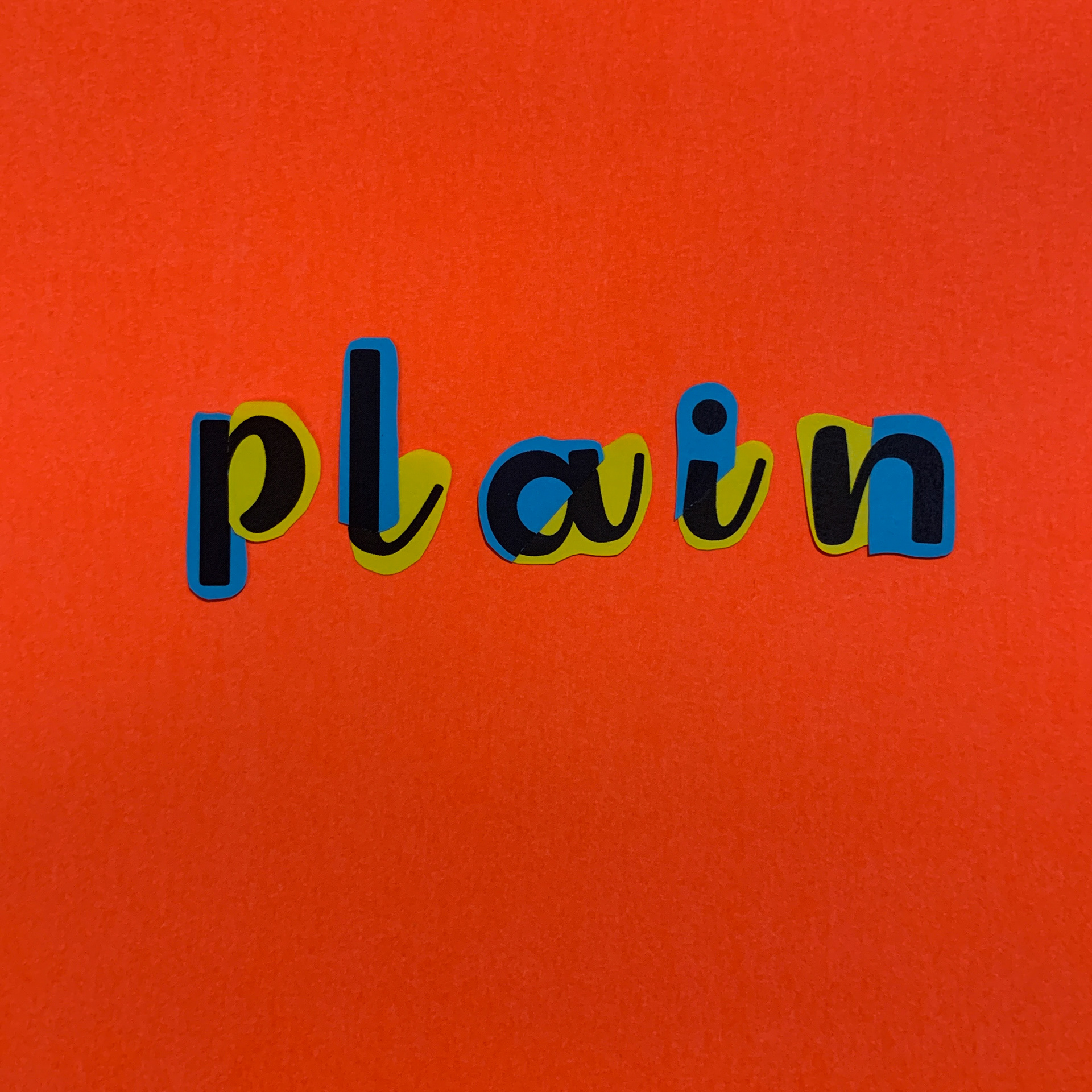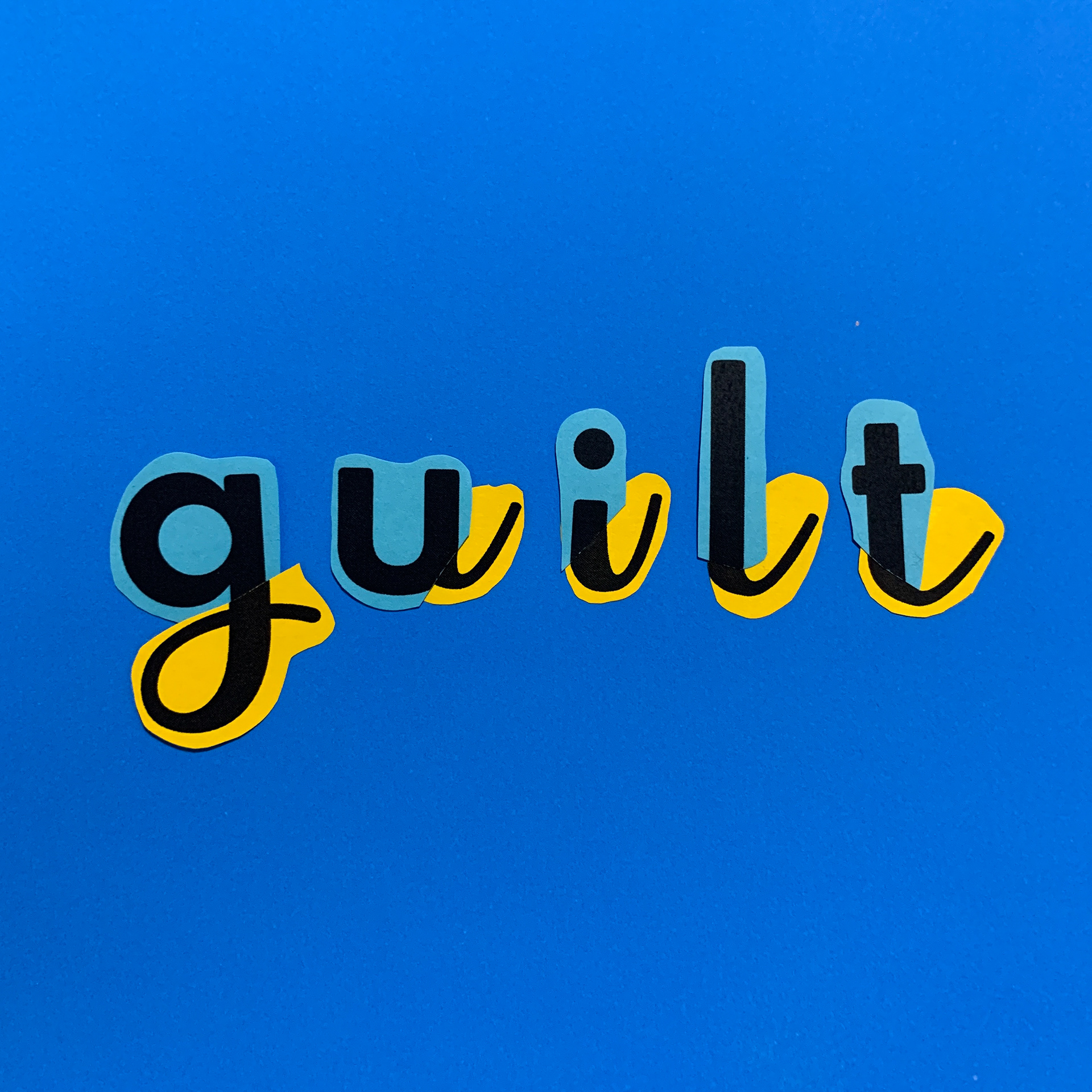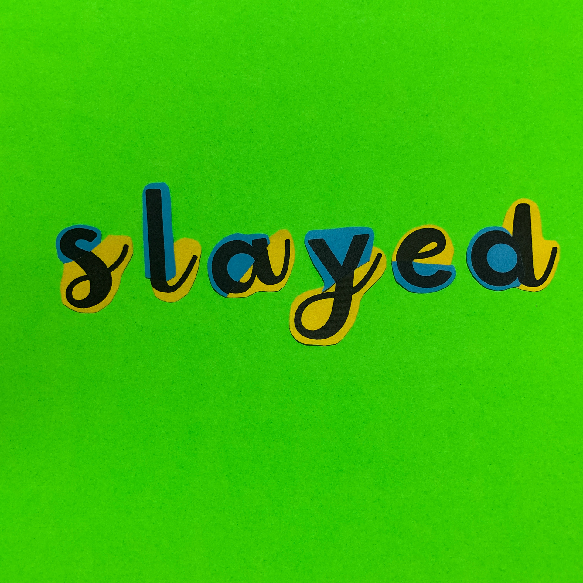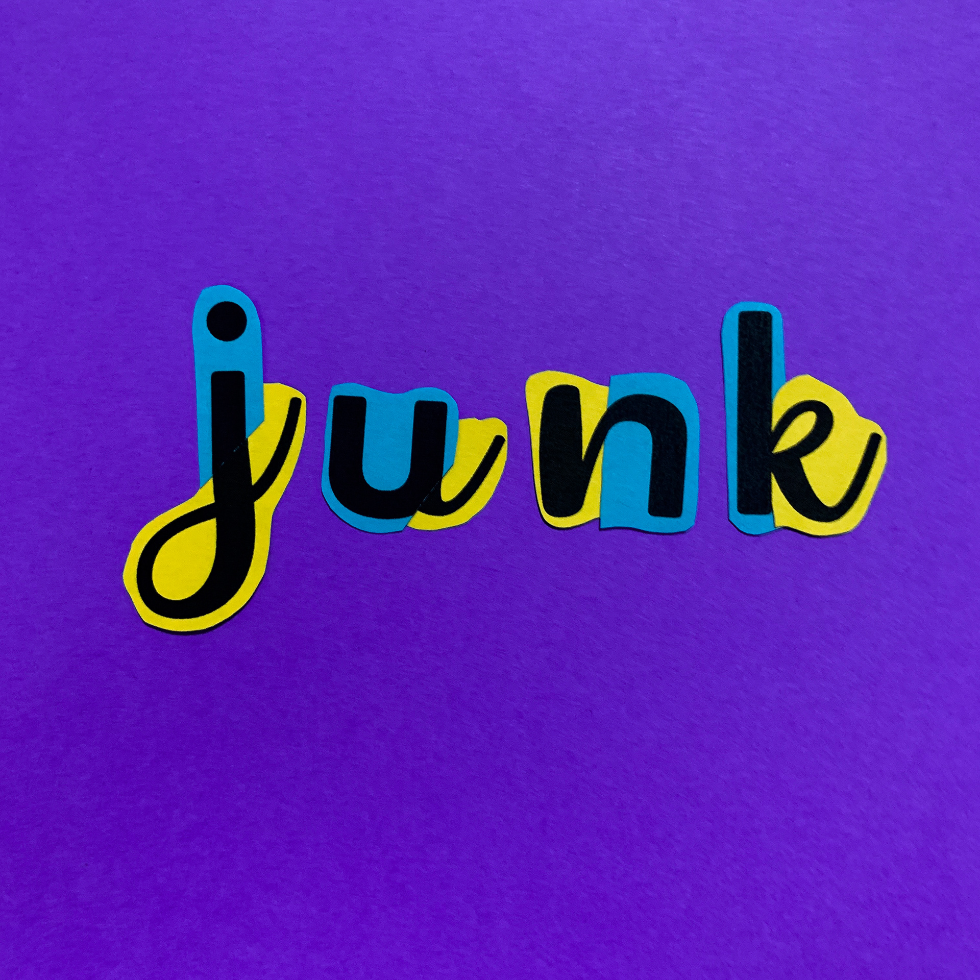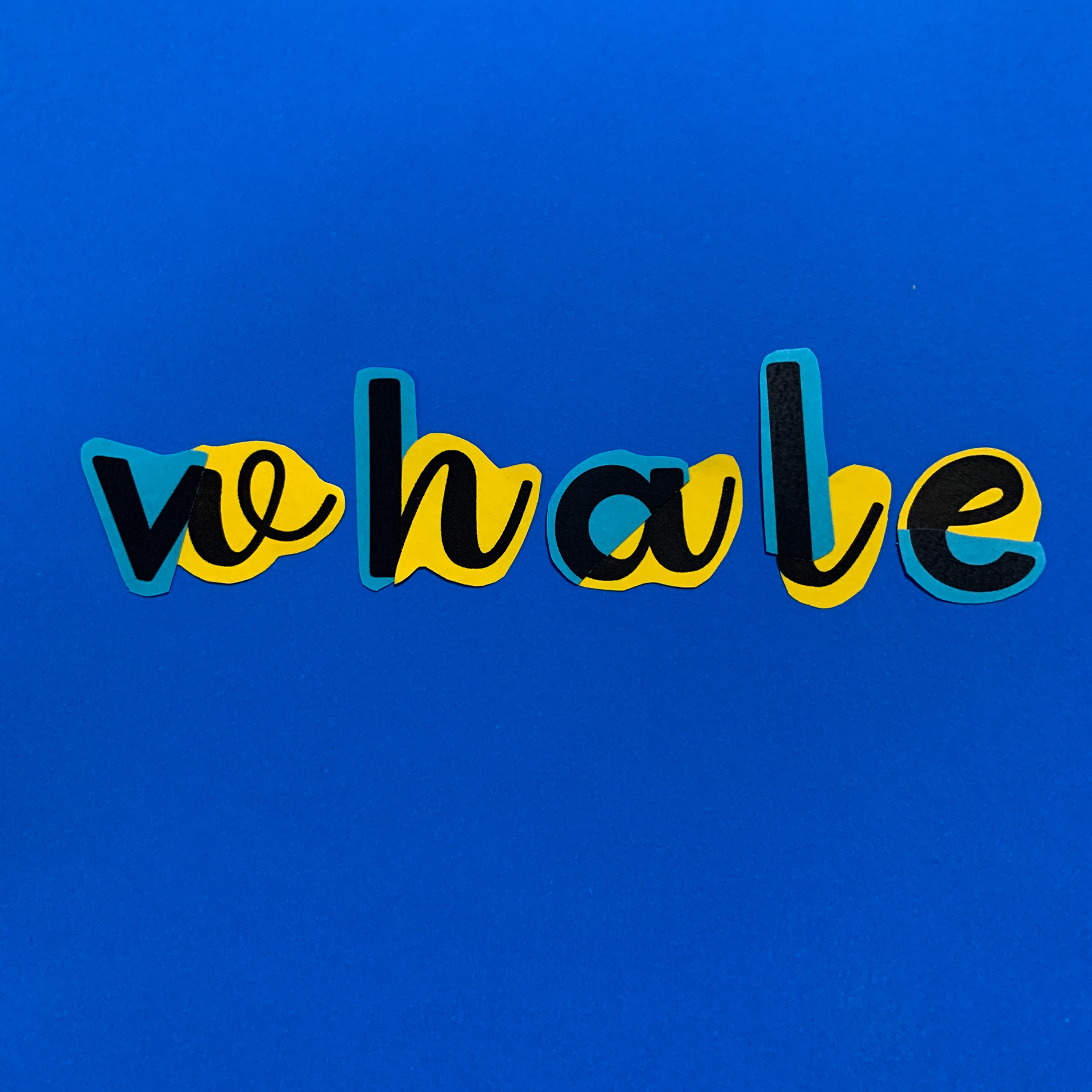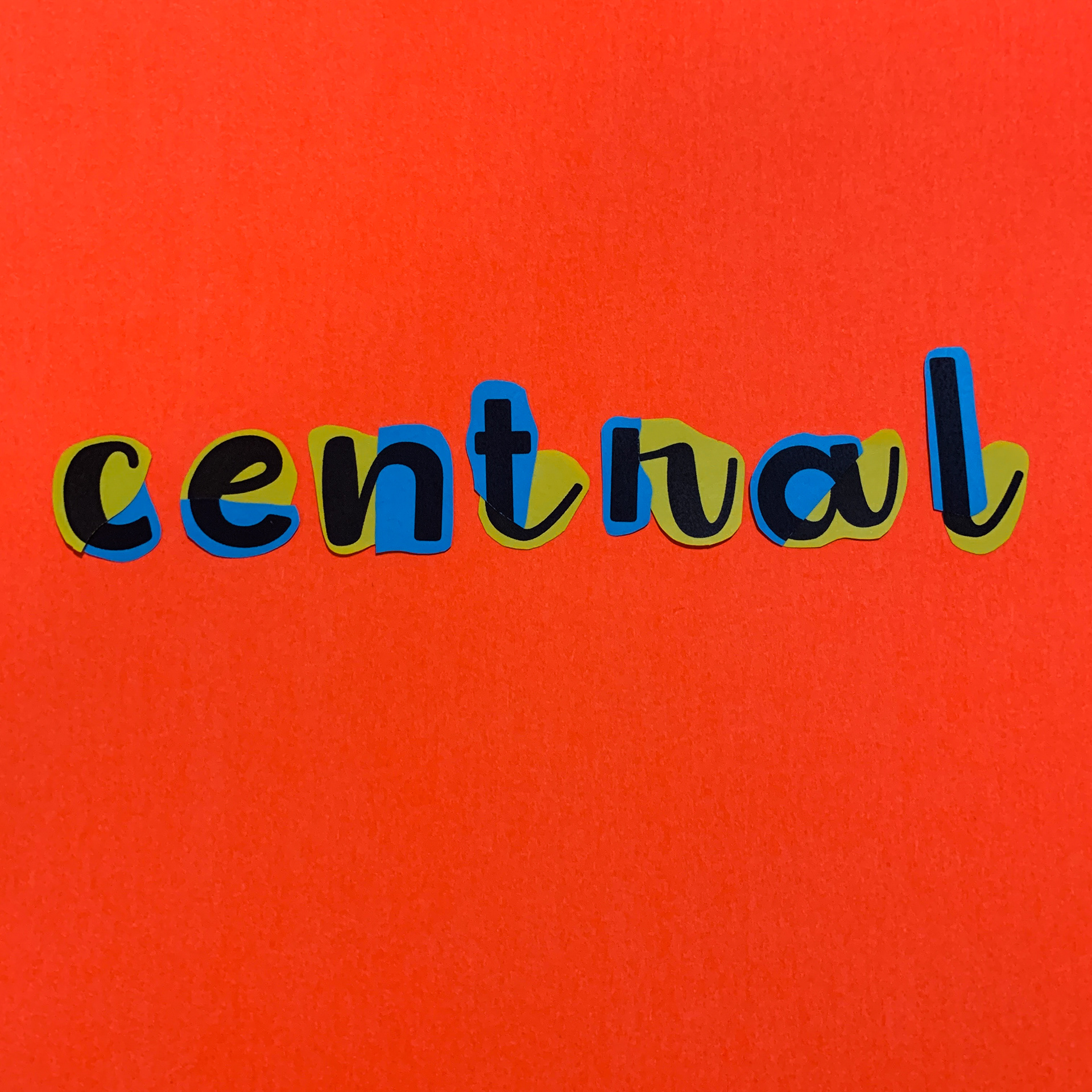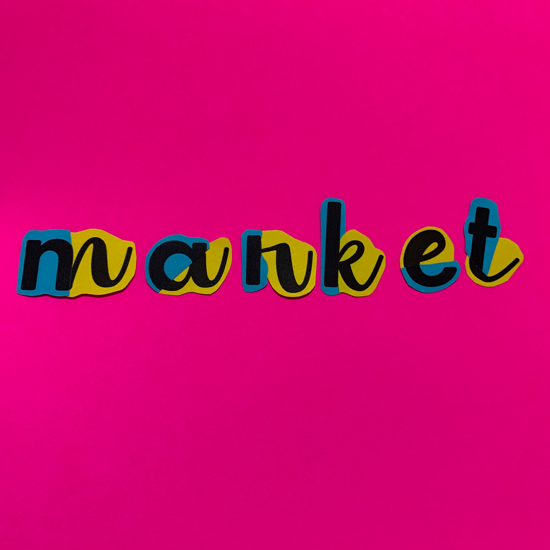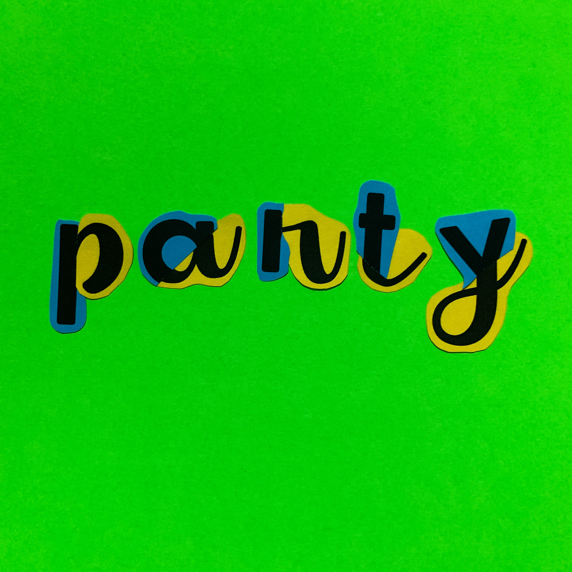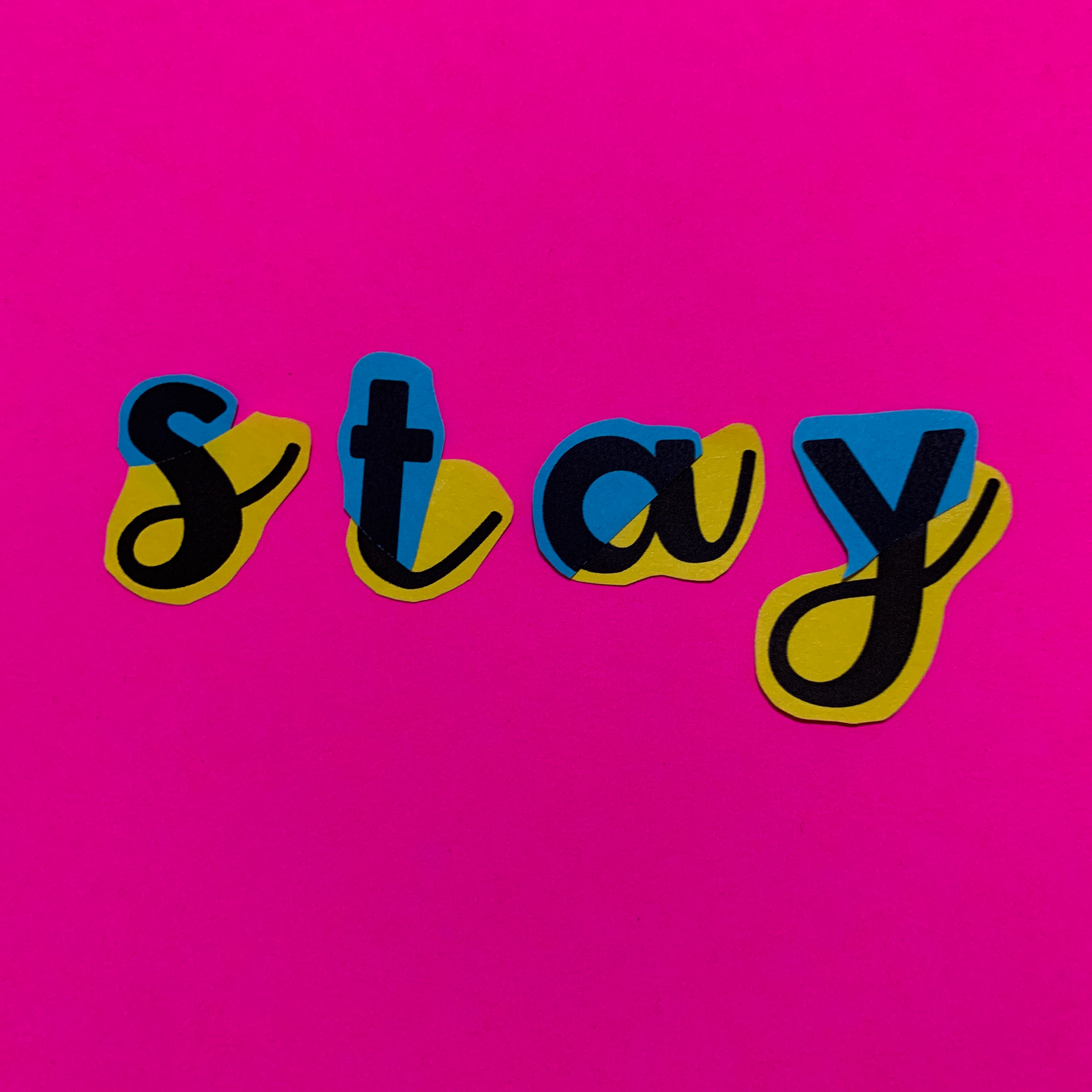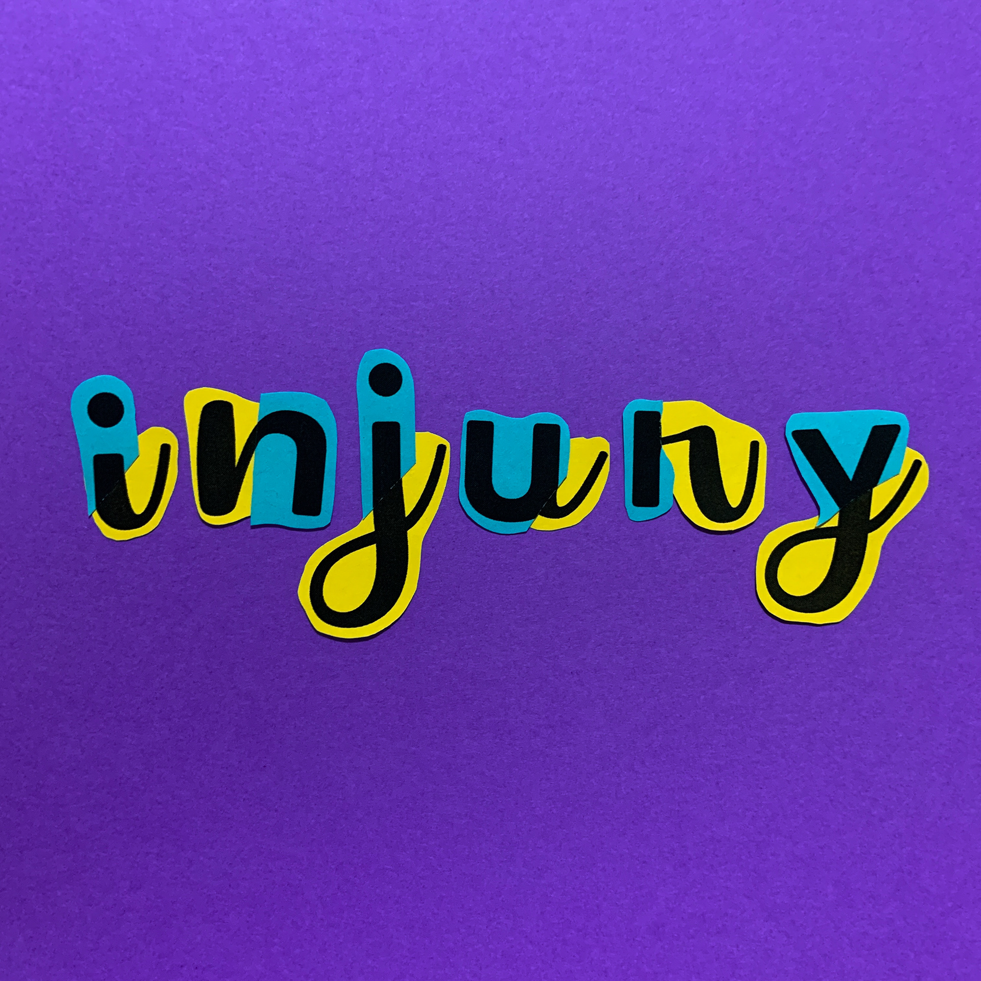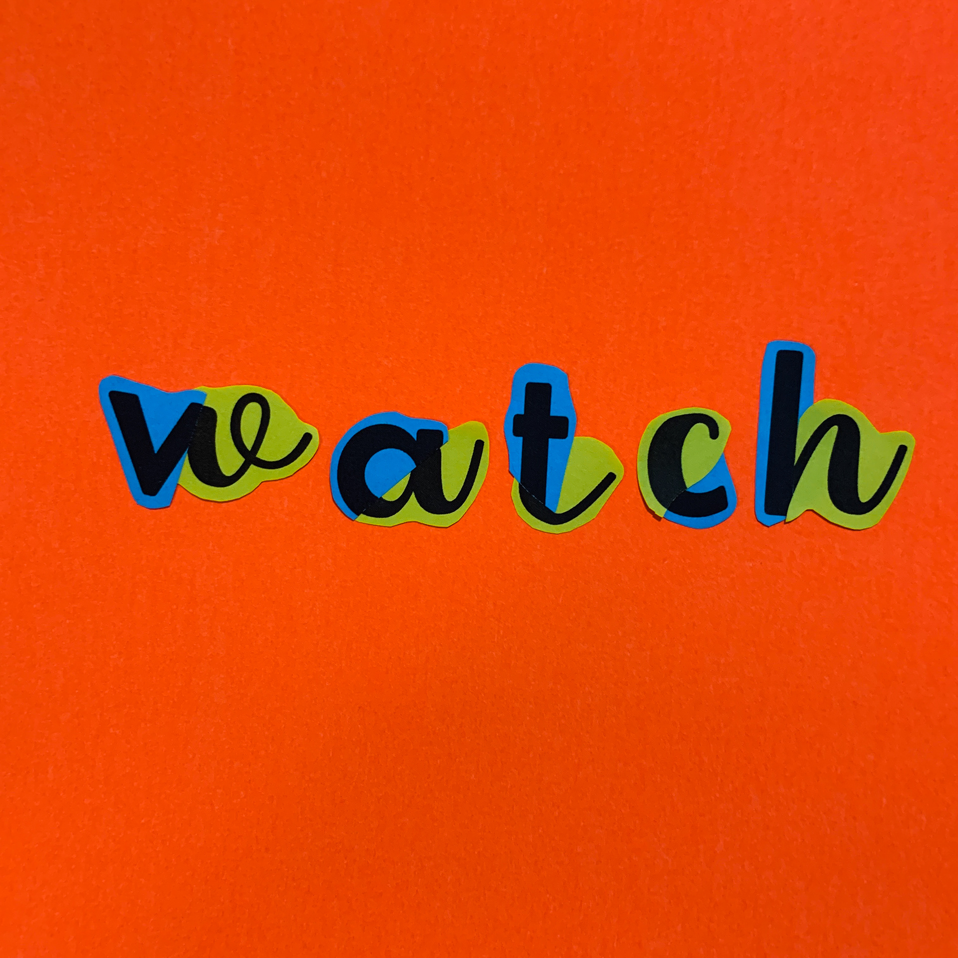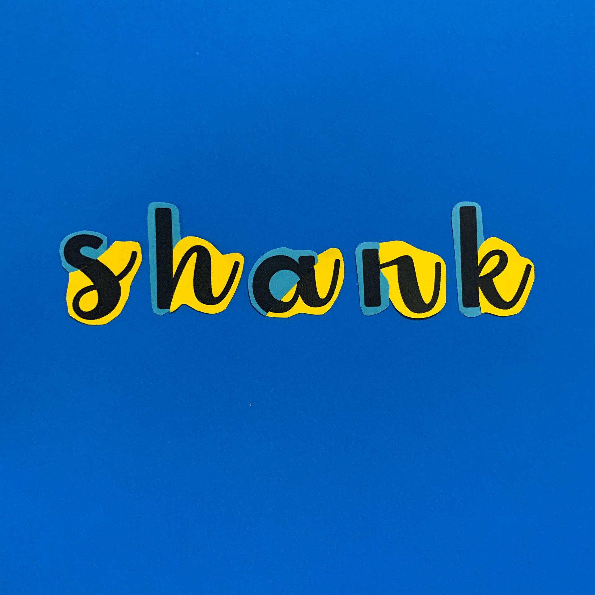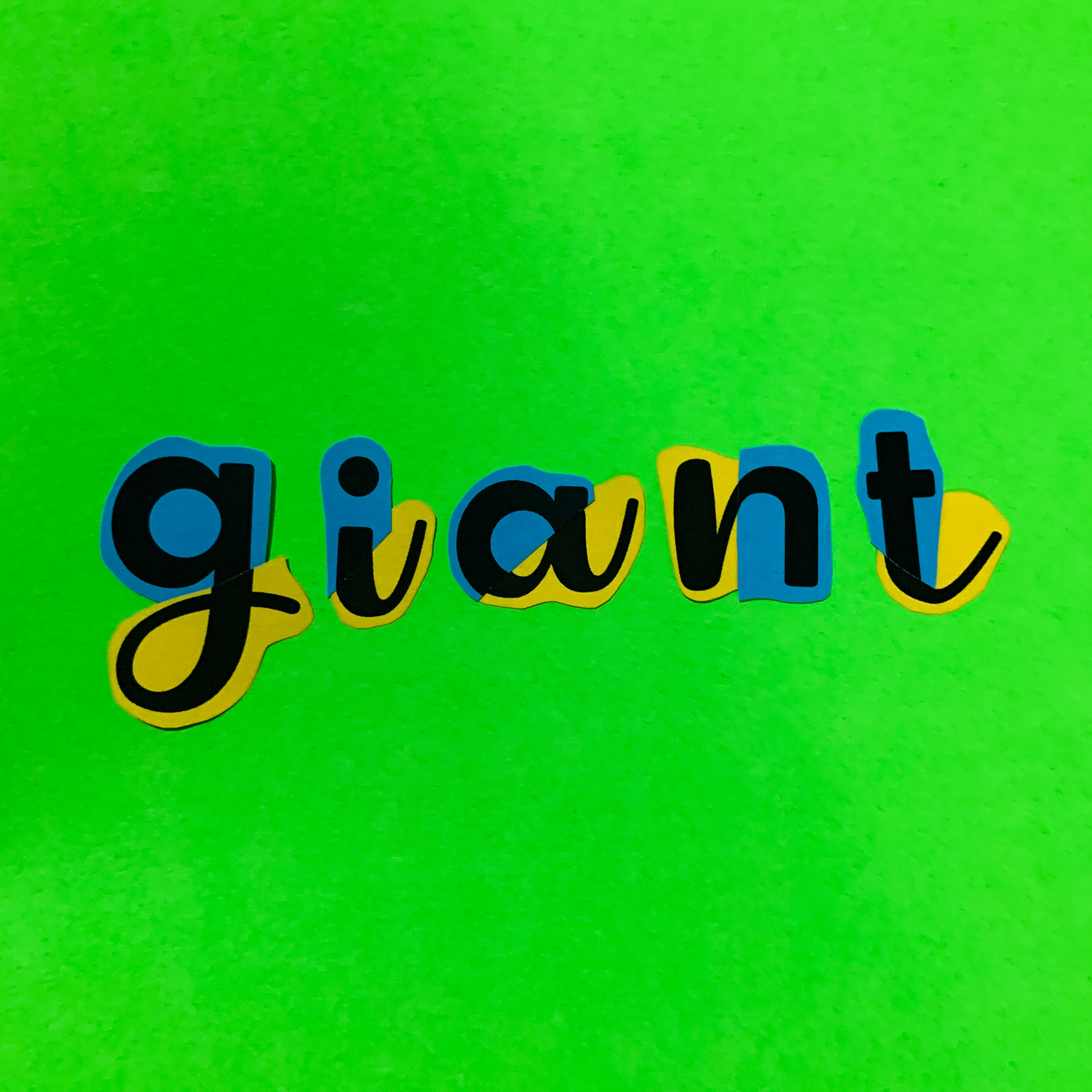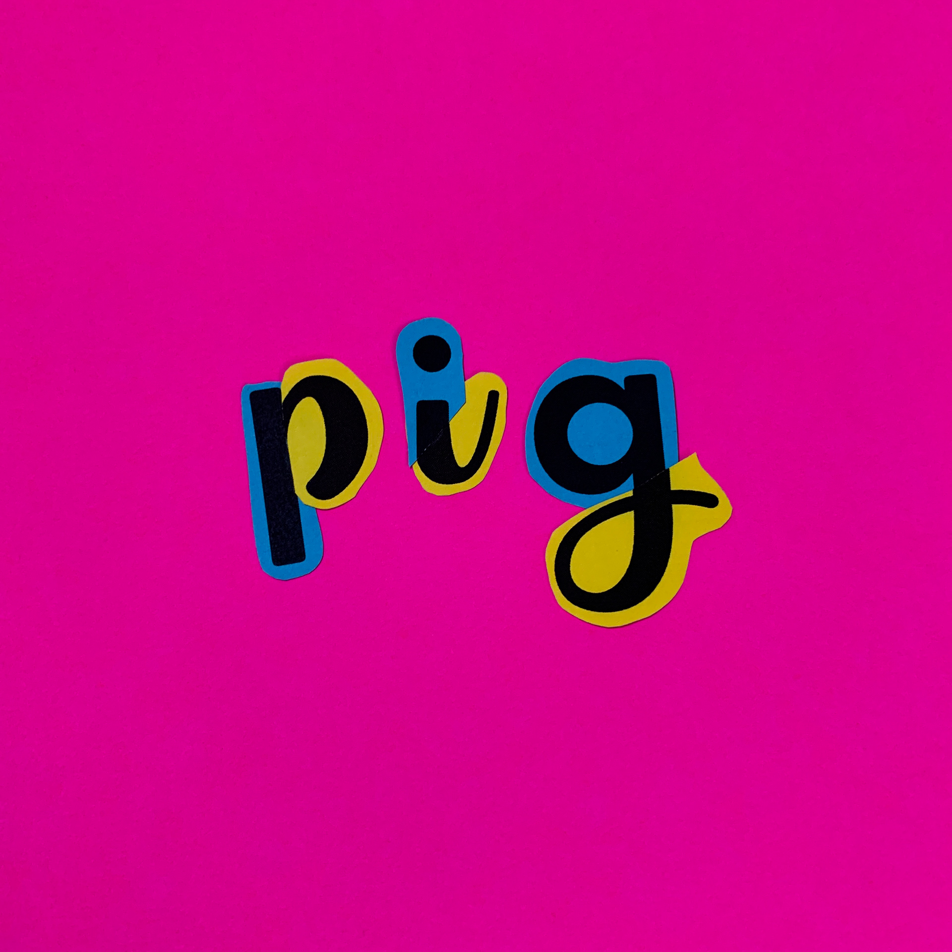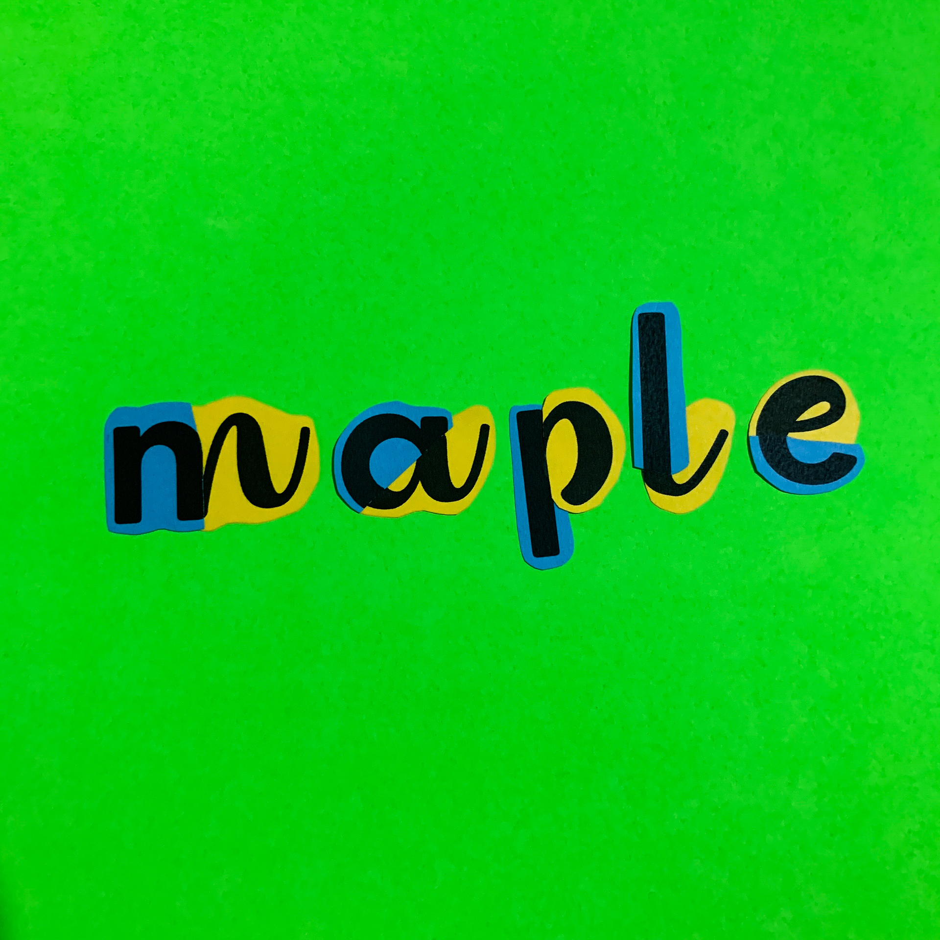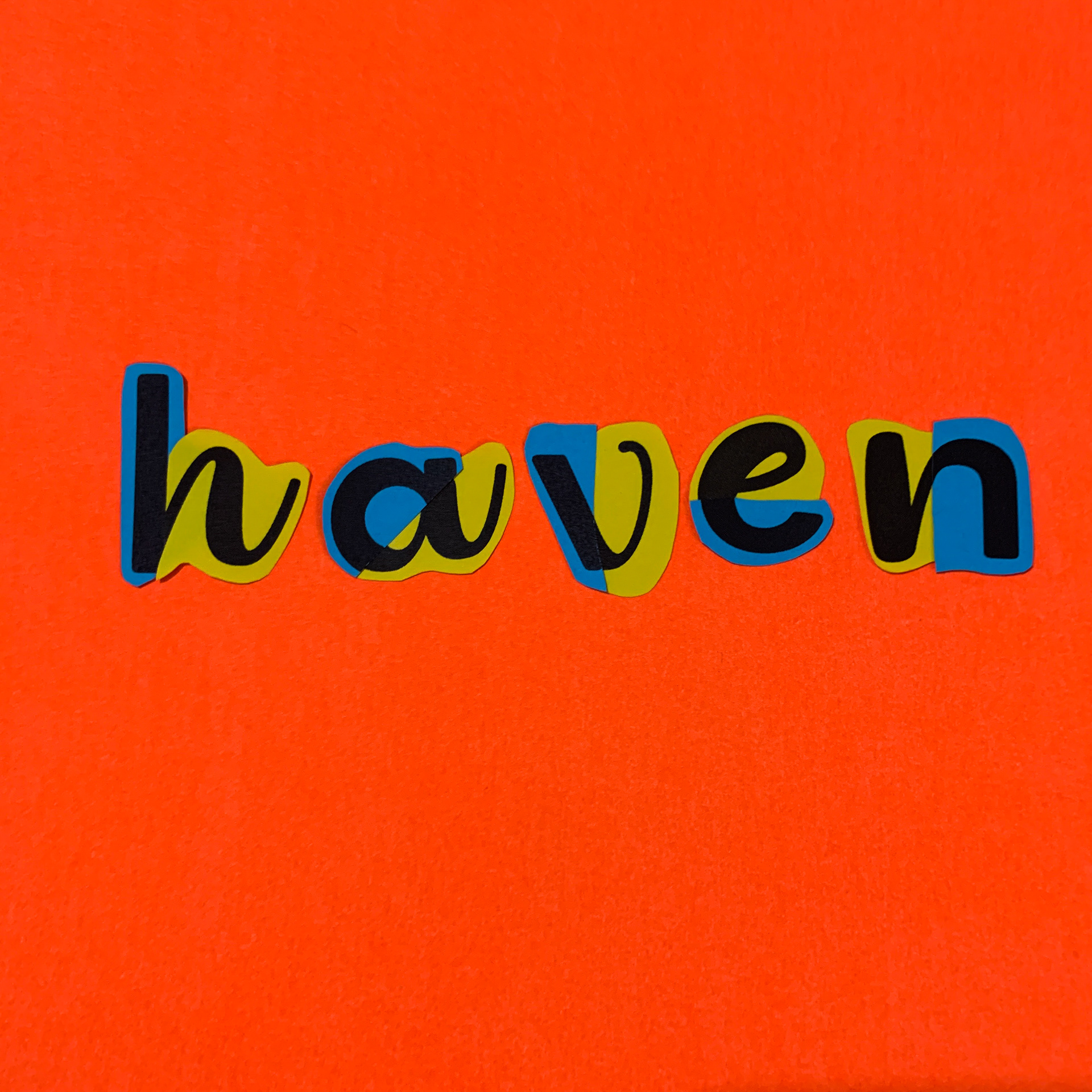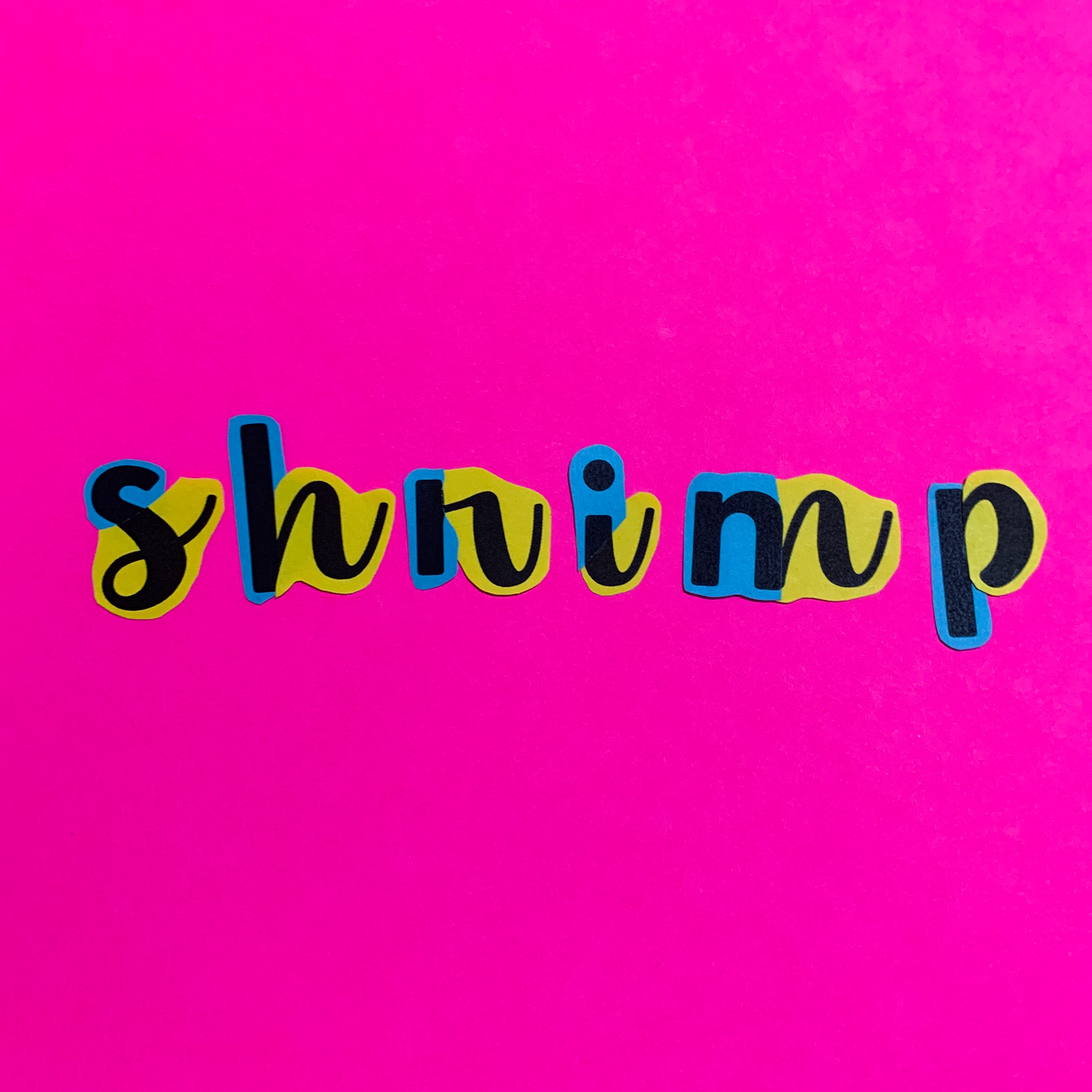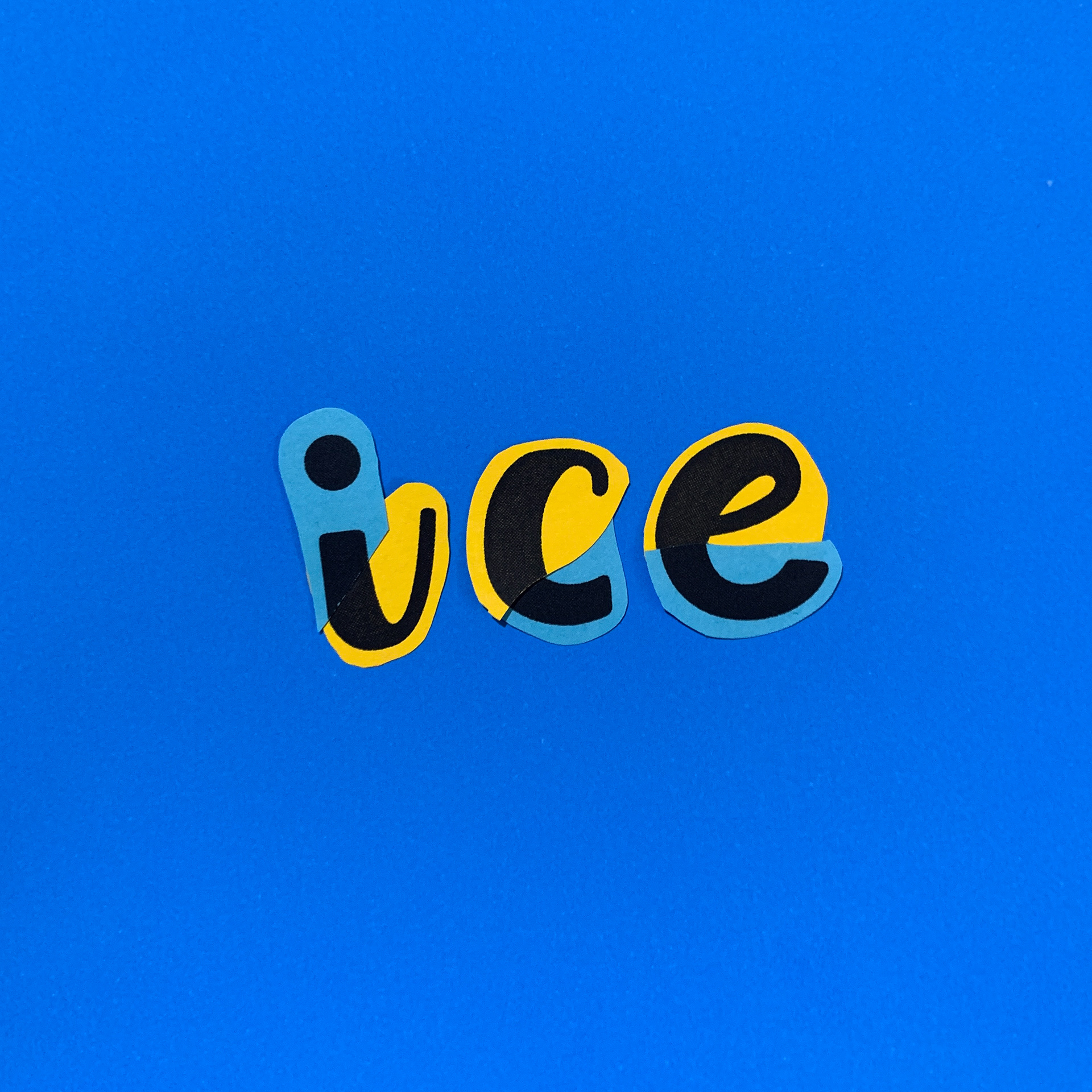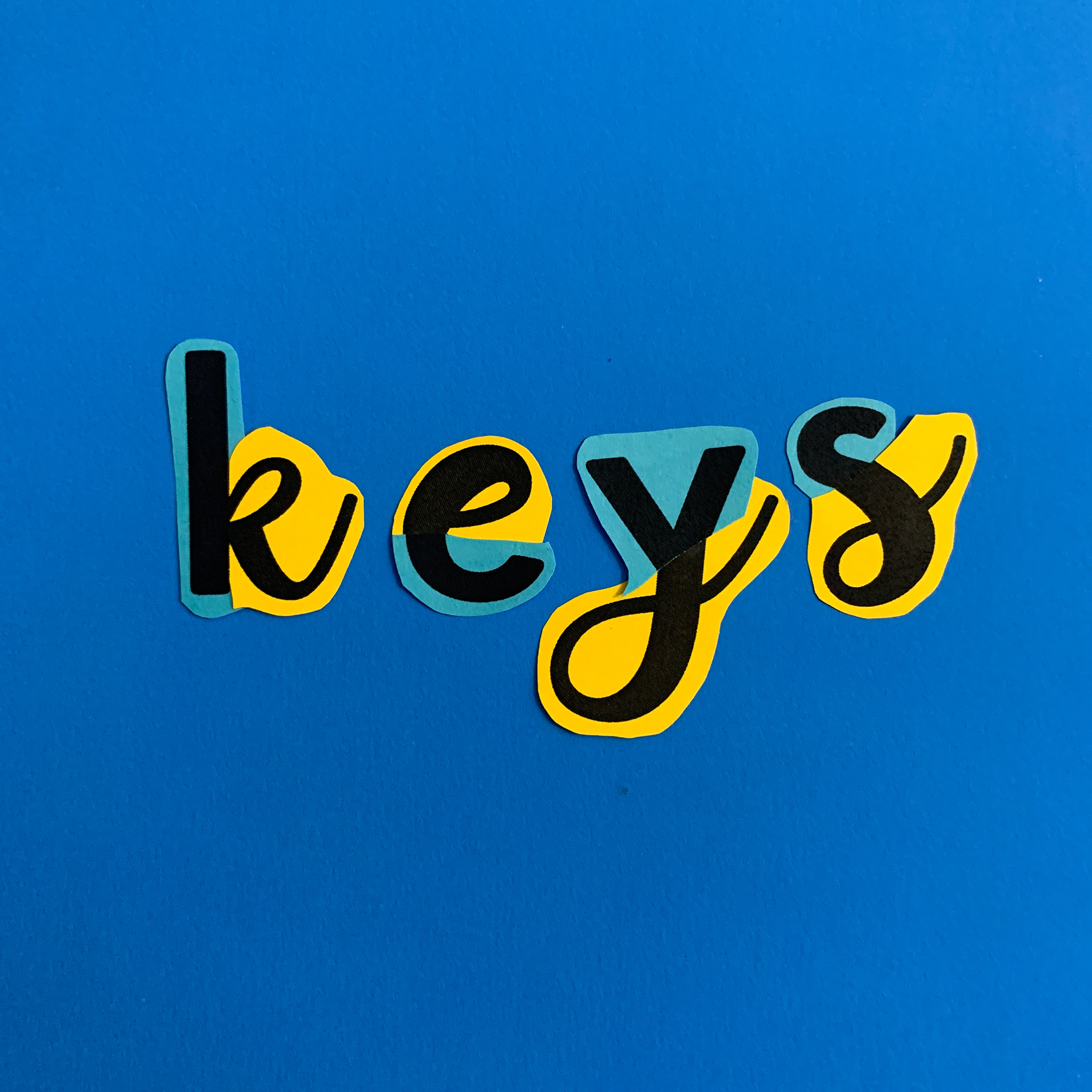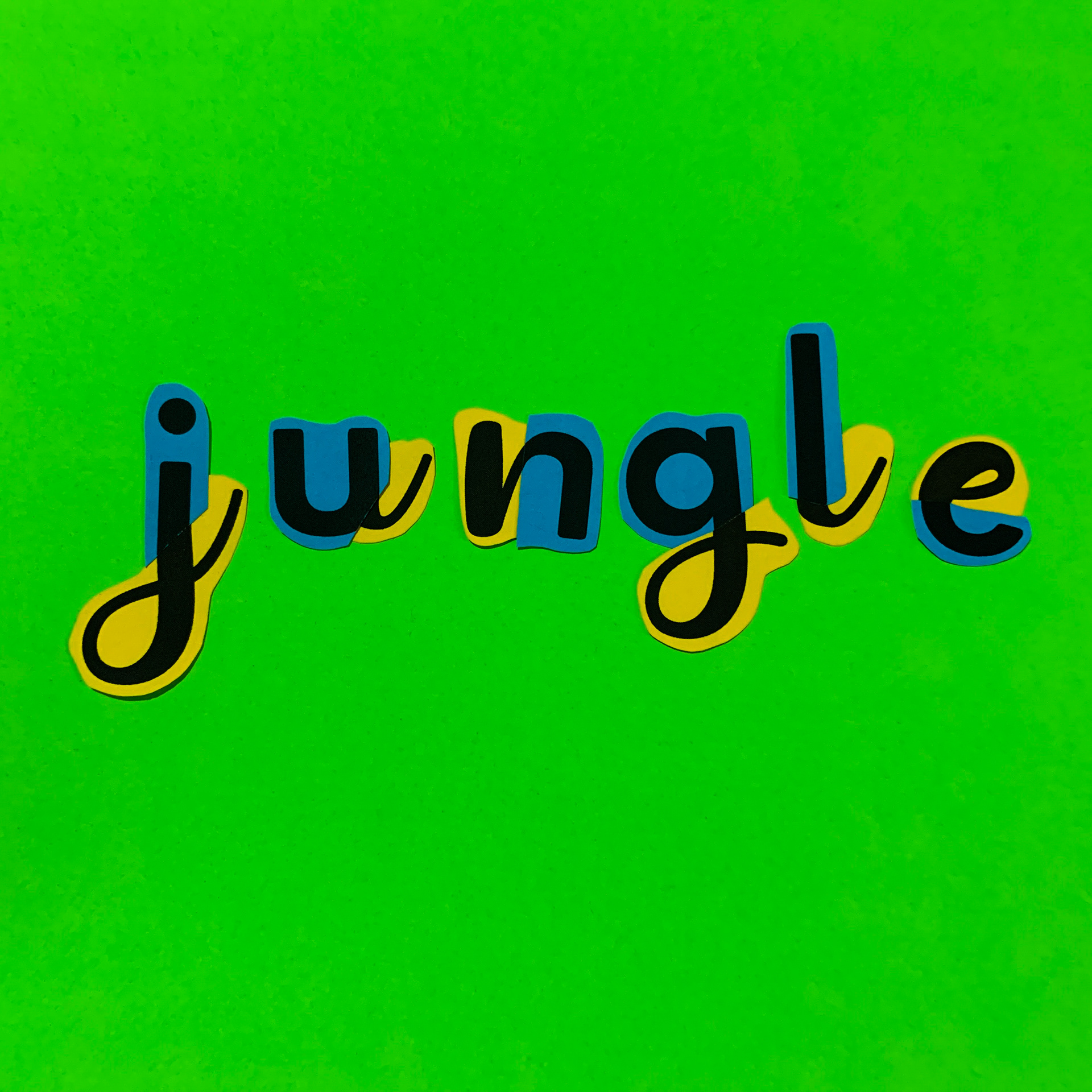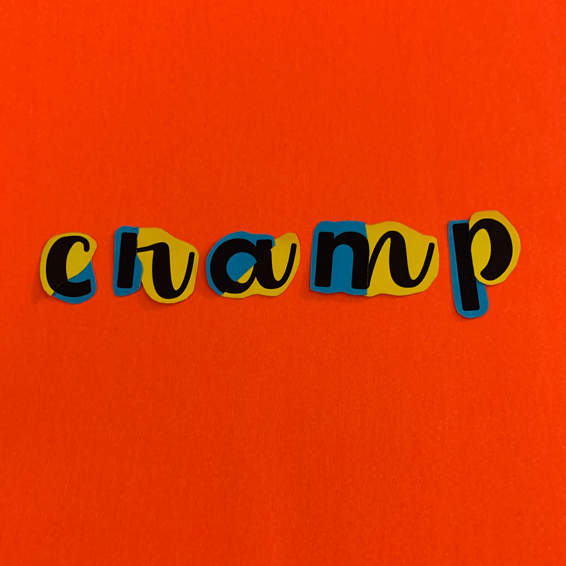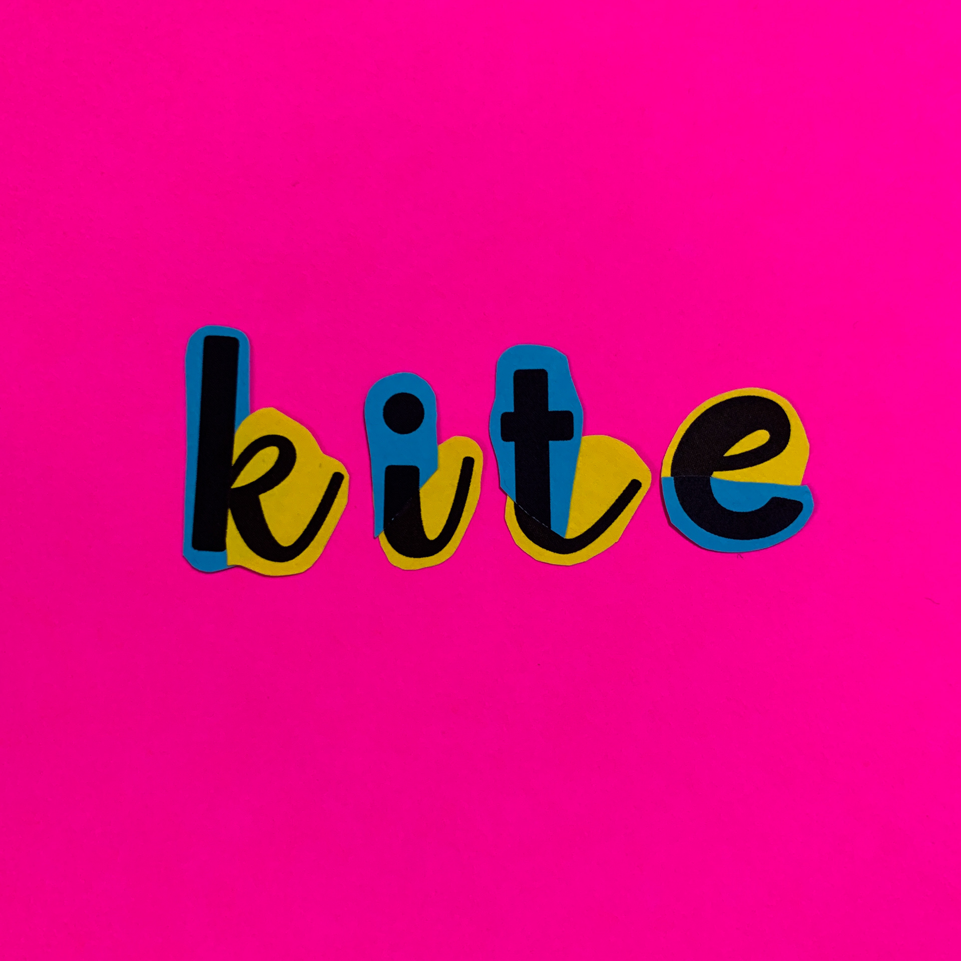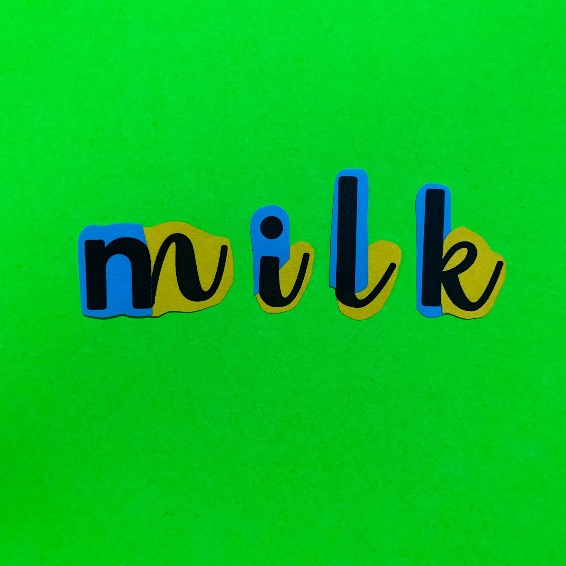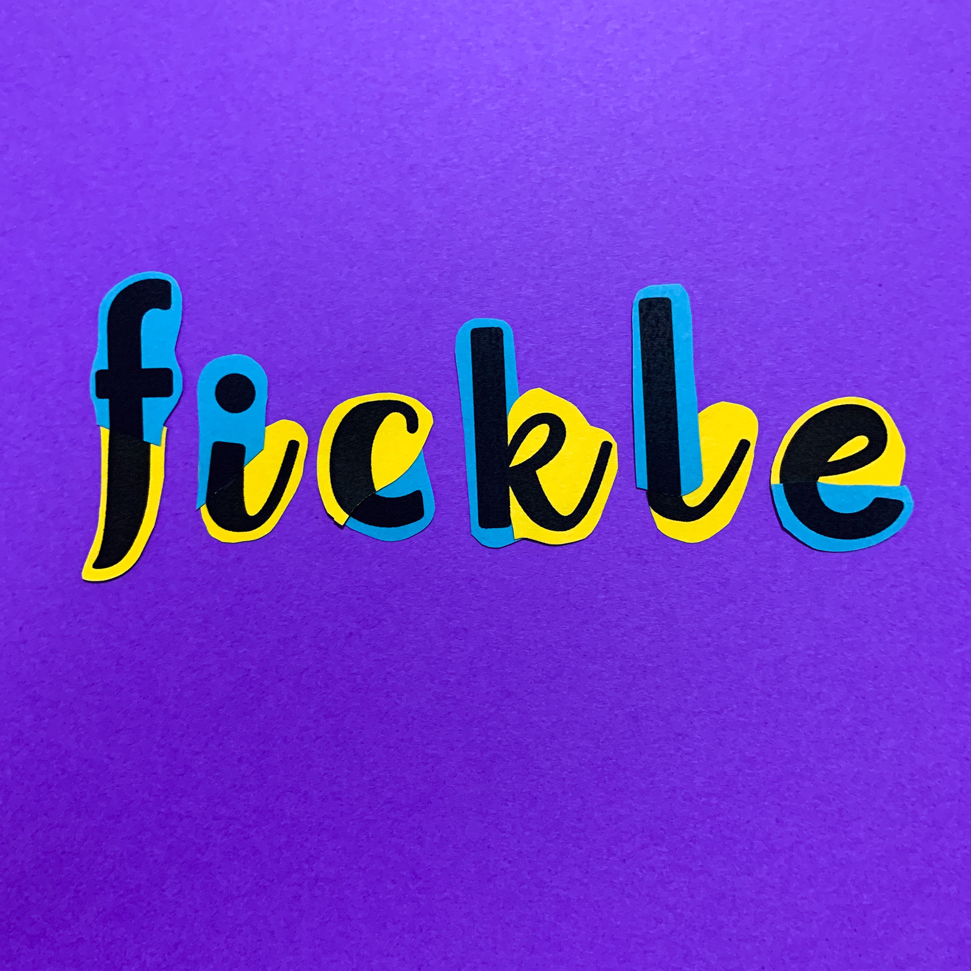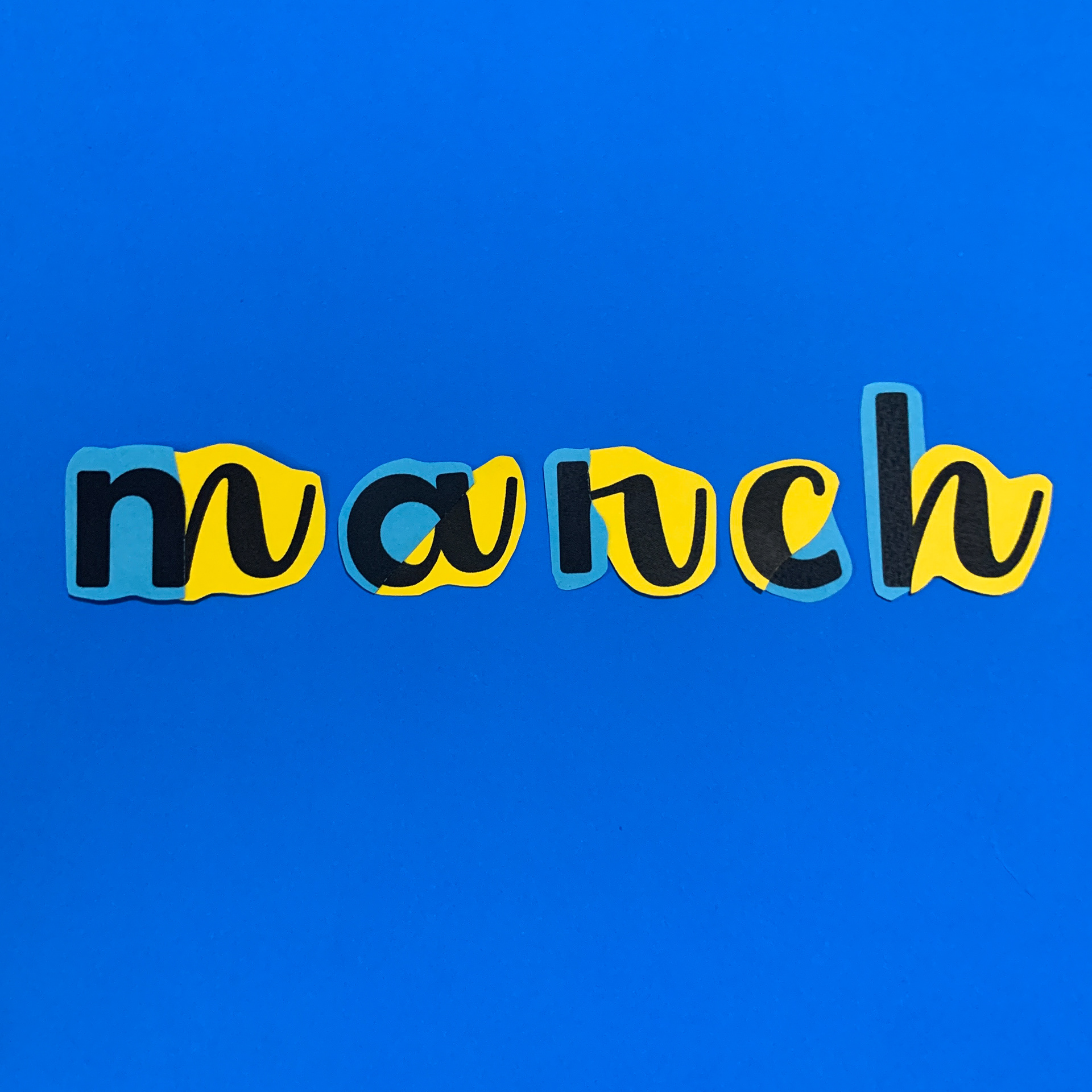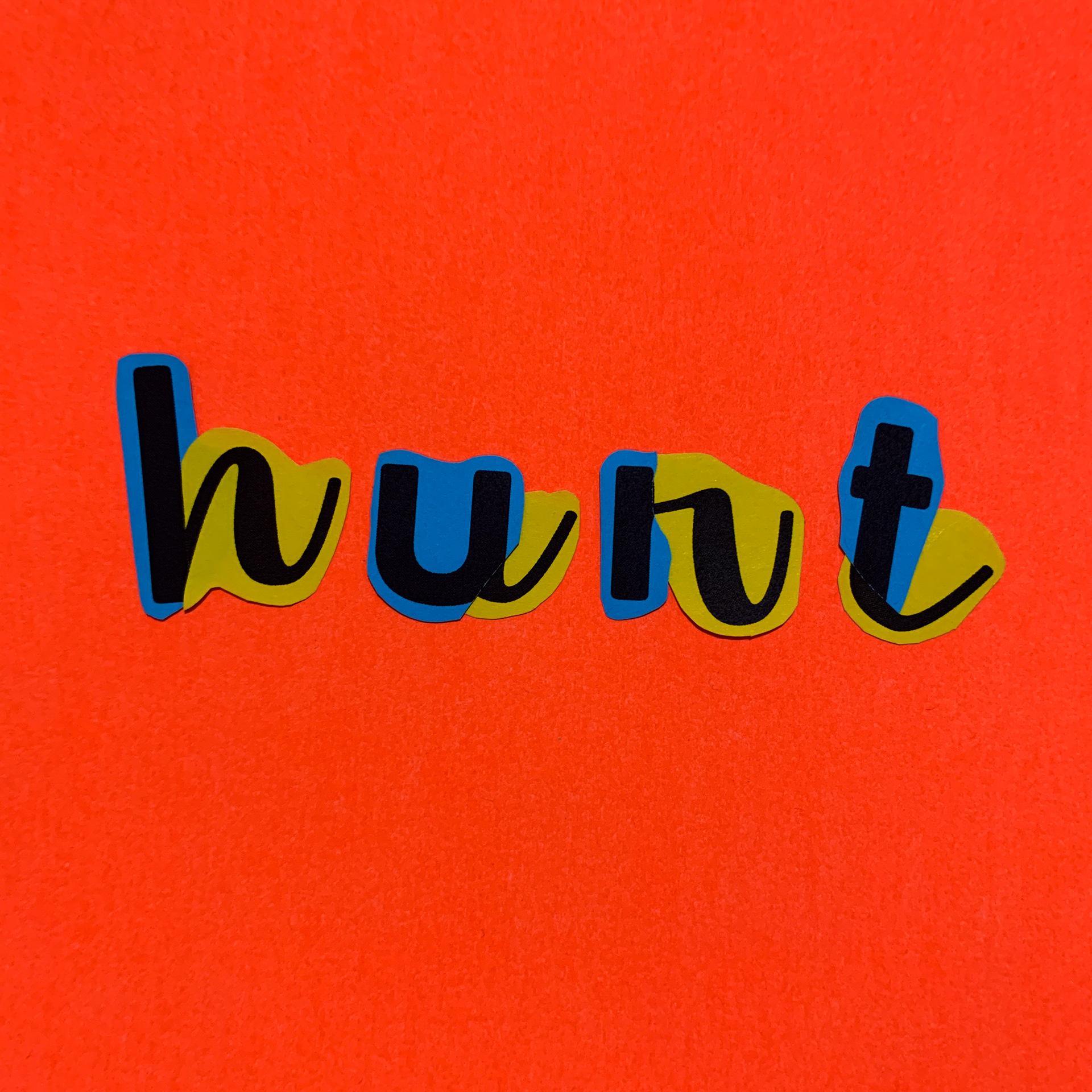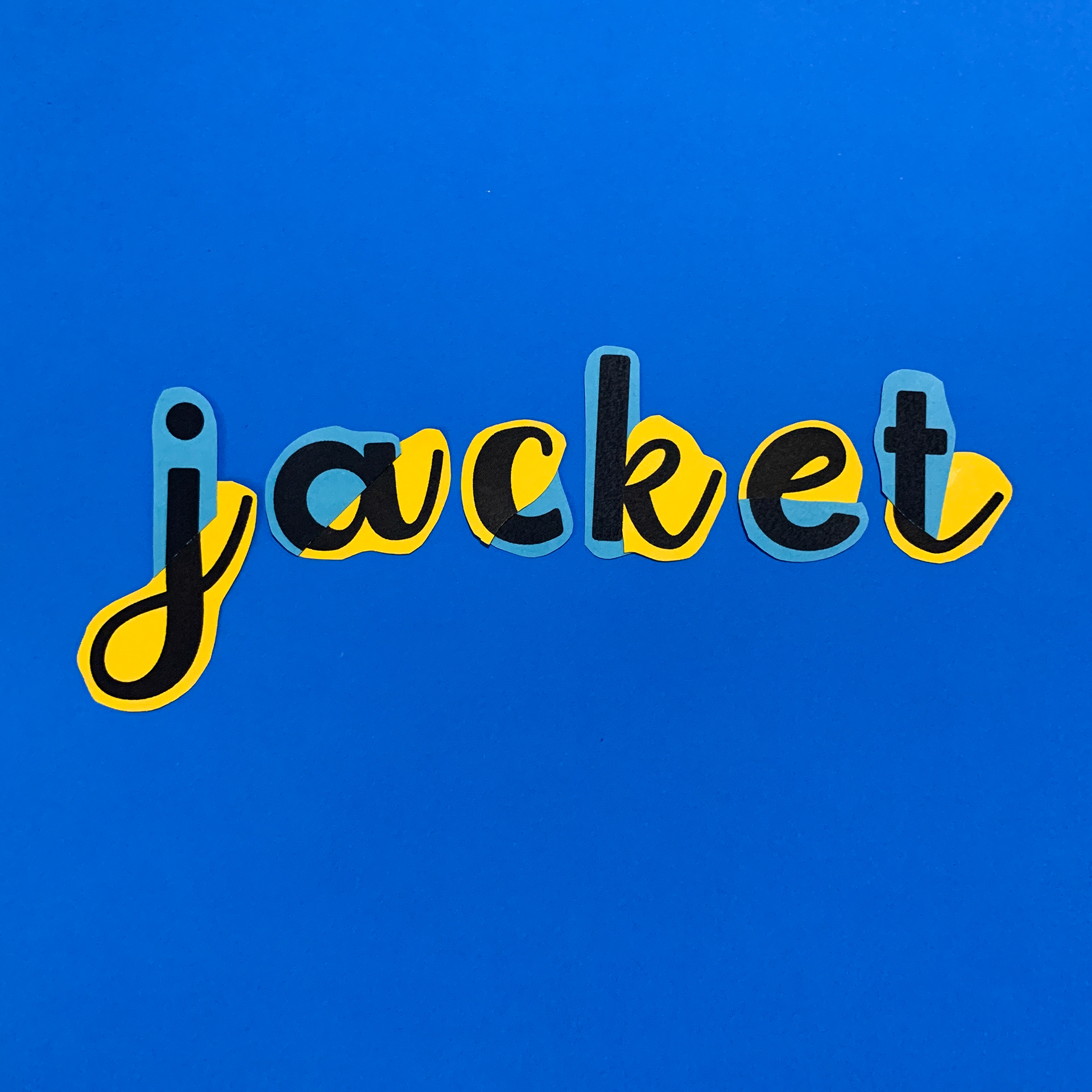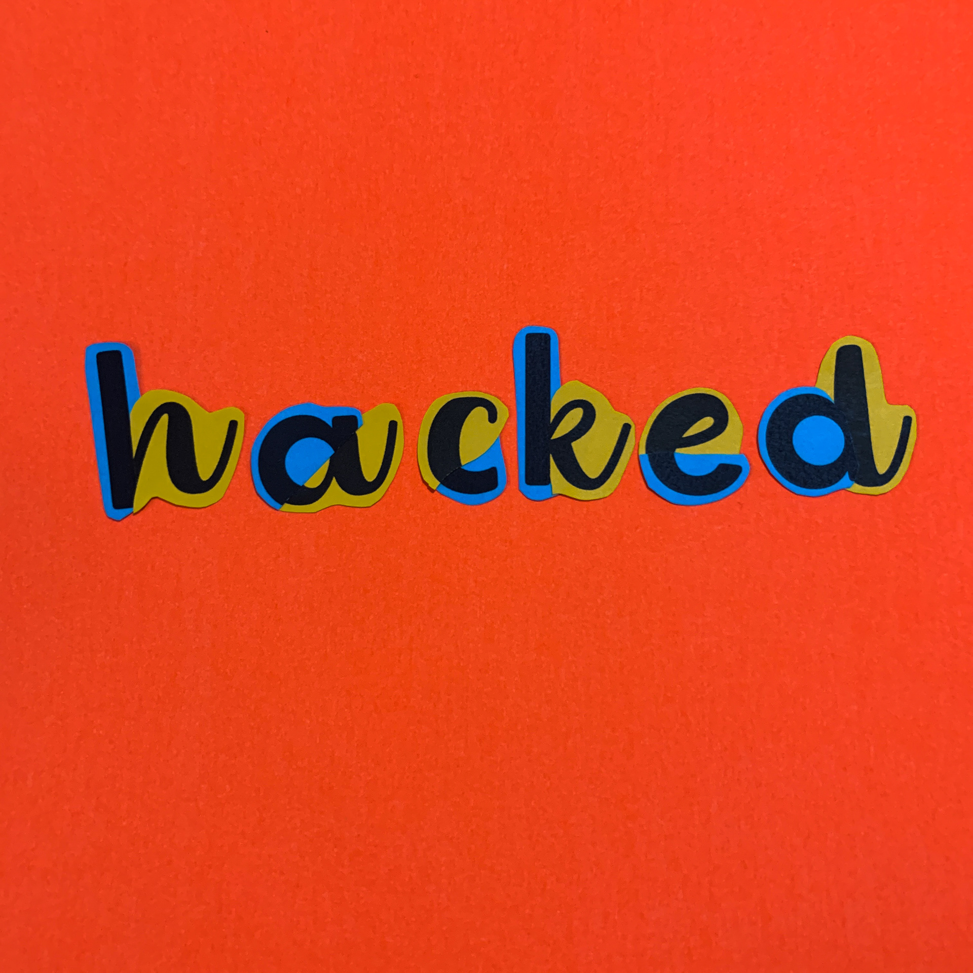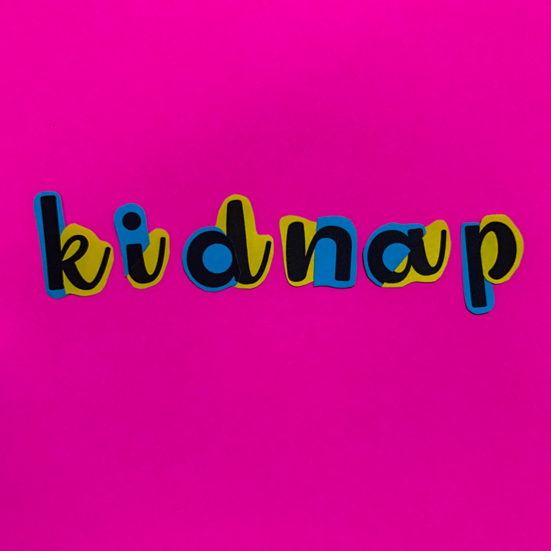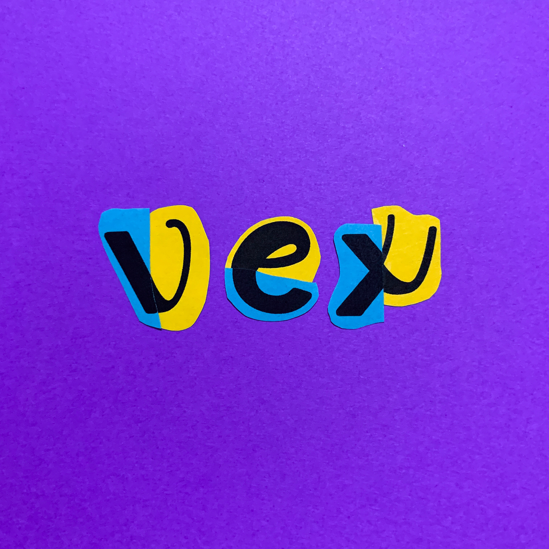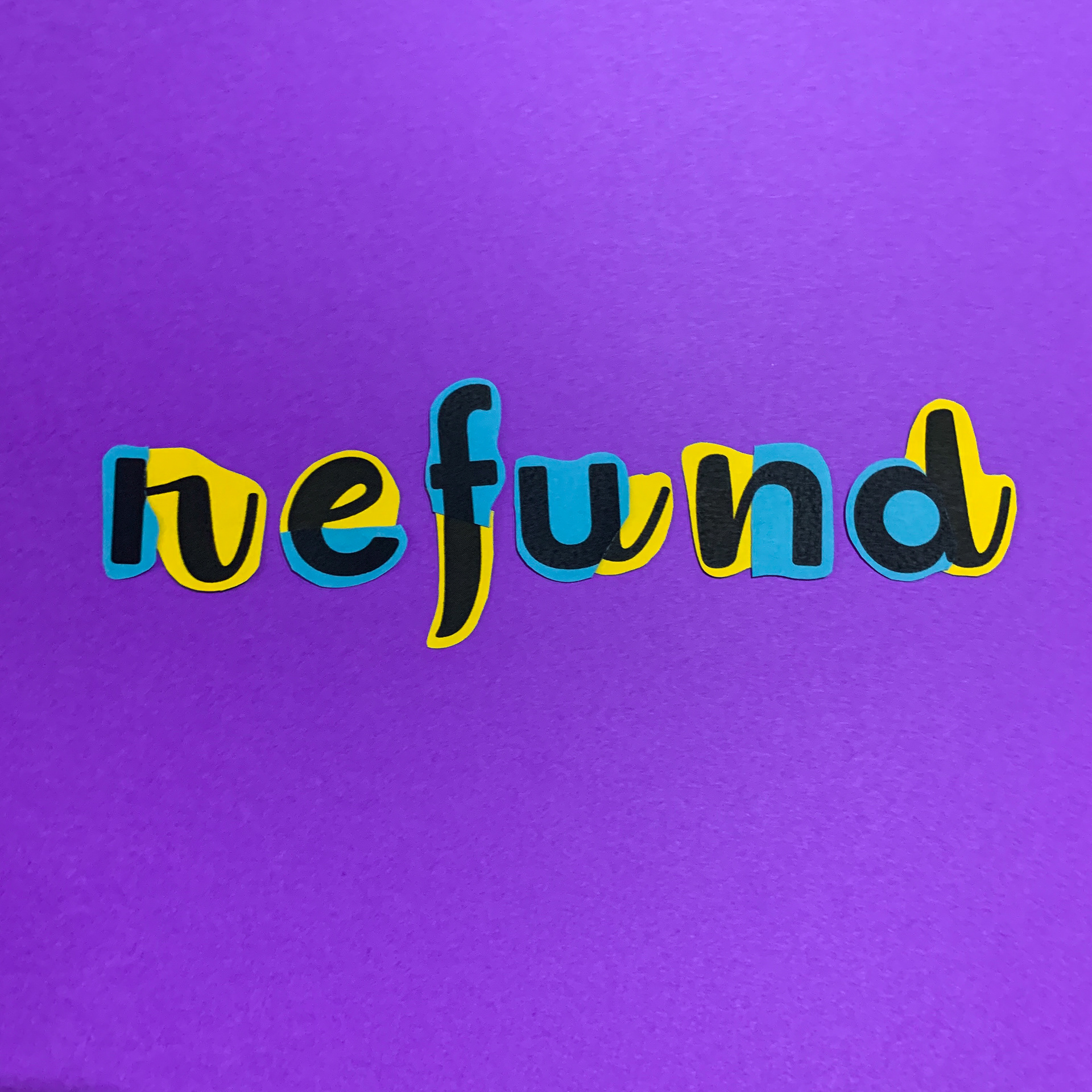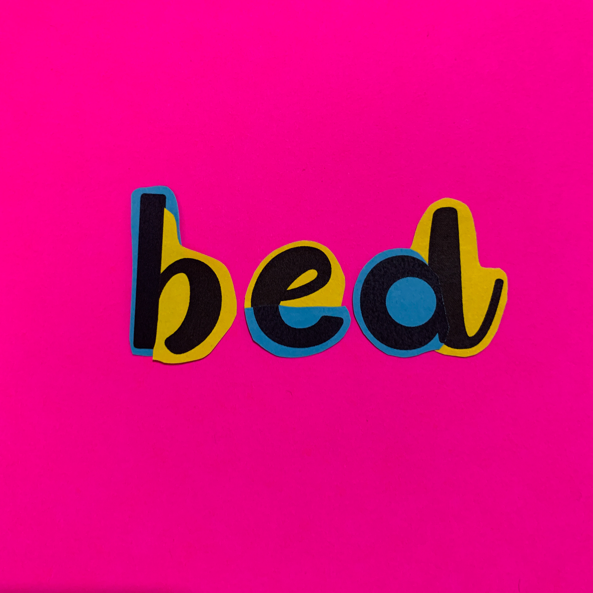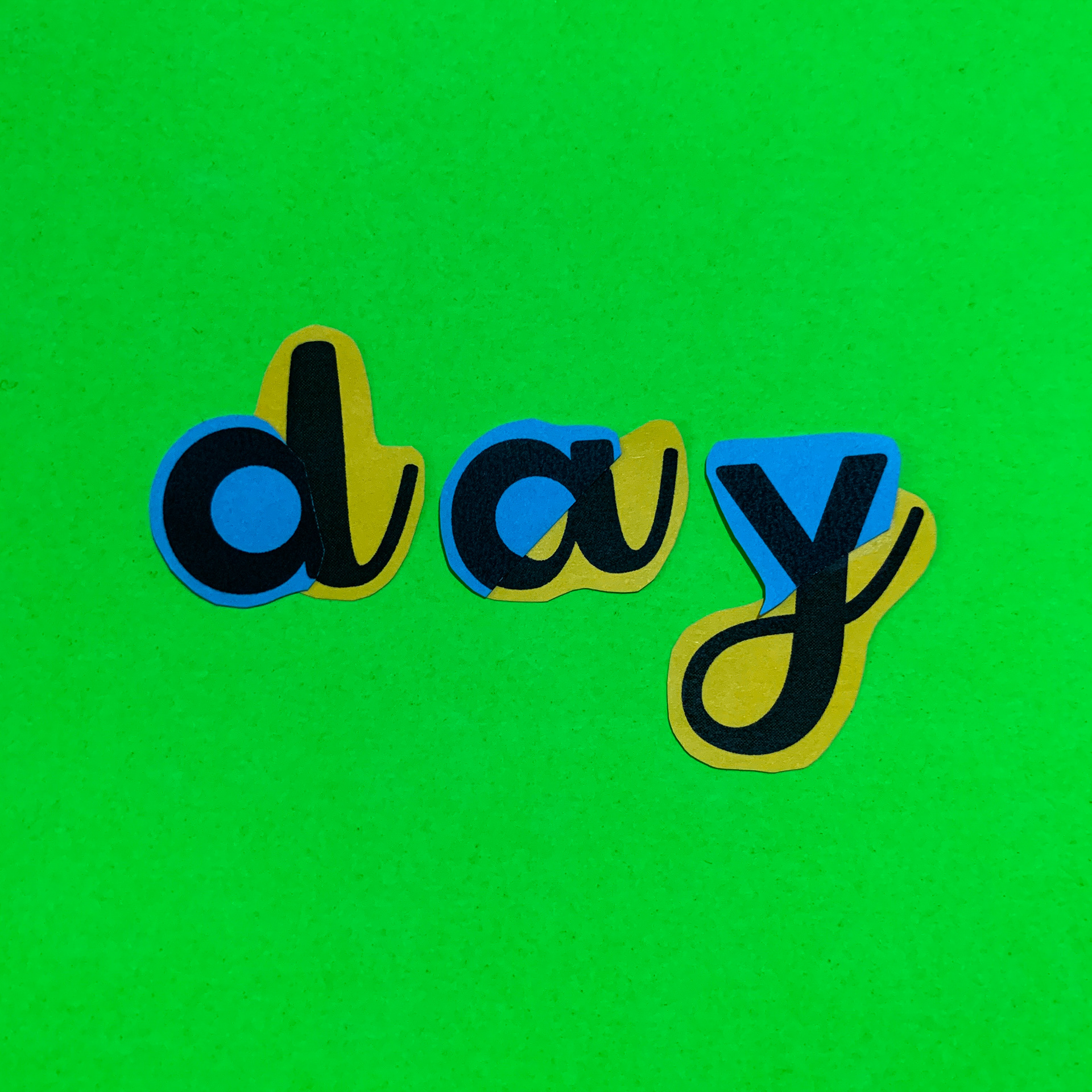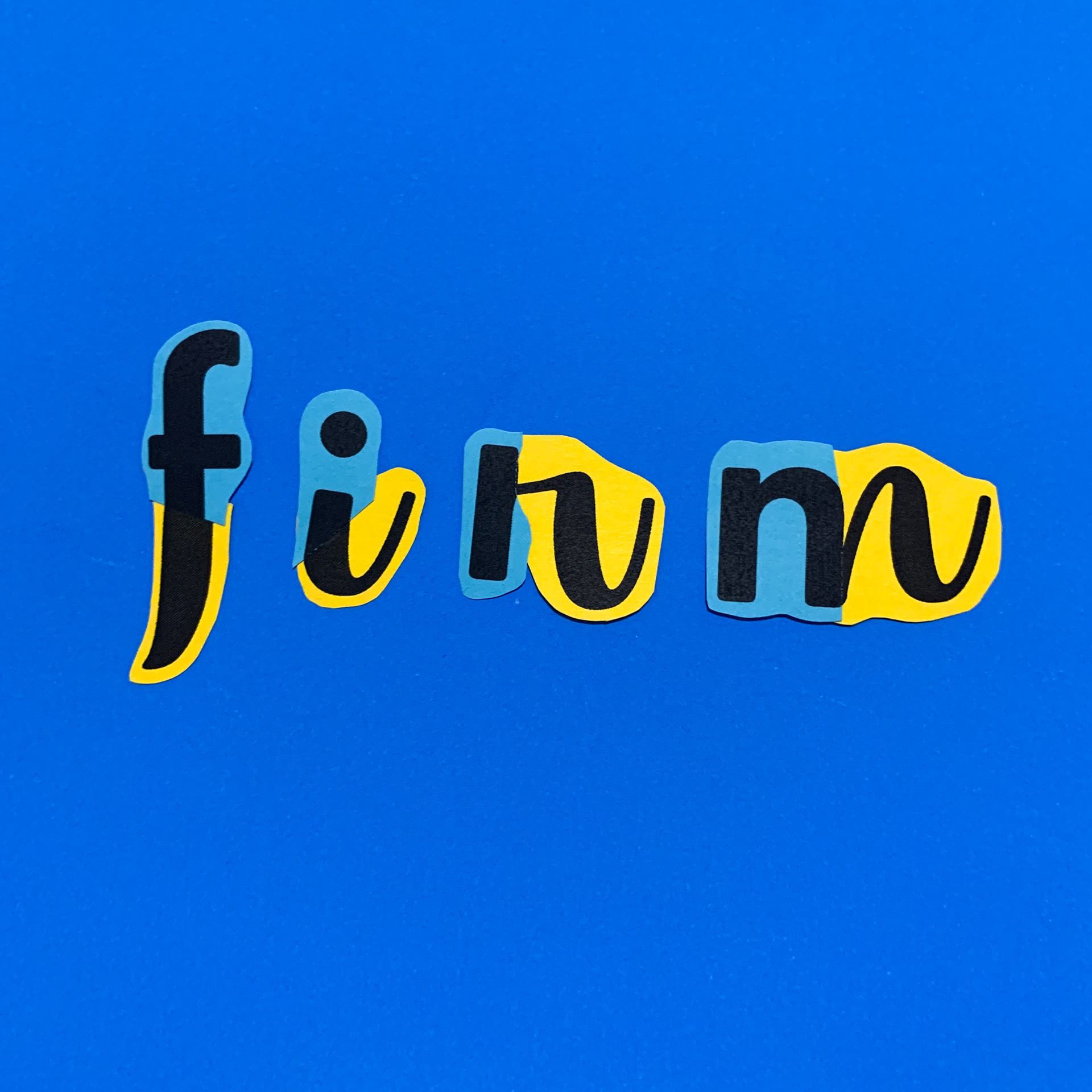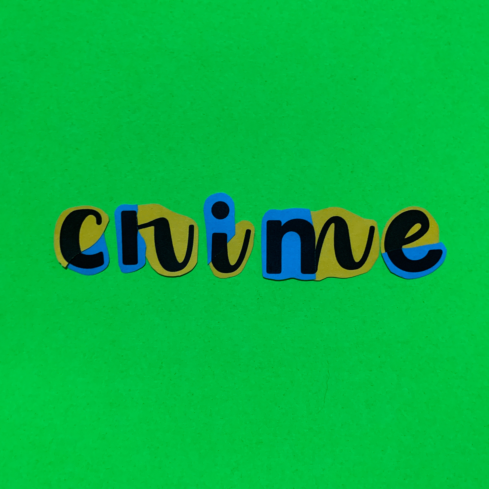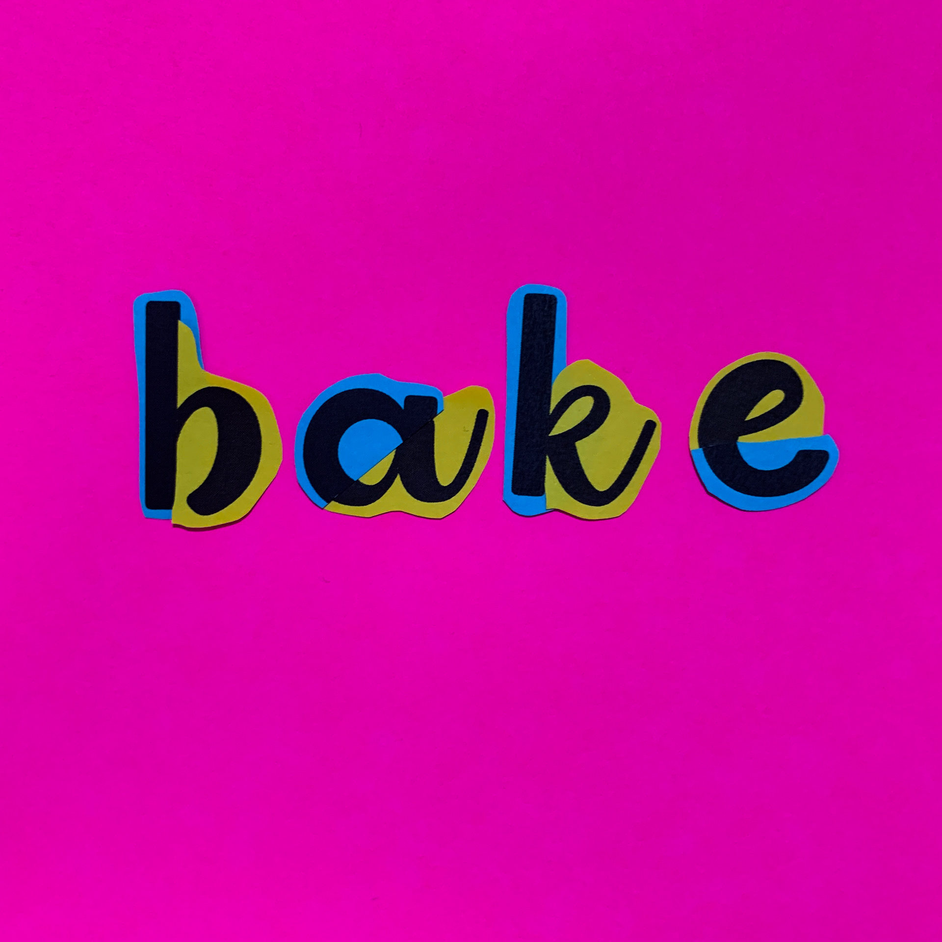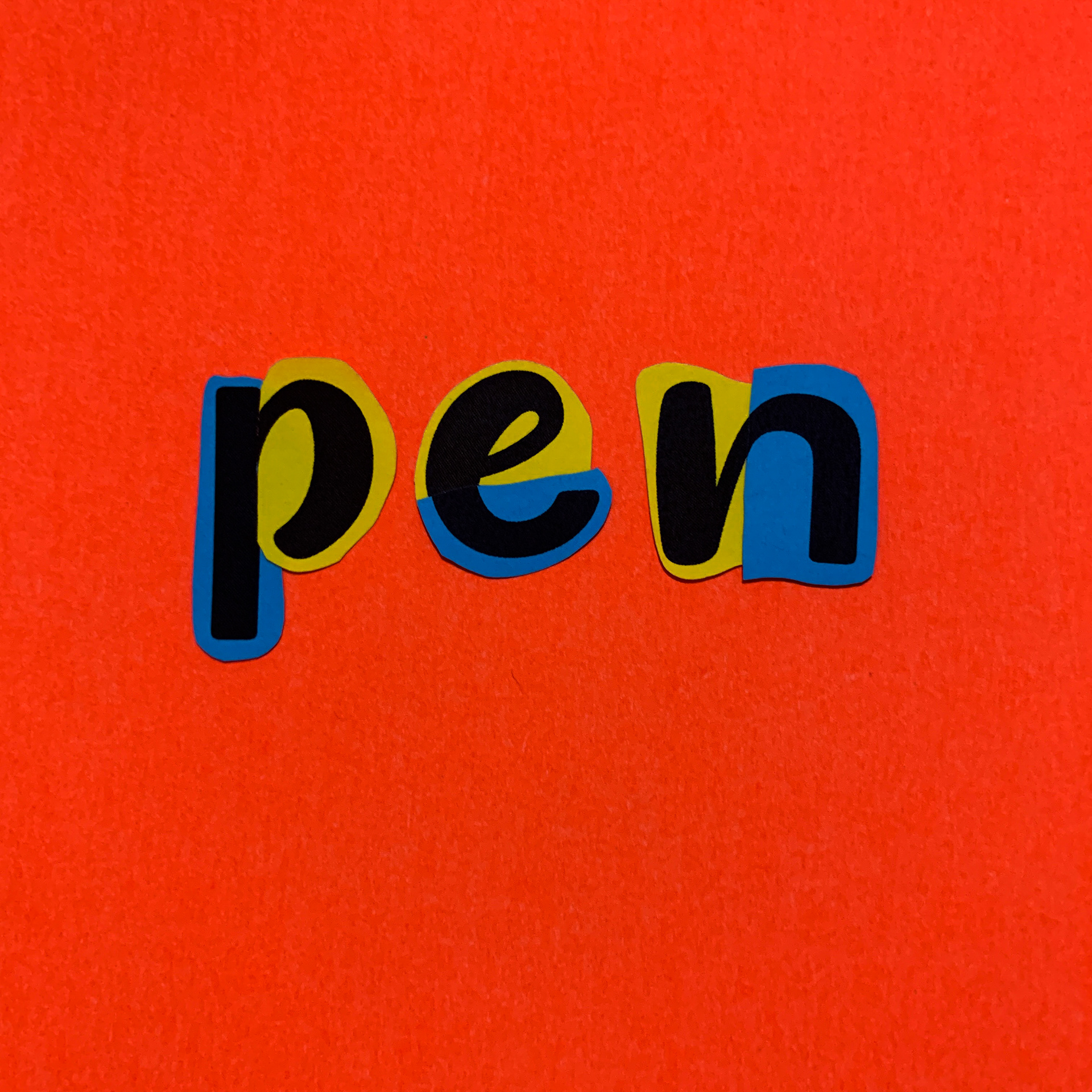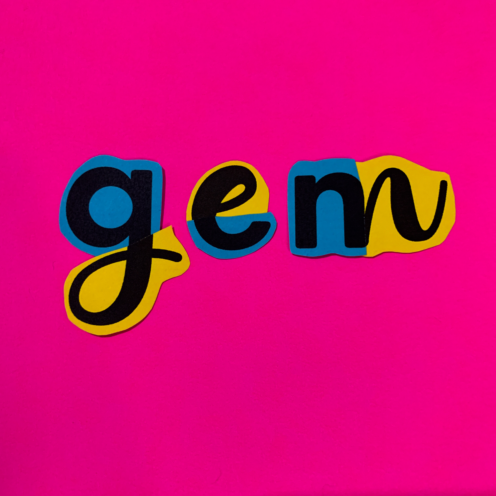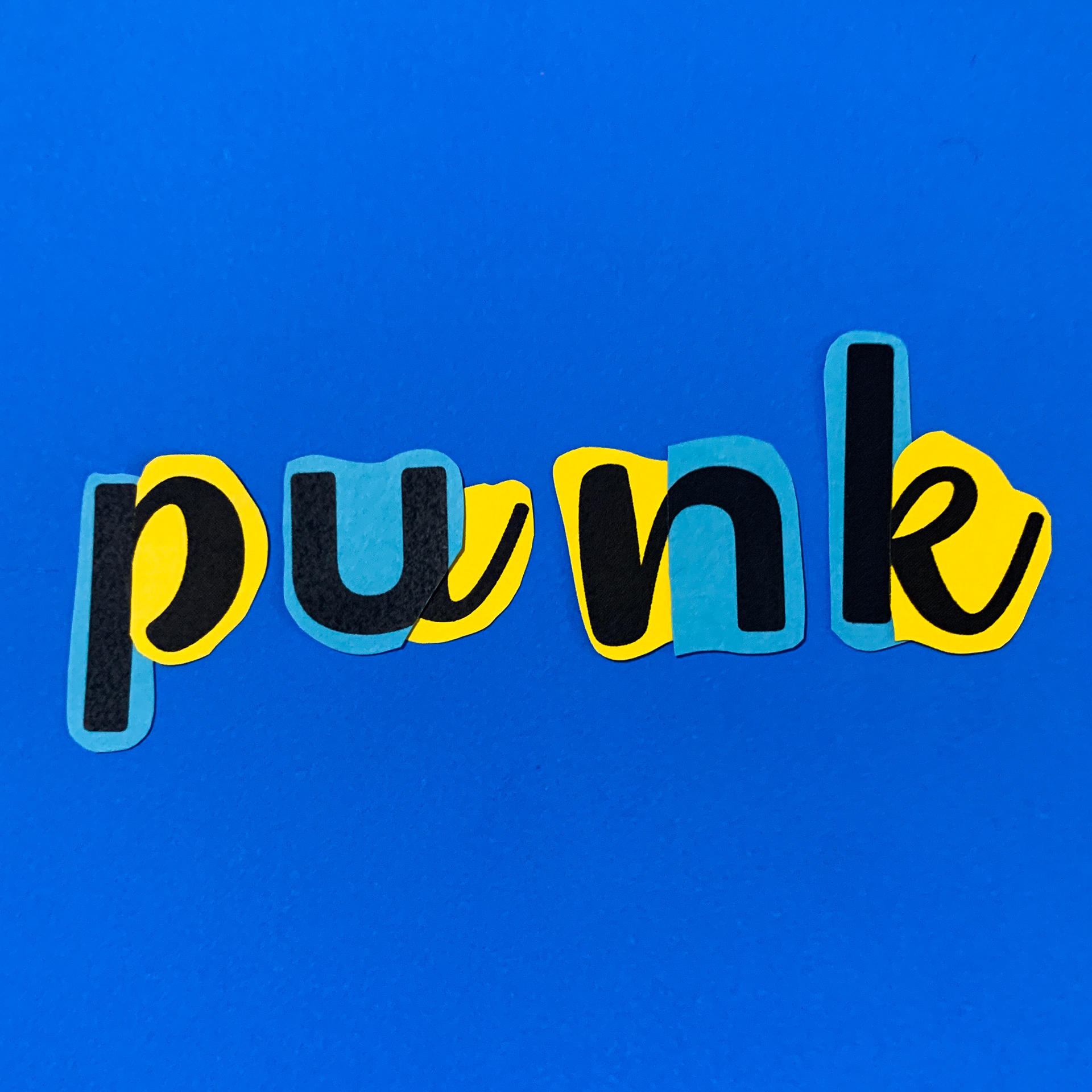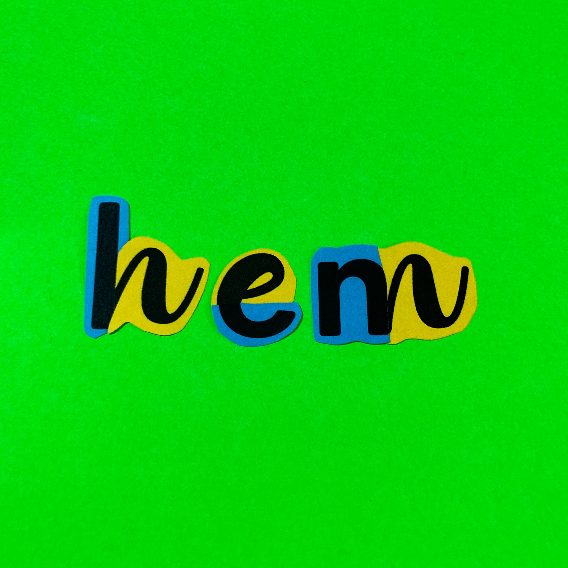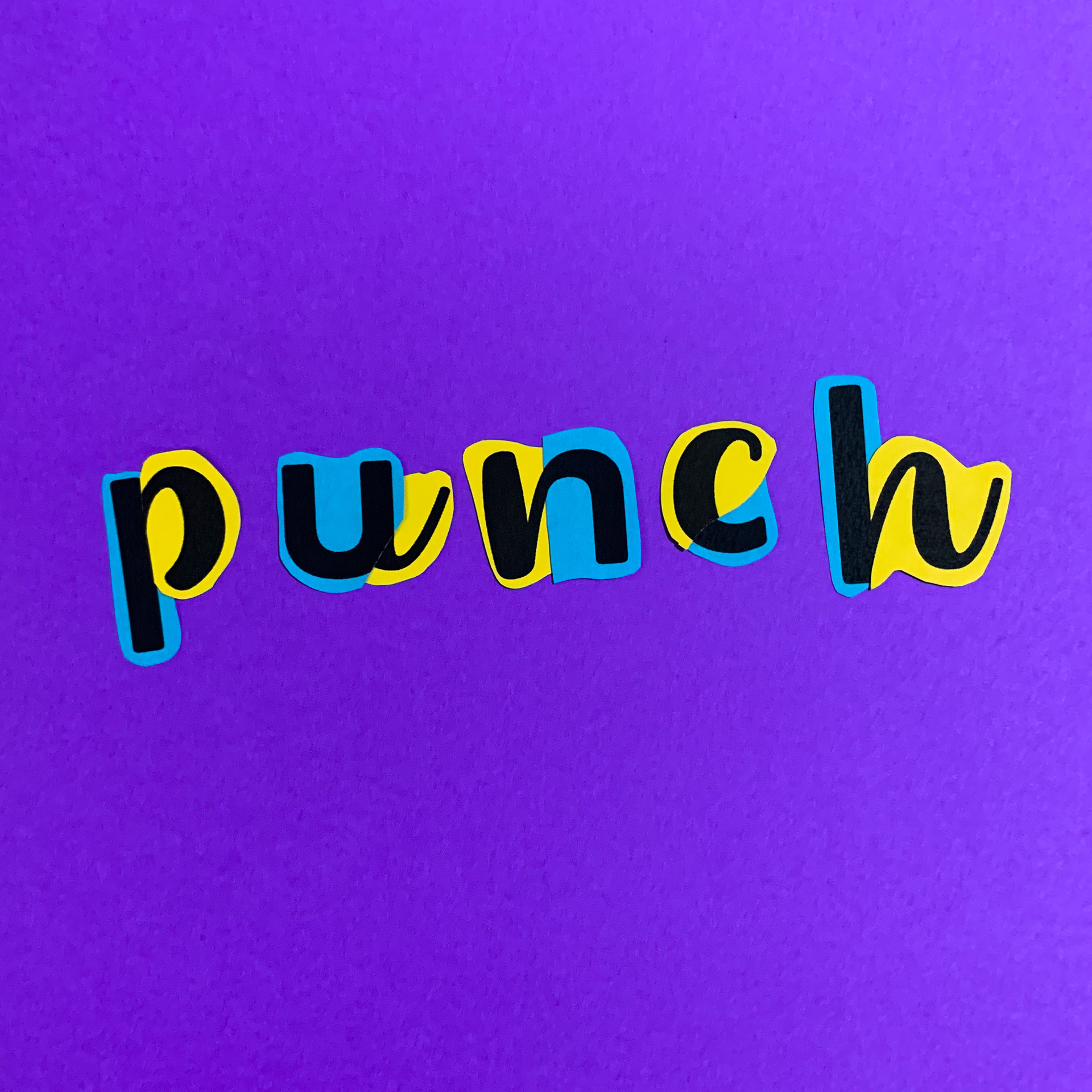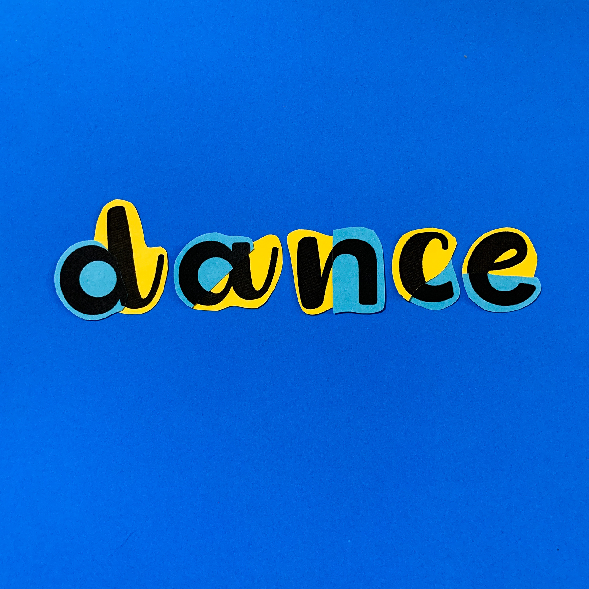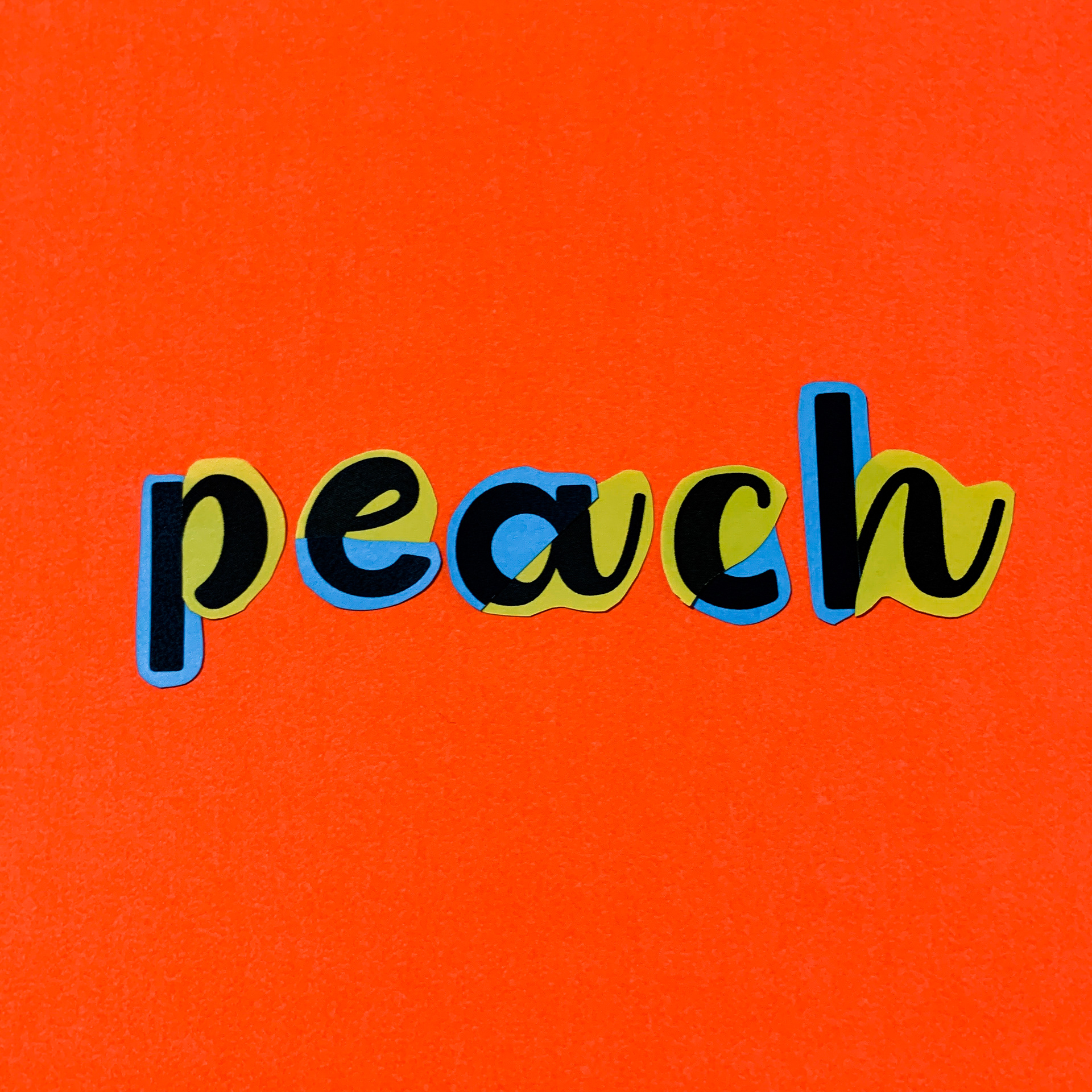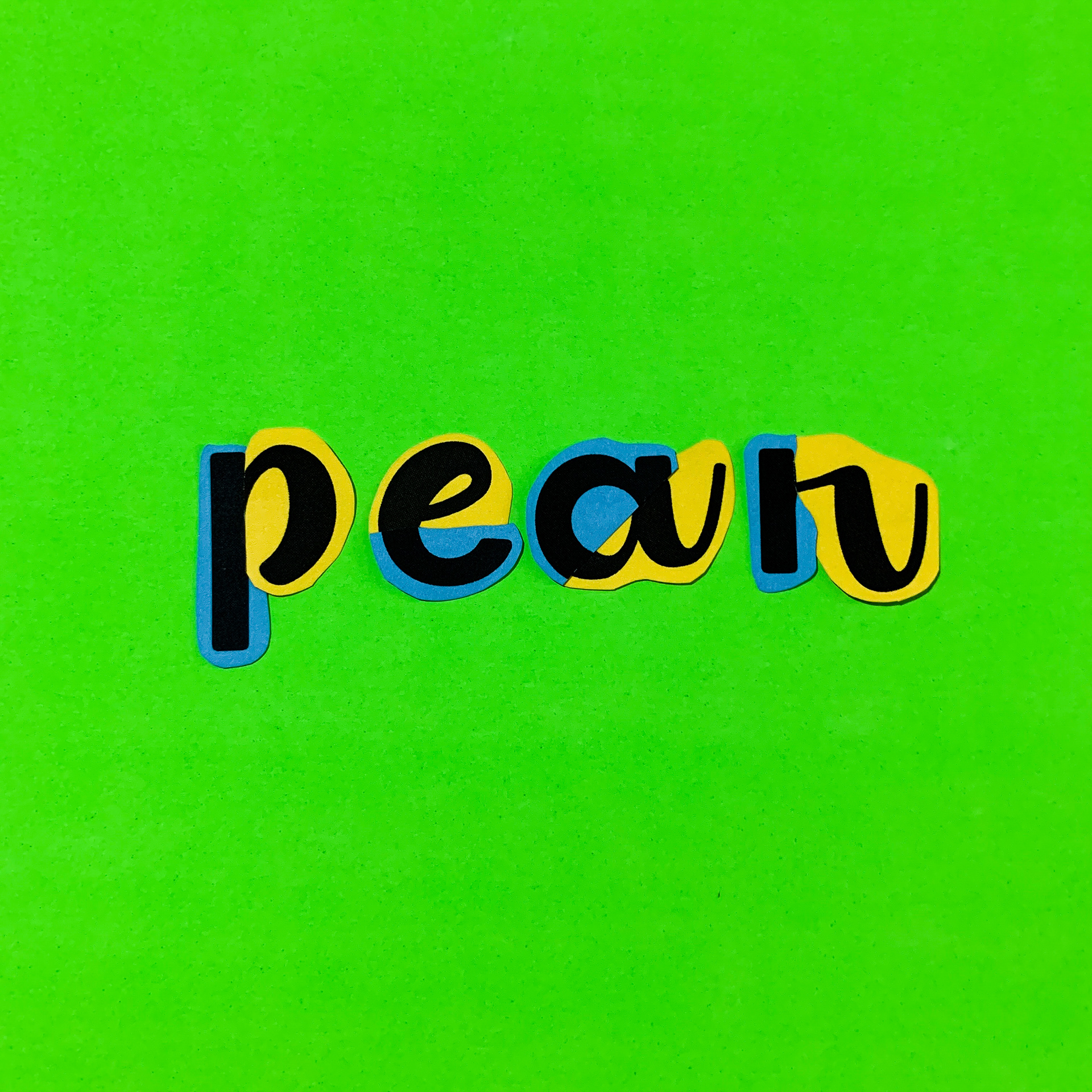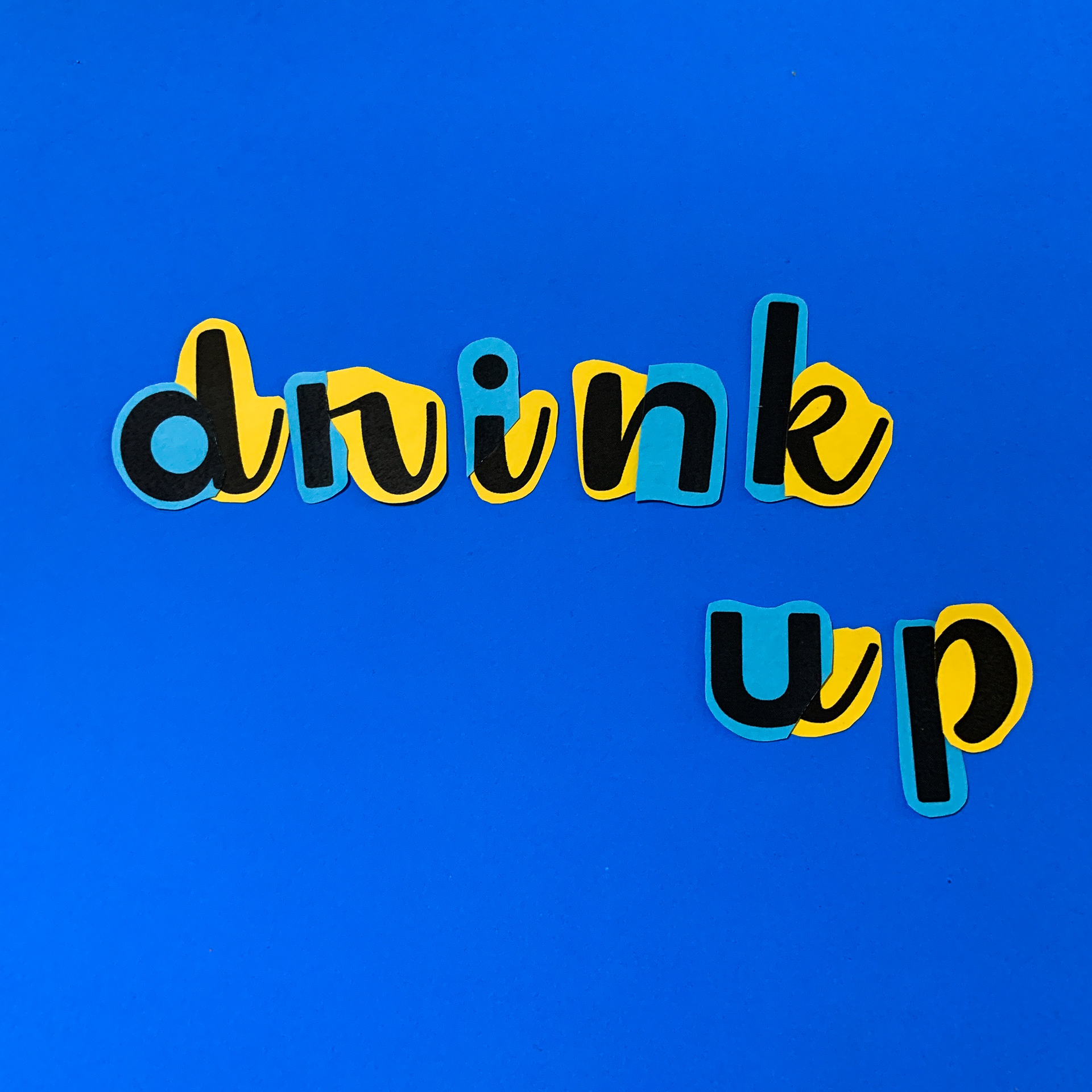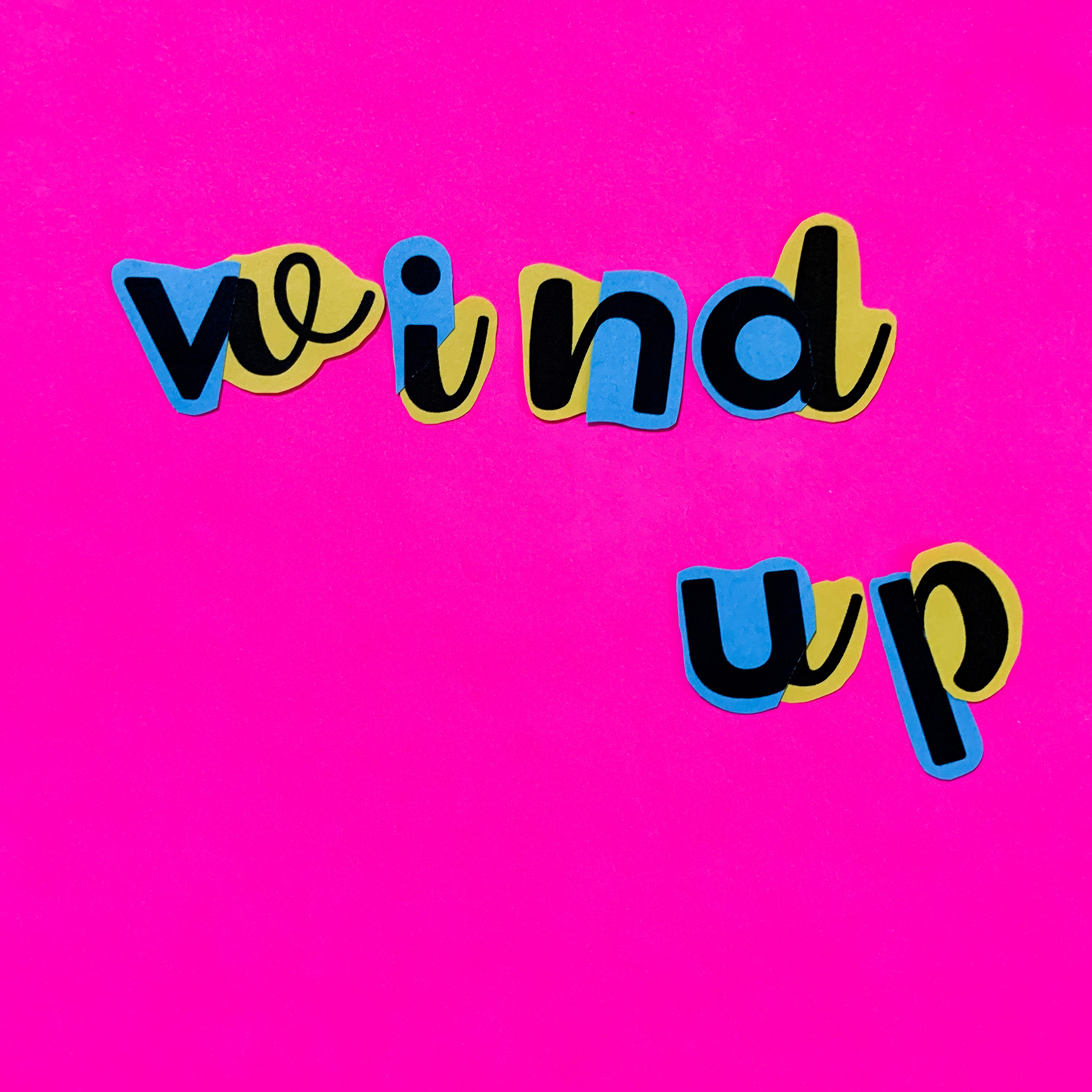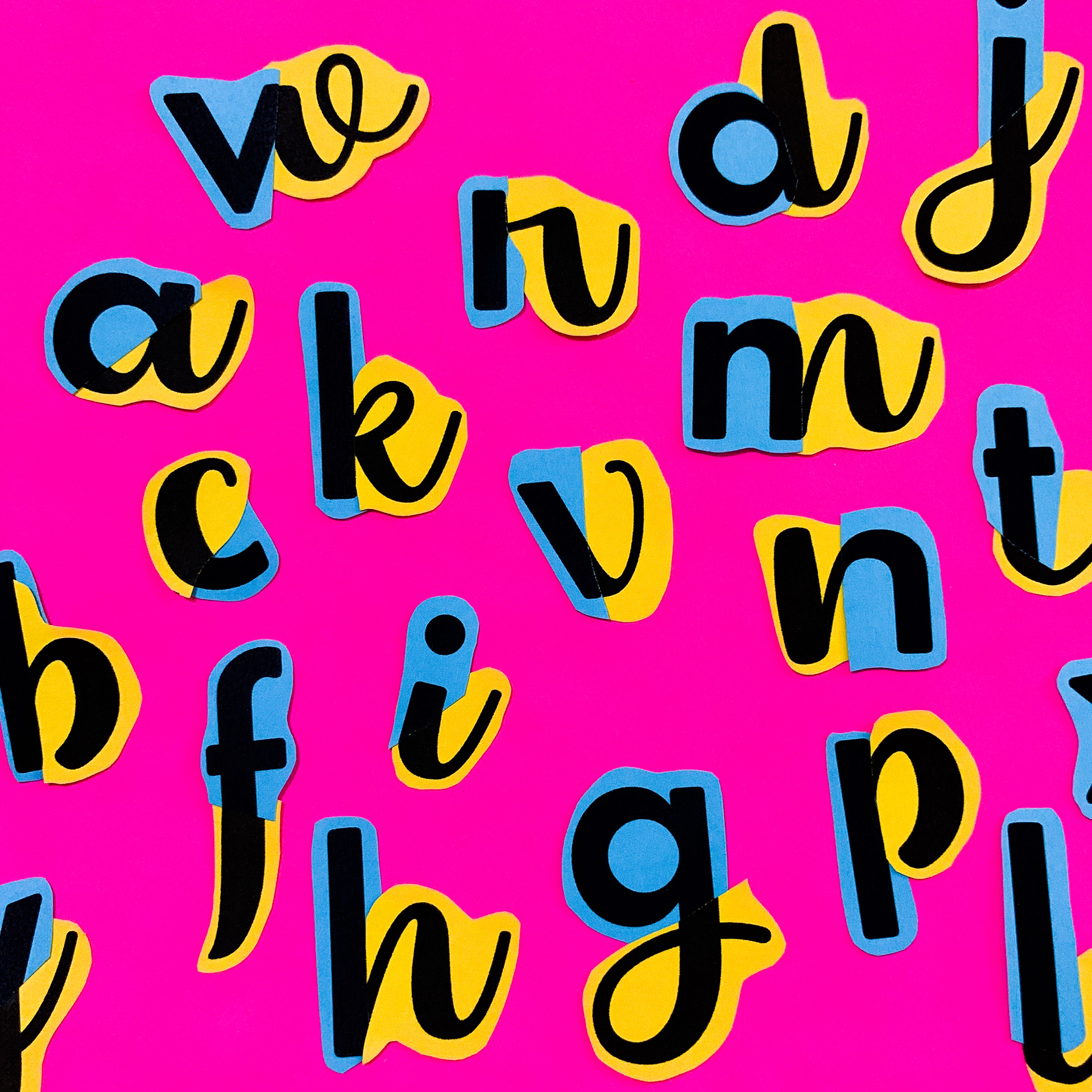
This started as a typography experiment, in which I printed out two different styled alphabets and used pieces from each one to create a new alphabet.
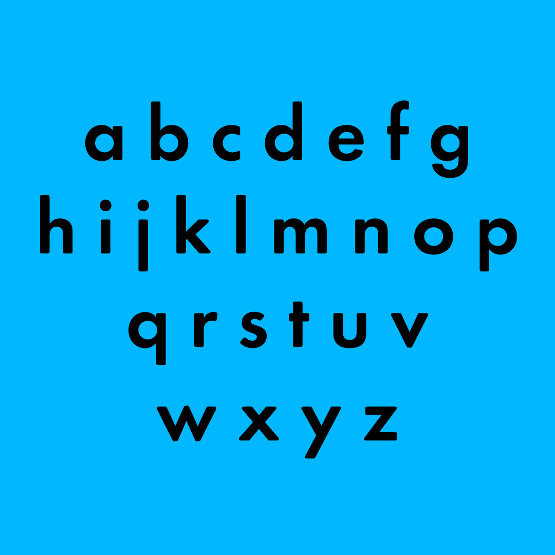
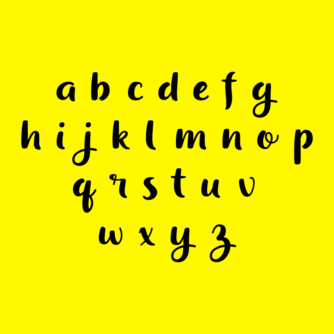
The two fonts I chose were Futura Round Demi and Dessert Menu Script Regular. I chose them because they are different in style: one being sans serif and one being script. They are very different in style, however they both have a similar weight to them. I decided that this similar weight would be able to bring them together nicely while still creating something new and unique.
I printed the alphabets on different colored paper so that it would be easy to tell the two different fonts apart. Once printed, I analyzed the letters from each alphabet to find a good place for one to end and the next to start.
The results were quite rewarding and it was fun to spell out words with them, although challenging due to the limited letters. I plan to revisit this experiment with extra letters factored in. I also want to try it with different fonts and different colors.