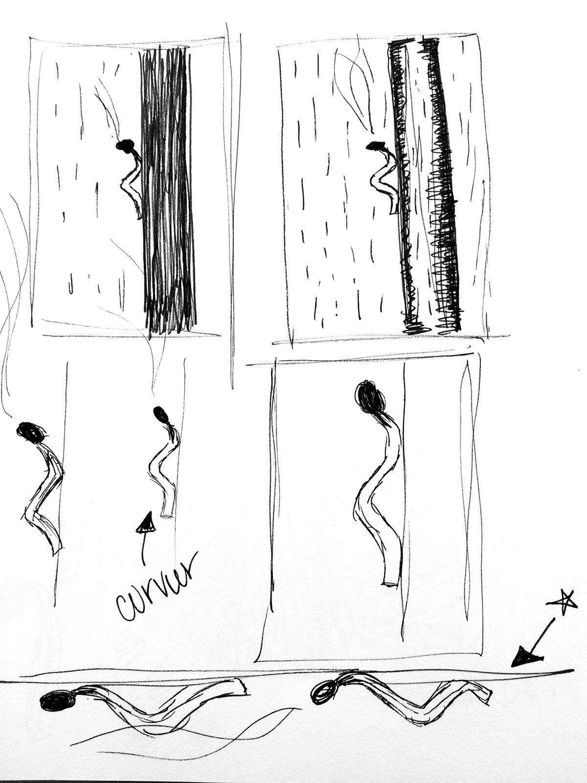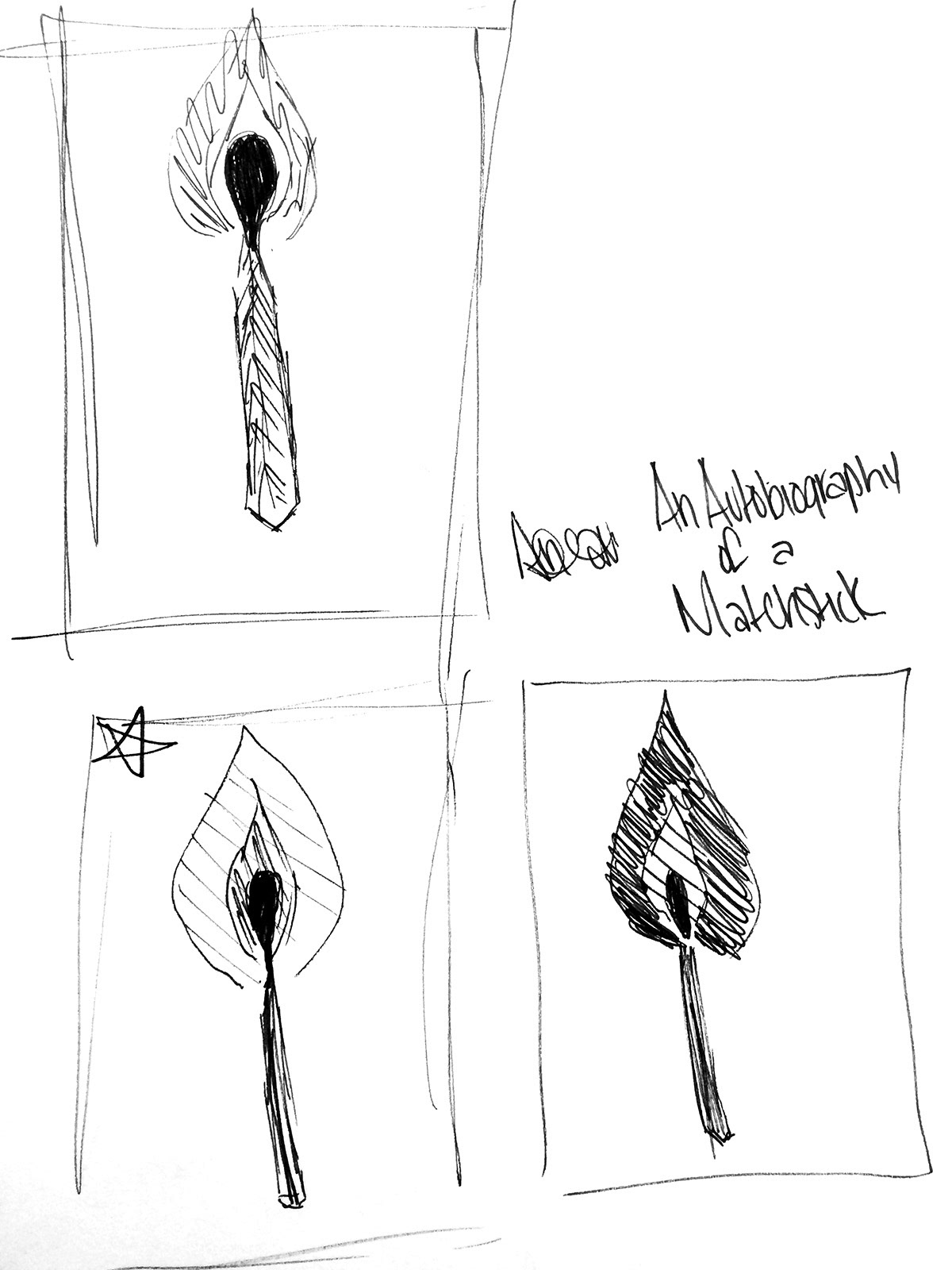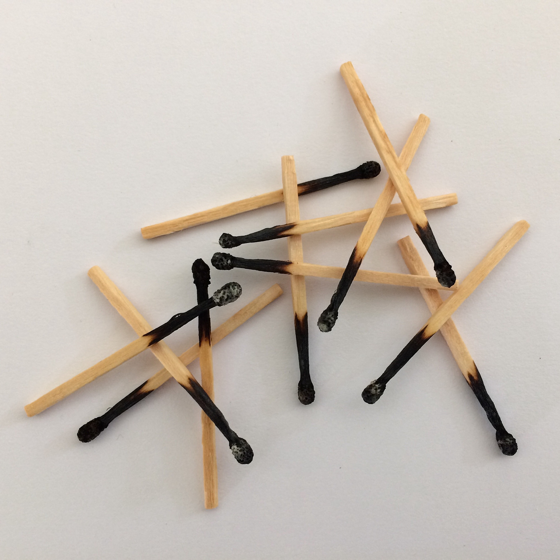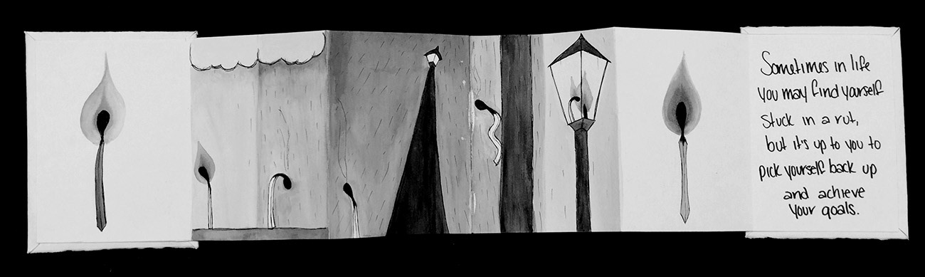
When approaching this project I wanted to tell the story of how I was brave enough to get out of my rut and achieve my goals, but I wanted to do it in a metaphorical way. I decided that a matchstick would be a good metaphor for the story at hand.
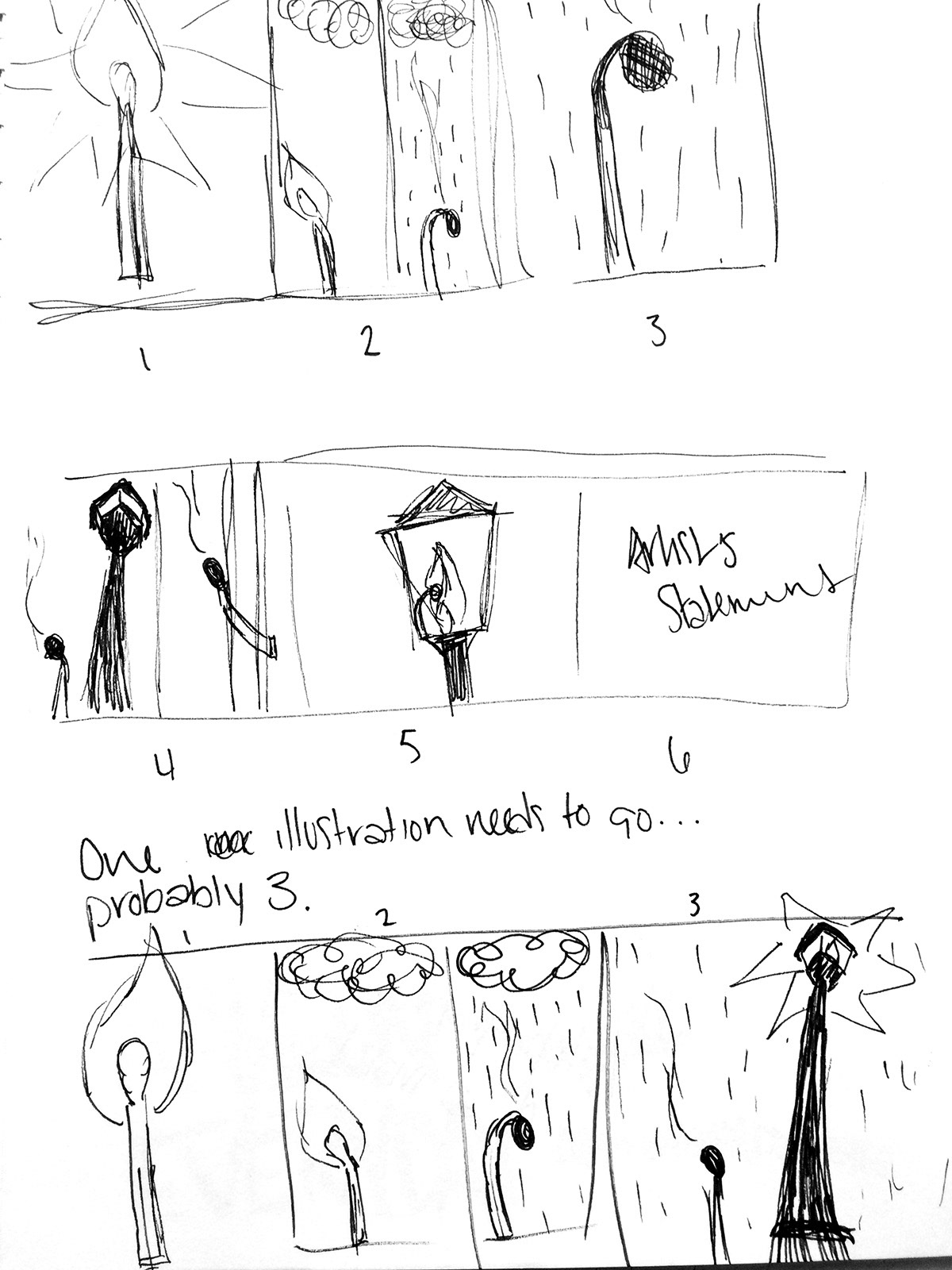
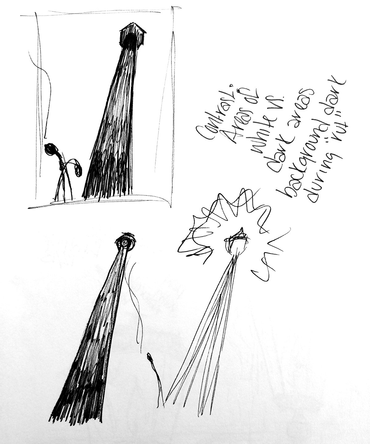
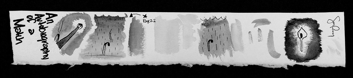
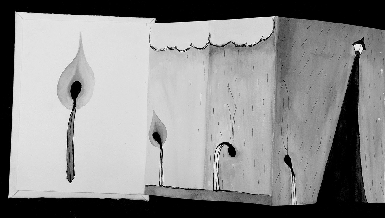
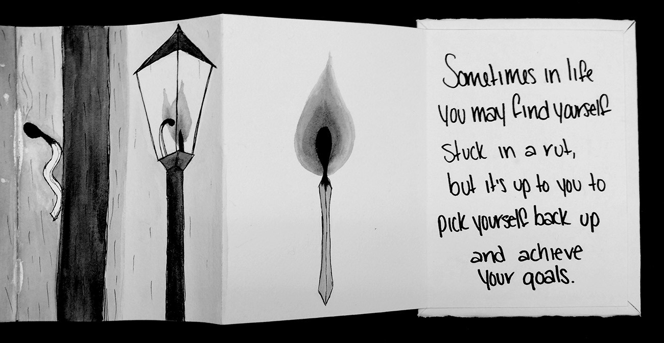
I used contrast to create sort of a rivalry between jet black and stark white in each frame. The black and the white are meant to represent opposing forces. For example, in the frames where the matchstick is not lit, the matchstick itself is shown as white to contrast against the darkness brought on by the rain and the lack of light that the matchstick can provide now that its flame has been put out. I used perspective to show scale on the third page. I exaggerated the base and the top of the lamp post to make it look like it is really high up in the sky, making it look taller, more challenging, and more menacing compared to the matchstick. This conveys that this lamp post will be a great obstacle to overcome. On the second page, I was able to pack a lot of emotion into it just by changing the stance of the matchstick. Once the flame has been put out, it is very obvious how sad and stifled the matchstick feels just from its body language. I did the same thing on the fifth page by giving the match a power stance once its flame is lit again. I tried to give it shoulders and sort of puff out its chest in order to convey that it is back and better than ever.
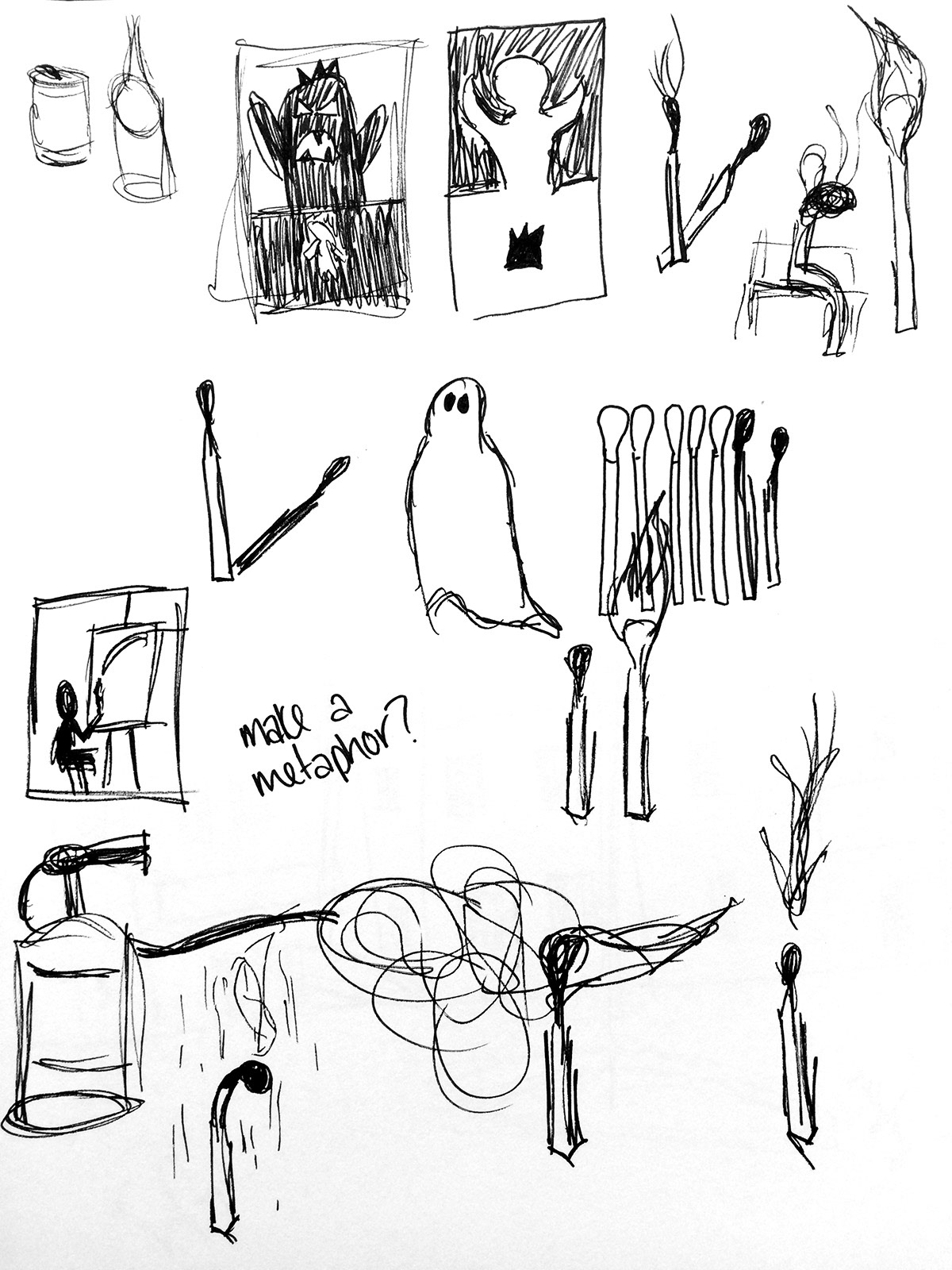
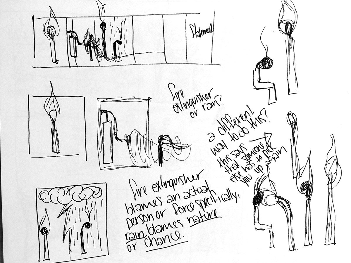
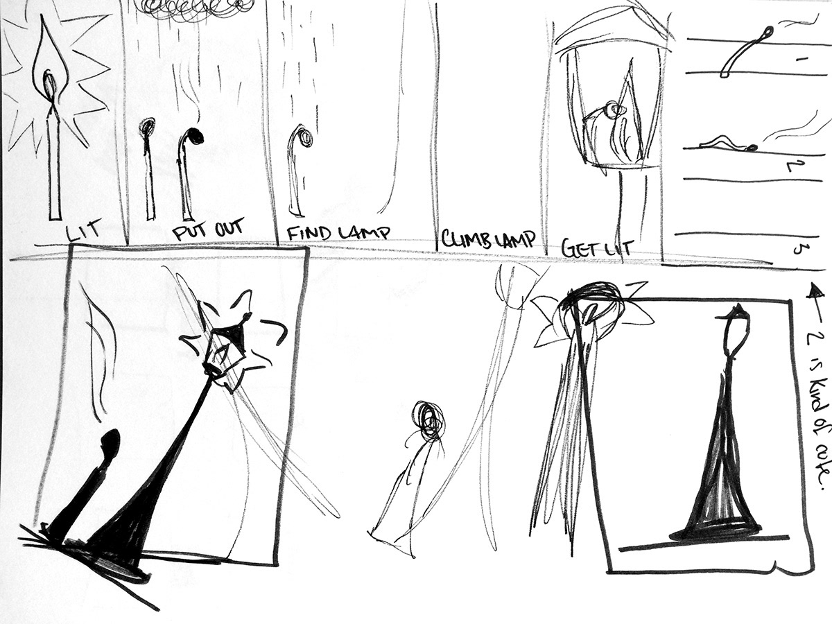
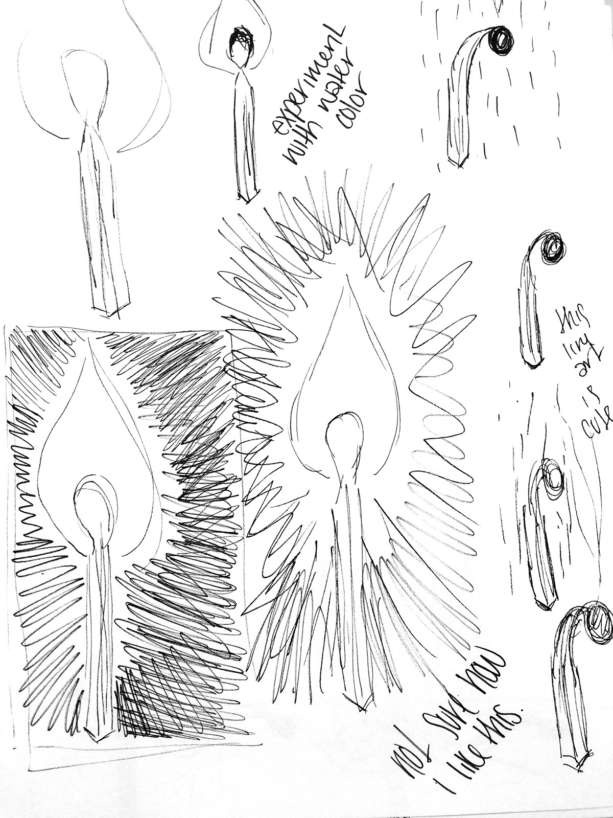
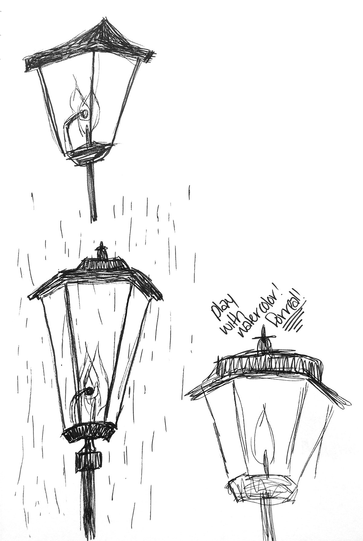
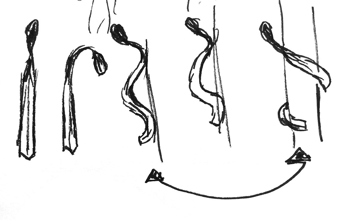
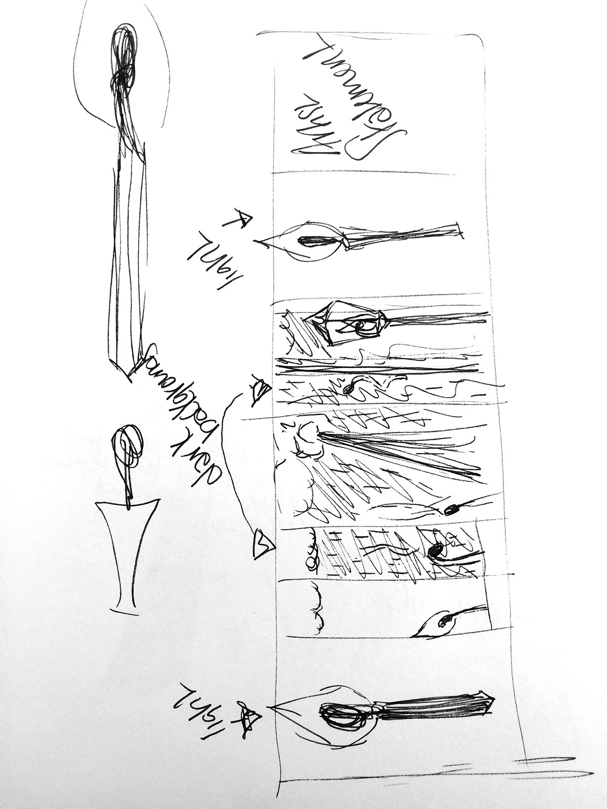
Provided below are my many preliminary sketches, studies, and file management for this project: