I redesigned a website using HTML and CSS for my Interactive Design class. I was asked to find a website that was not designed well, and improve it using the skills we had learned in class.
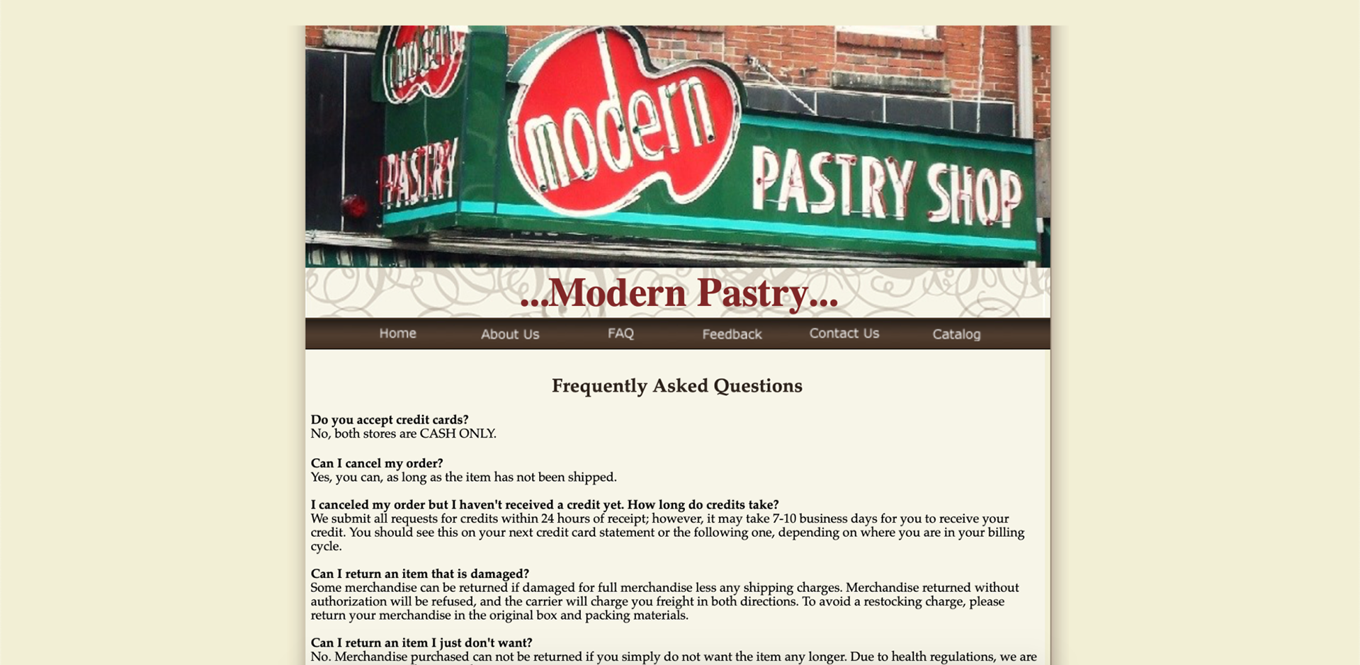
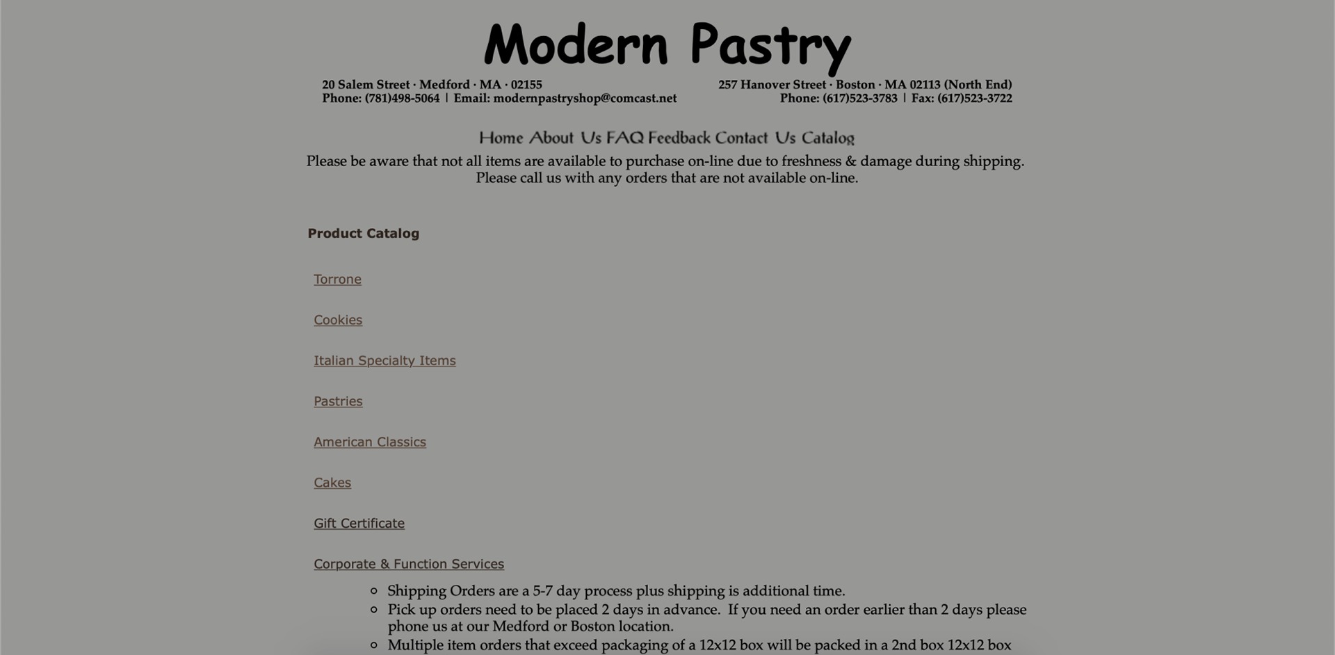
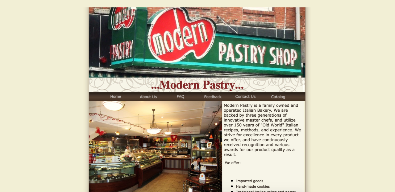
Issues with the original site included links that led to an error page, inconsistency through tabs (When a user clicks on the catalog page, the site looks completely different and even utilizes Comic Sans) and photos that are poor in quality.
Below are some screenshots of the original website (2019):
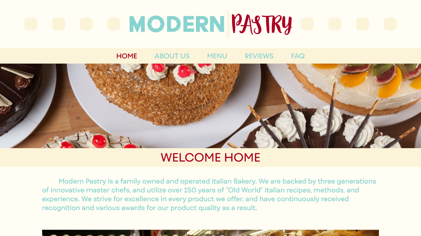
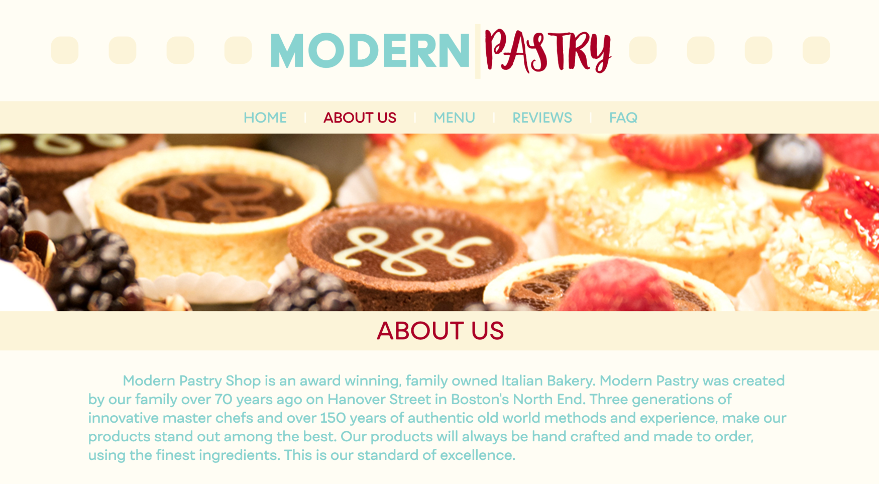
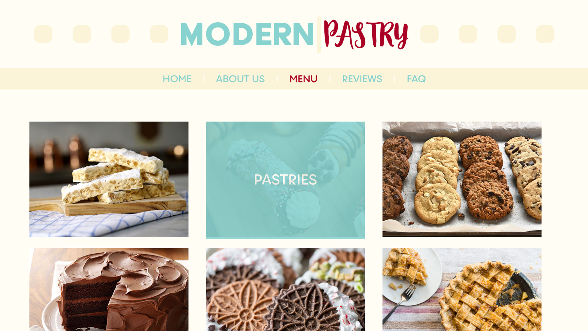
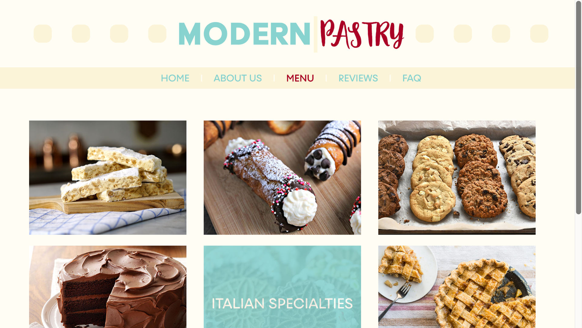
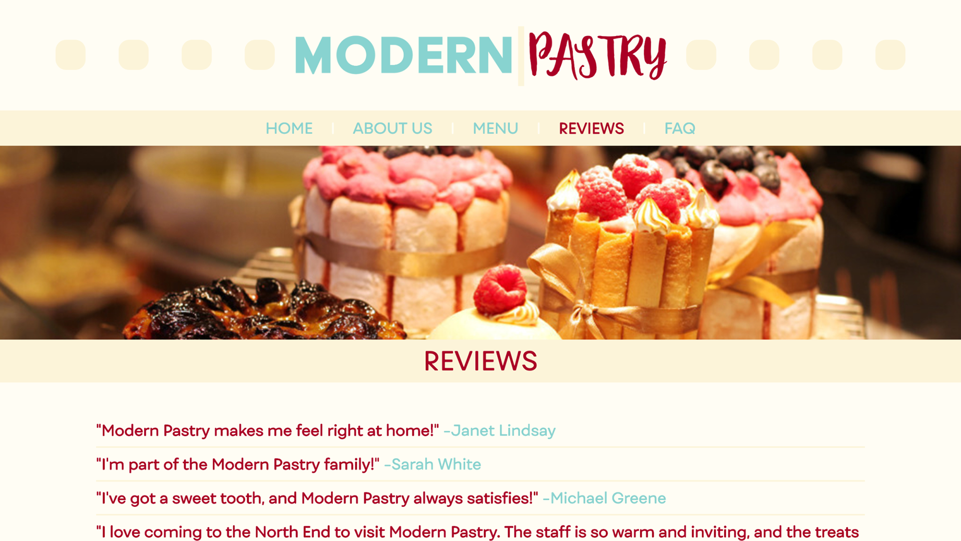
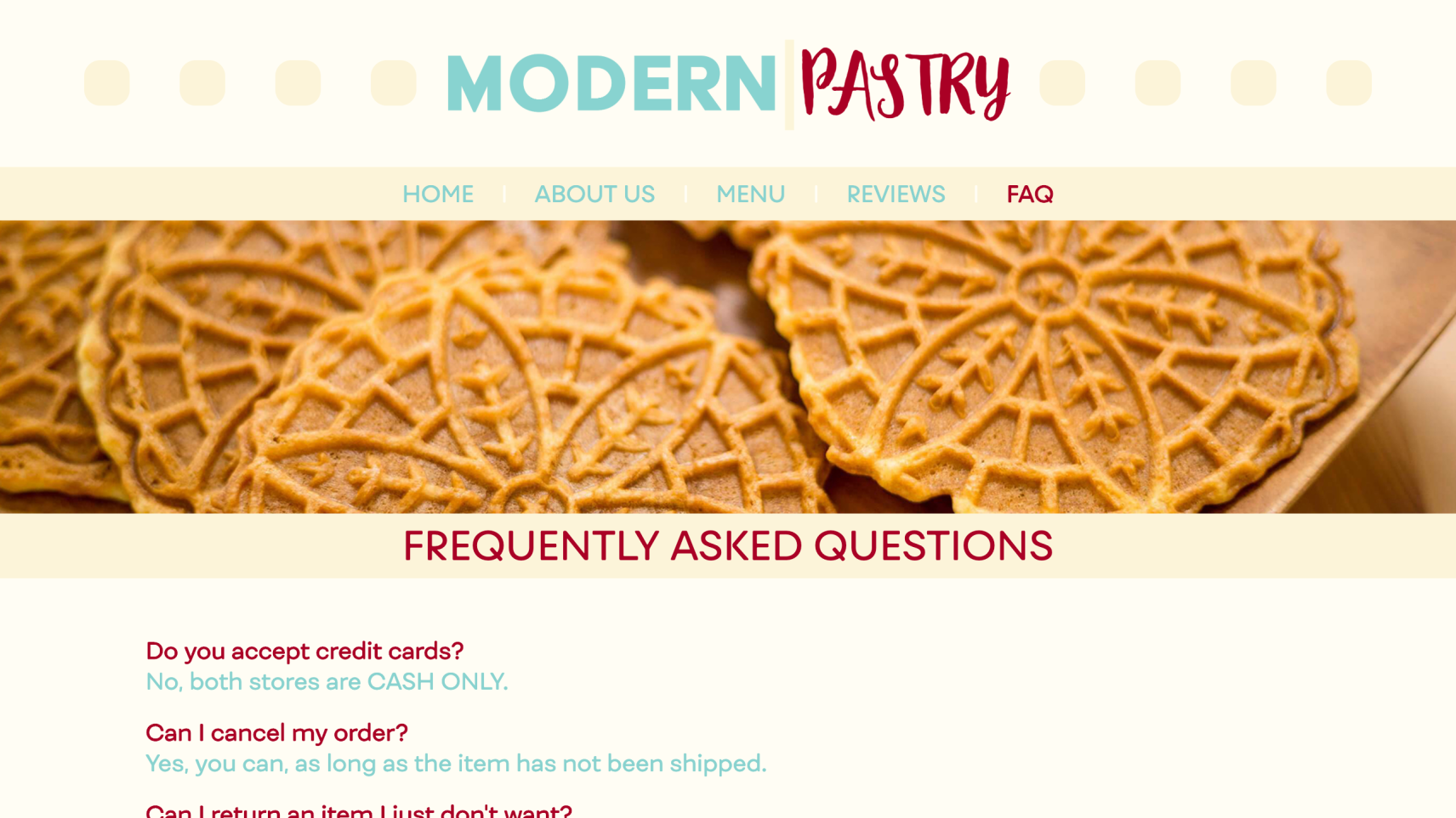
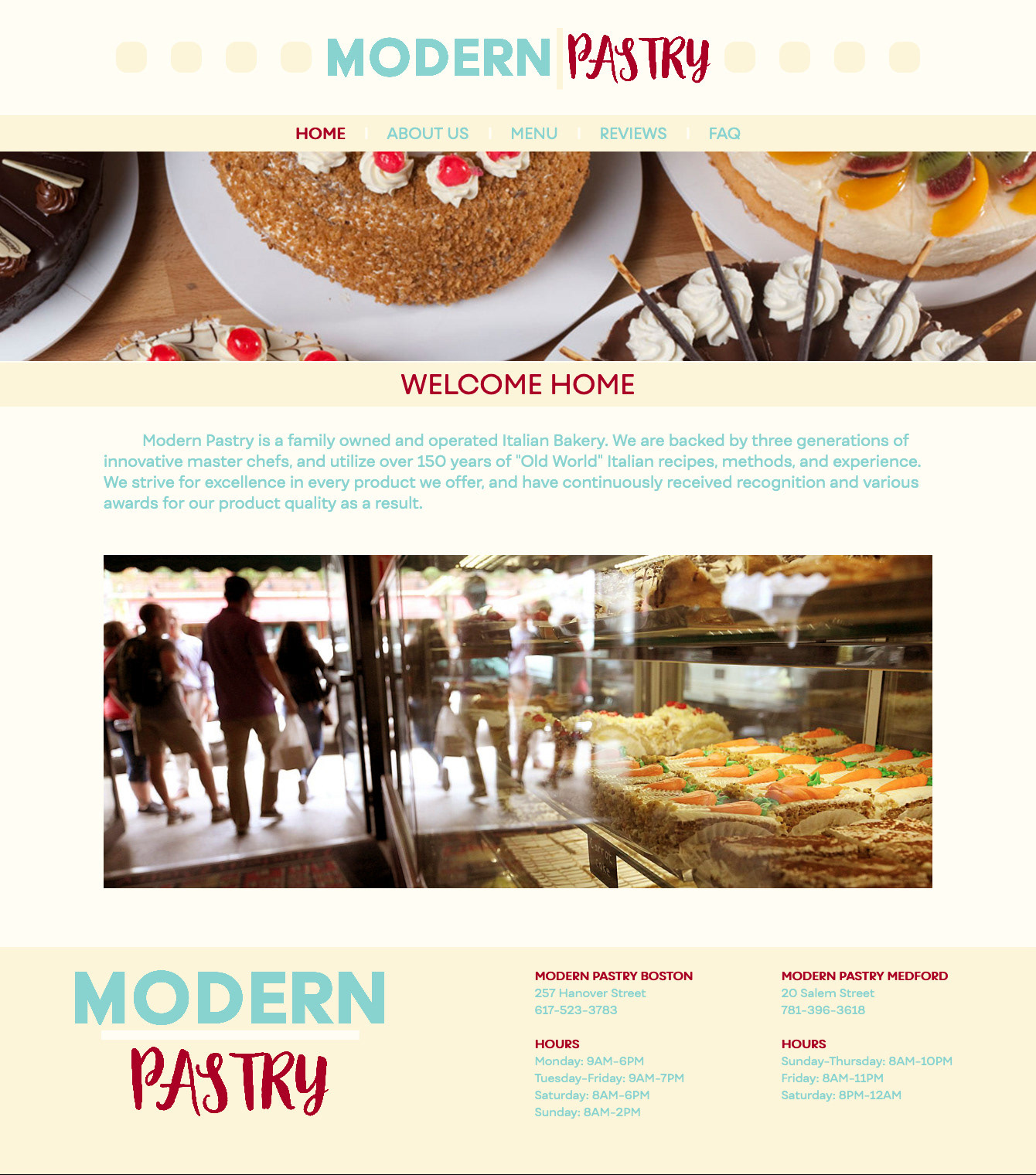
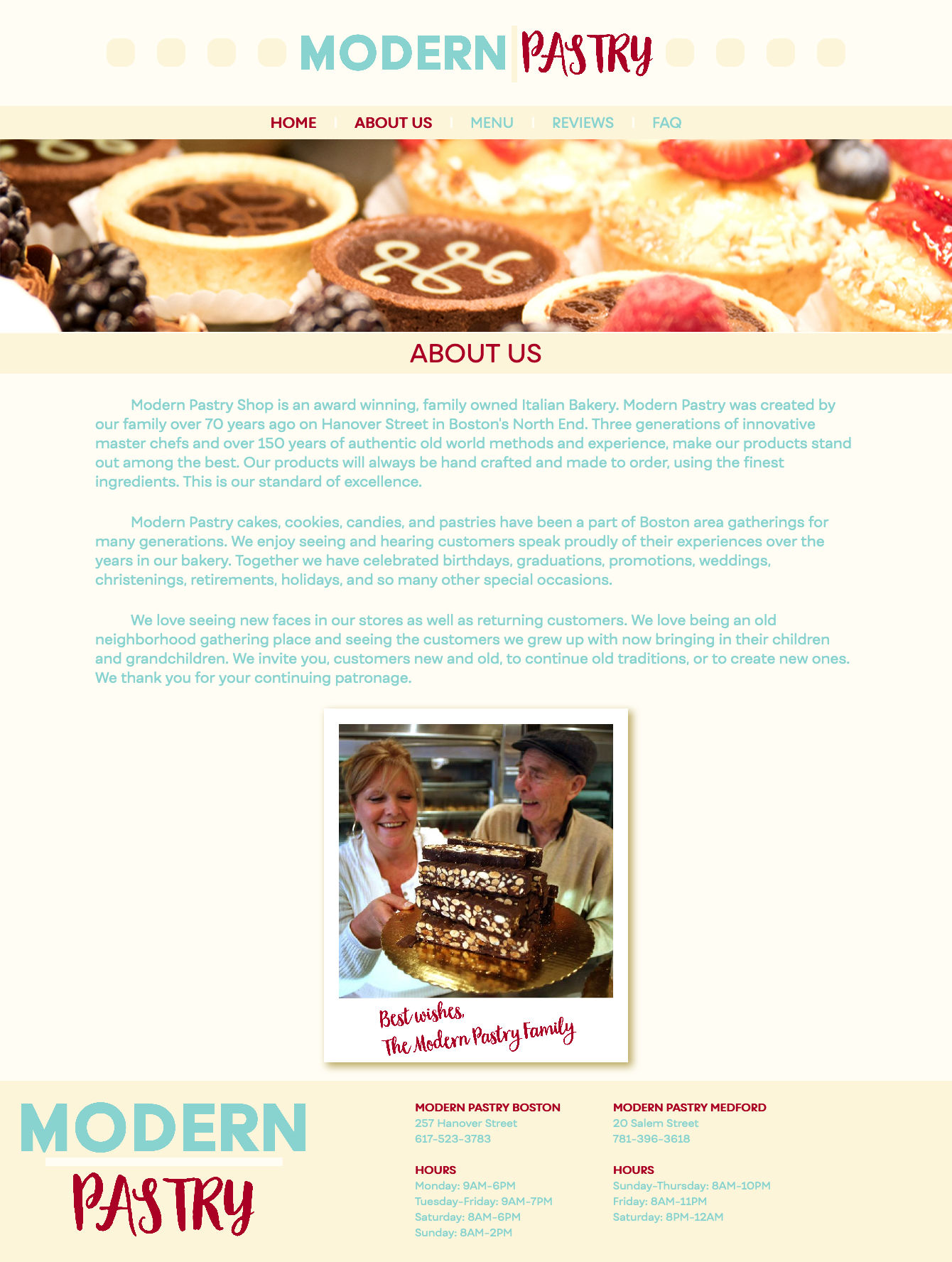
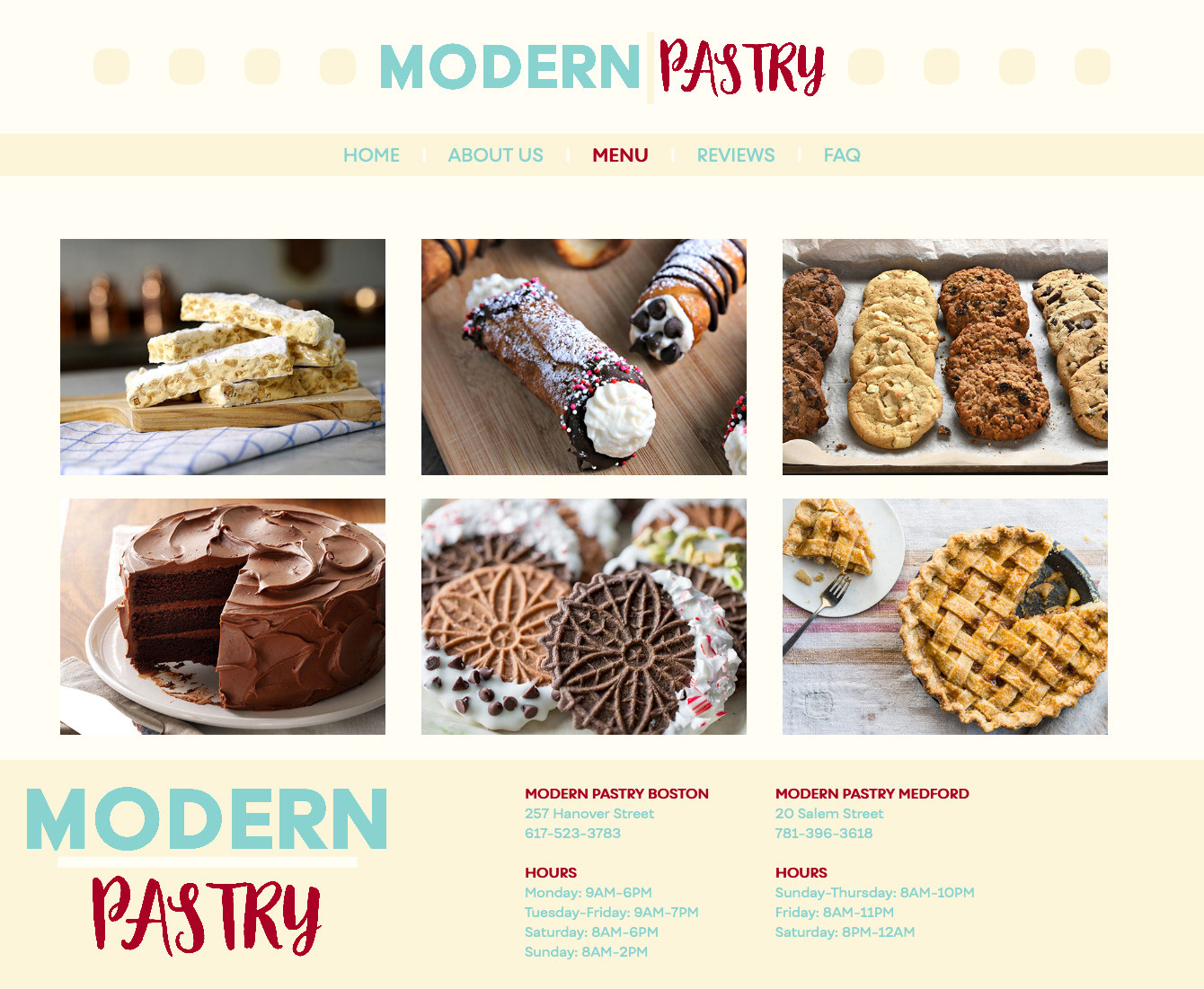
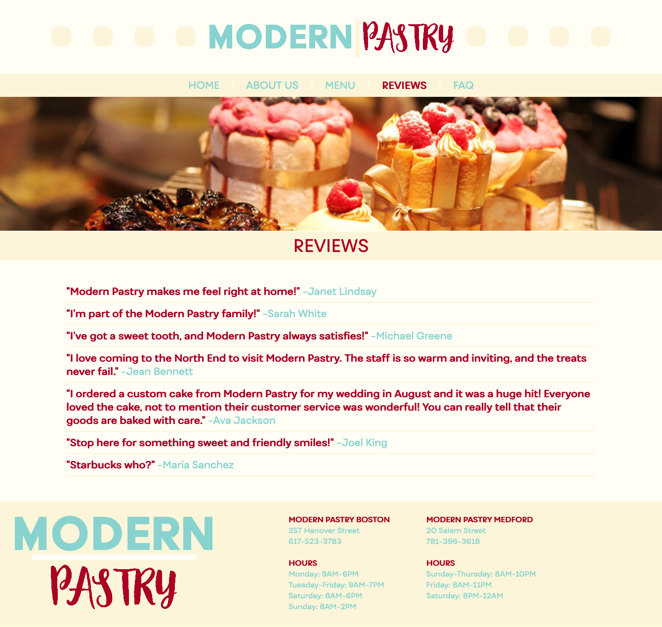
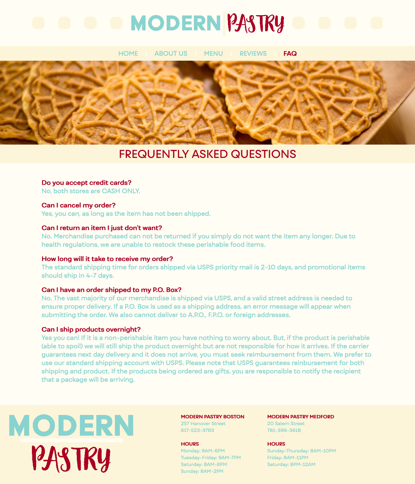
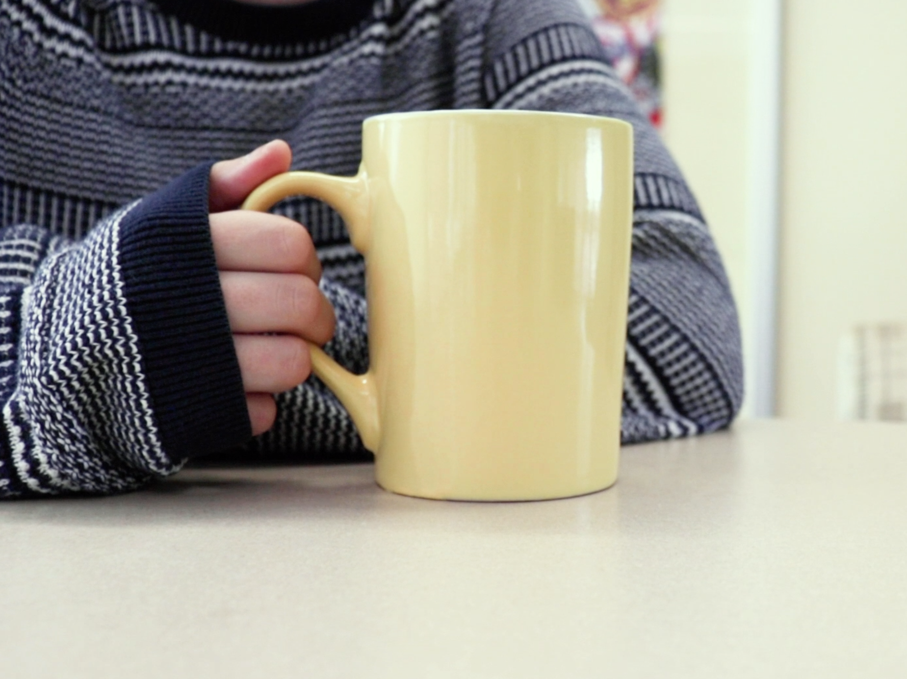
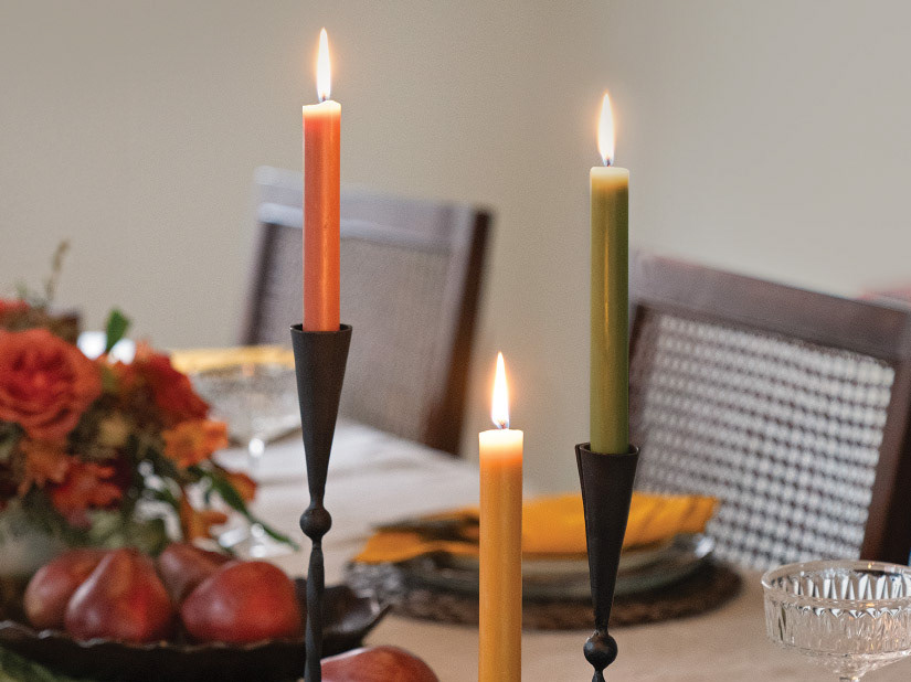
When deciding how I wanted the site to look, I was thinking about what the company was actually selling (other than pastries). They were selling comfort, cleanliness, sweetness, deliciousness, family, and homemade. It was important to show these themes in my website design.
I kept the navigation that they used for their site, but introduced a new logo, a new color palette and better quality images. I figure nothing makes someone wanna buy food than giant unavoidable pictures of food. I kept a family touch by including a photo of the owners as a polaroid.
Below are some screenshots of my final website redesign: