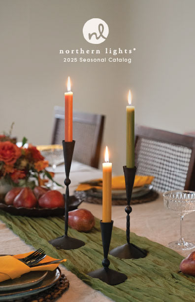
Northern Lights 2025 Seasonal UPC Catalog
I was responsible for putting this catalog together, as well as attending the photo shoot, partial photography at the photo shoot, editing the all final photos for the catalog, and formatting the catalog for all company uses. 3,700 printed copies were ordered!
This catalog is a great example of my skills related to photography, photo editing and compositing, and typography.


Photography and Editing
Cover Photo
We originally planned to use Original A. We felt that the white pumpkin candle wasn't quite right, so I pulled an orange one from a different photos. I was able to accomplish the composite, but since the orange pumpkin photo was out of focus in the original we decided to pivot to the Original A.
You can see that the bell on the Moss Green taper in Original B was not burned down far enough yet, so I took the top of the Moss Green taper in Original A to create the Final. I also adjusted lighting and temperature to make the scene feel more intimate.

ORIGINAL A
ORIGINAL B
FINAL
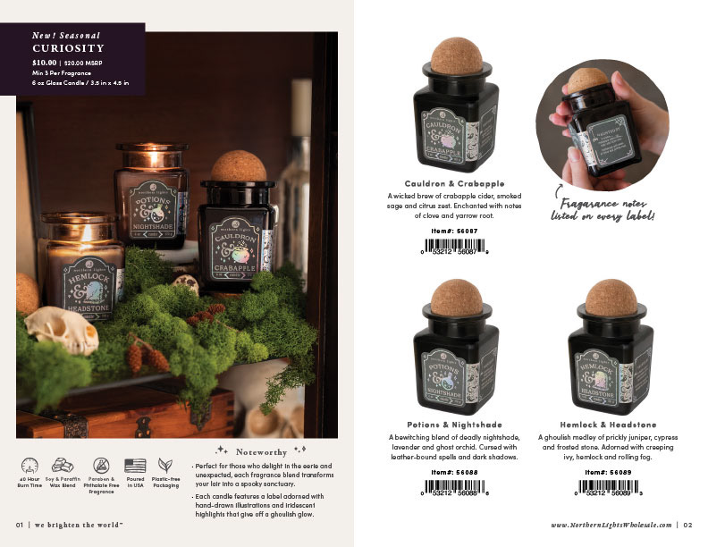
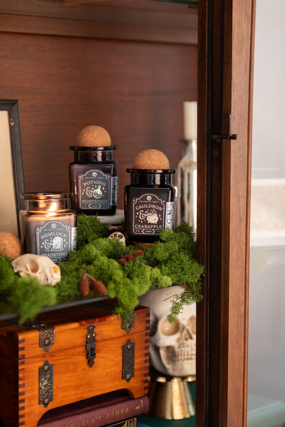
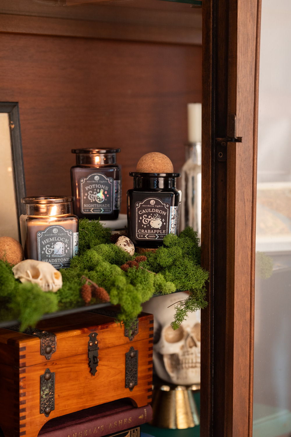
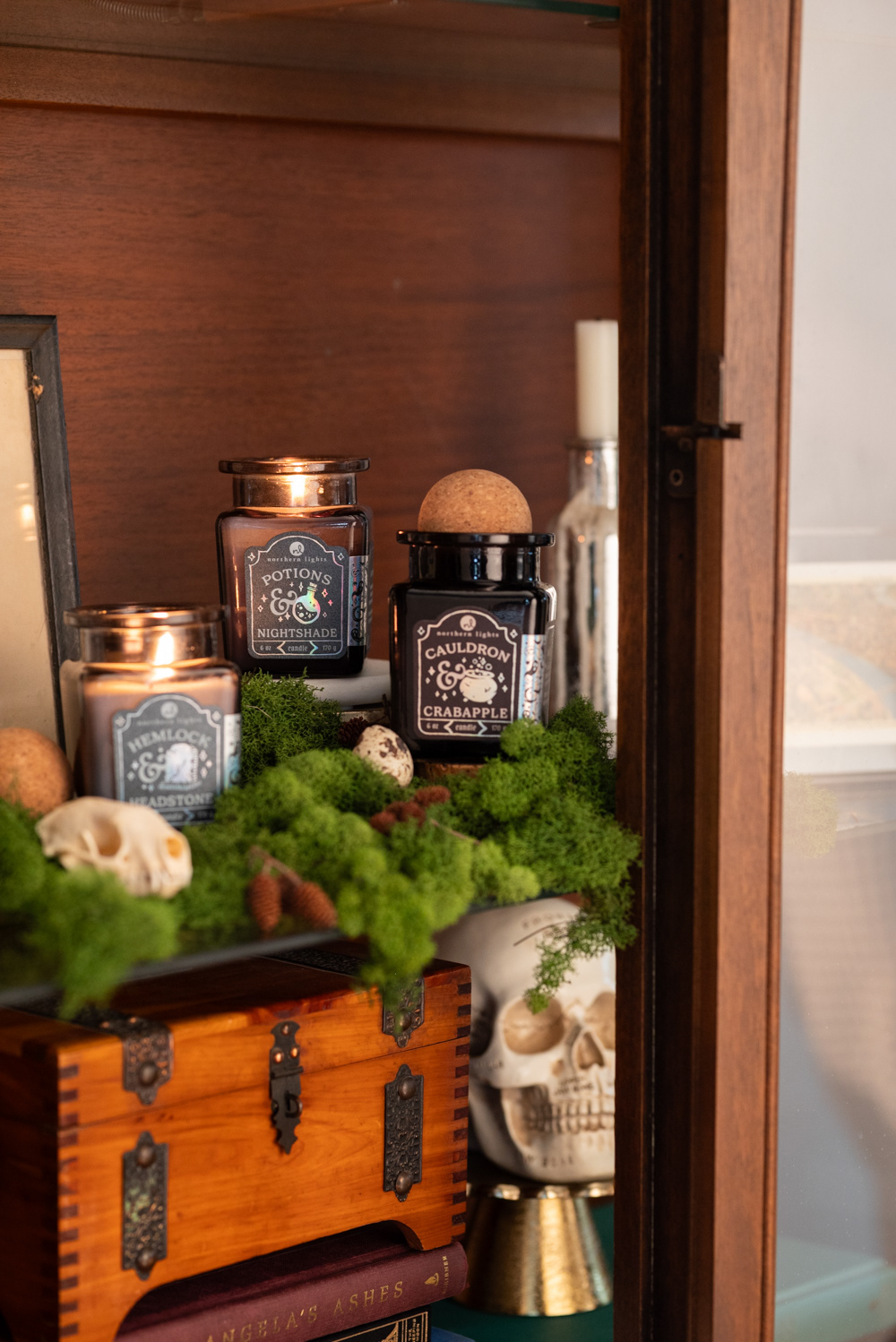
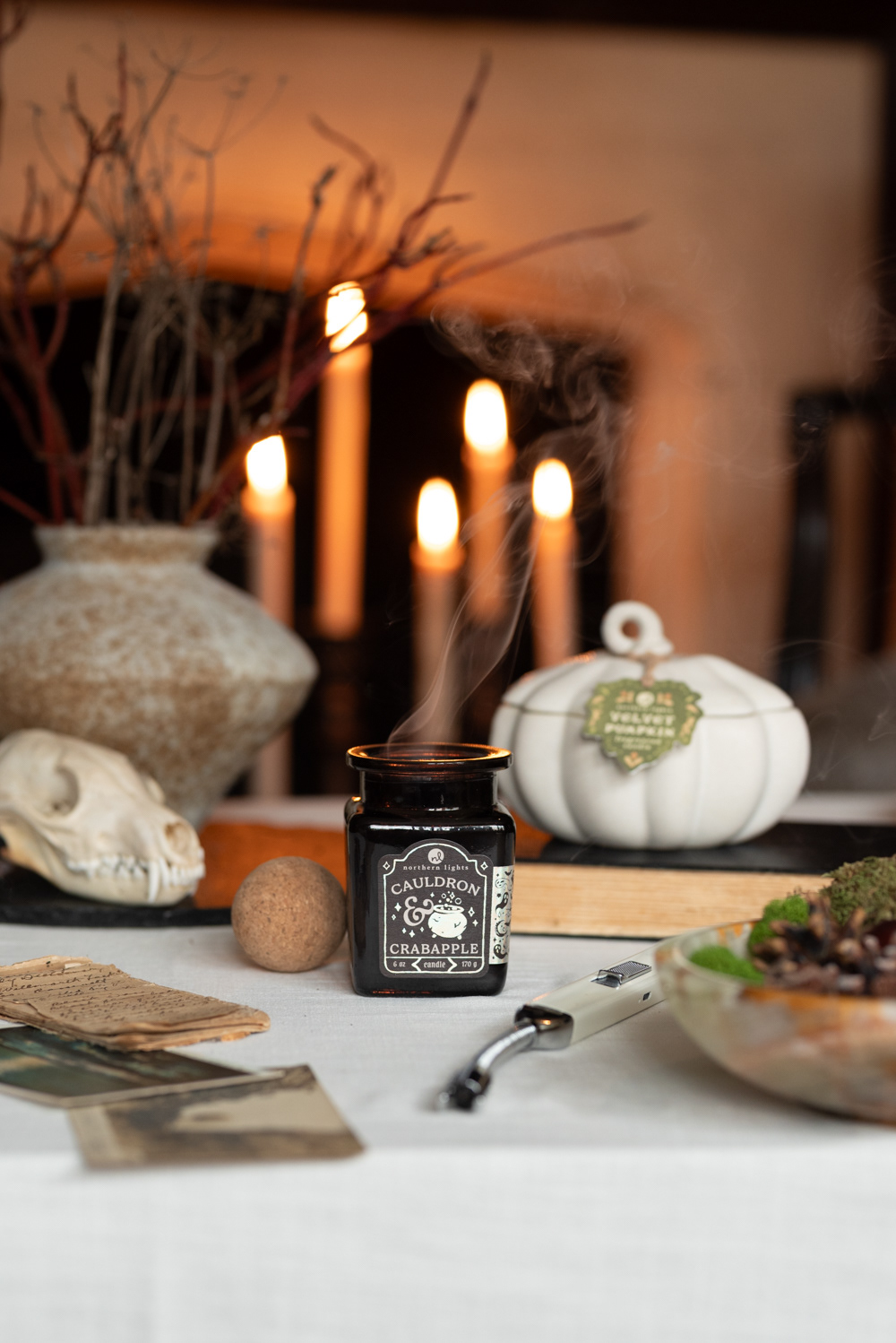
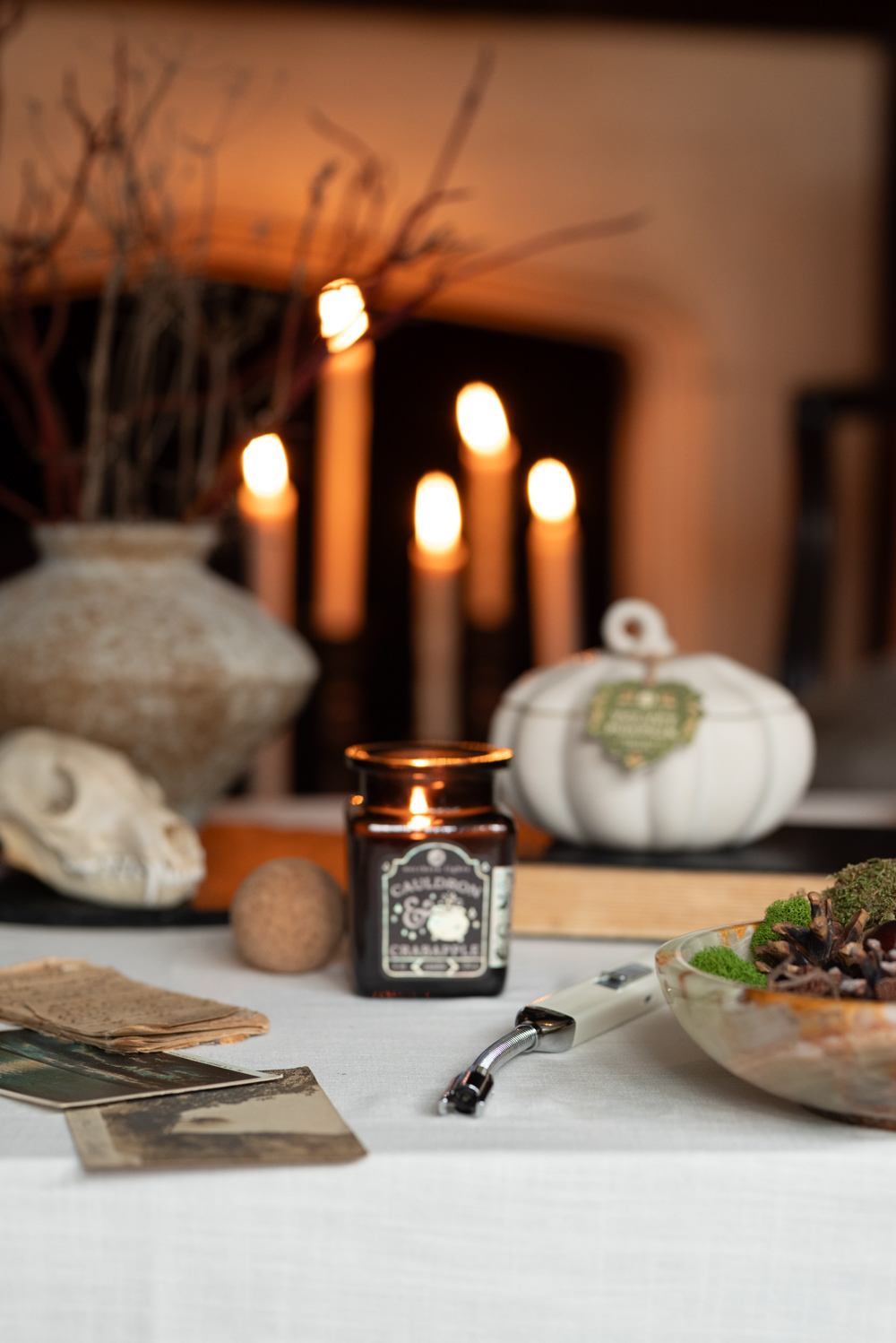
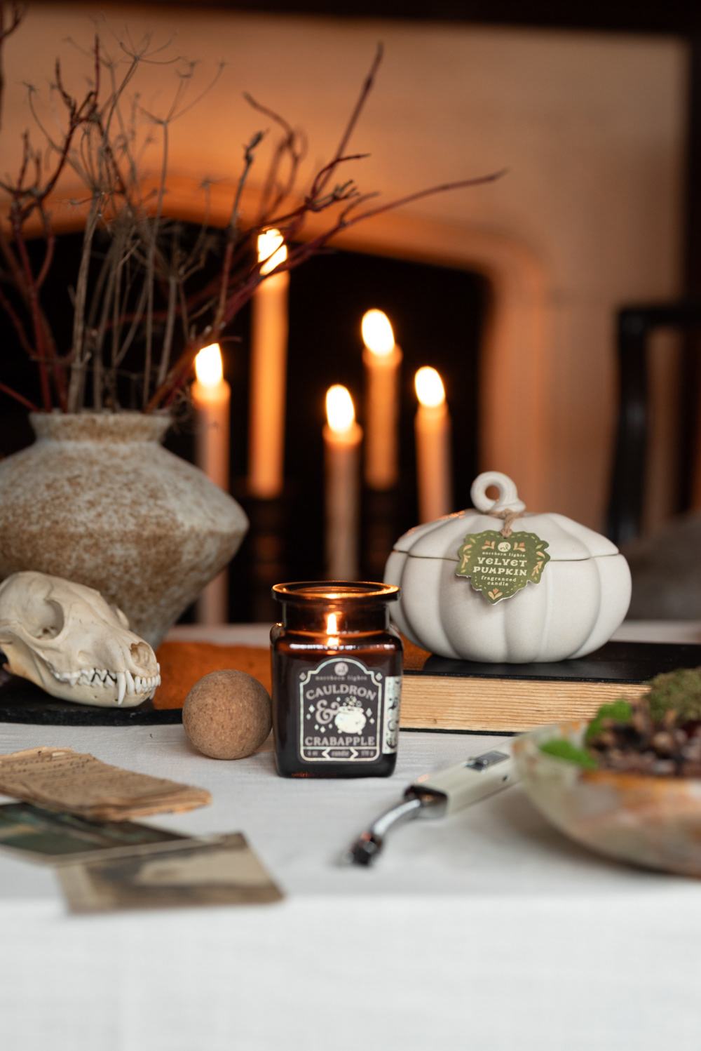
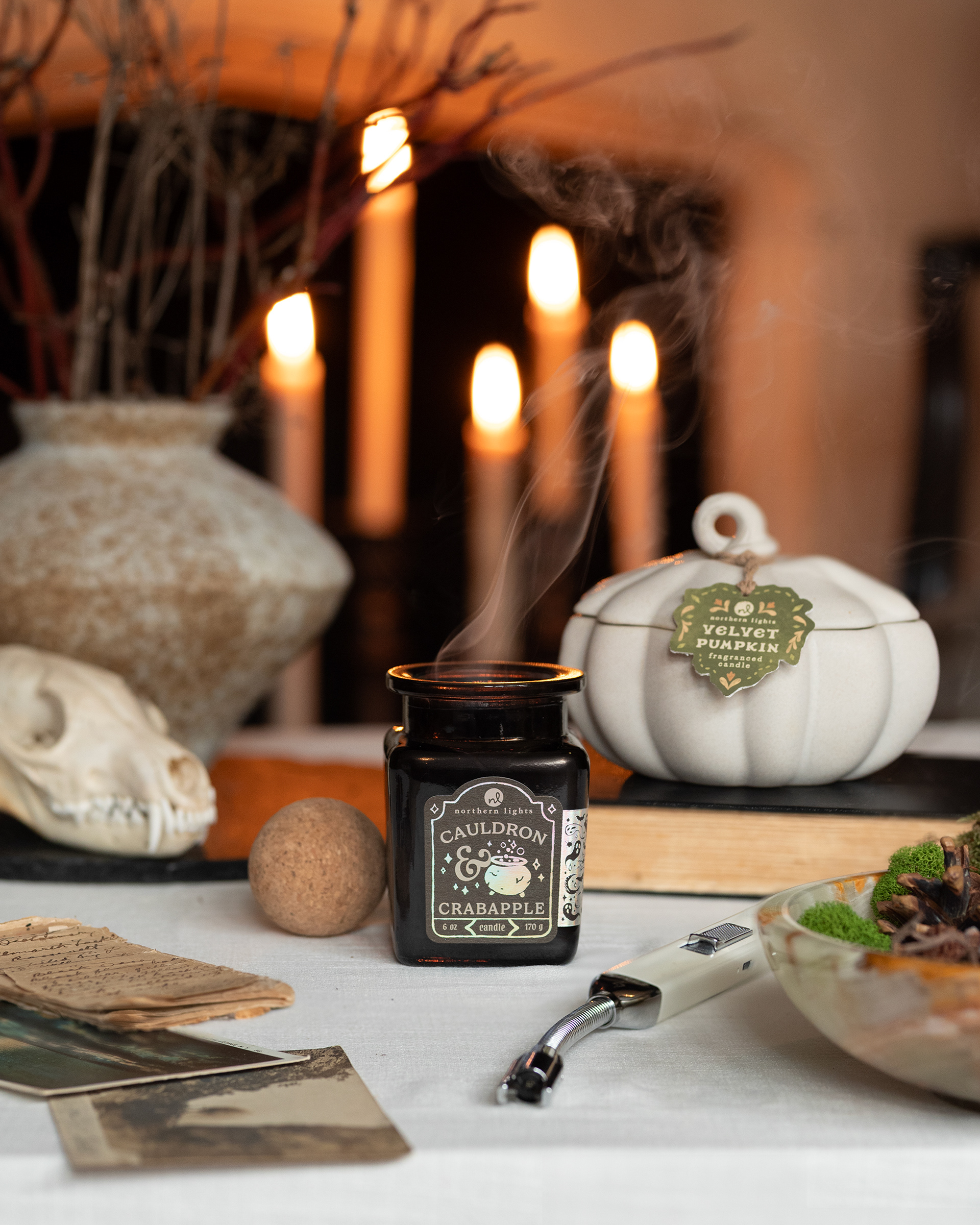
Seasonal Curiosity Photo
In order to get a photo where all three candles and their labels are in focus, we took one with each candle in focus and I composited all 3.
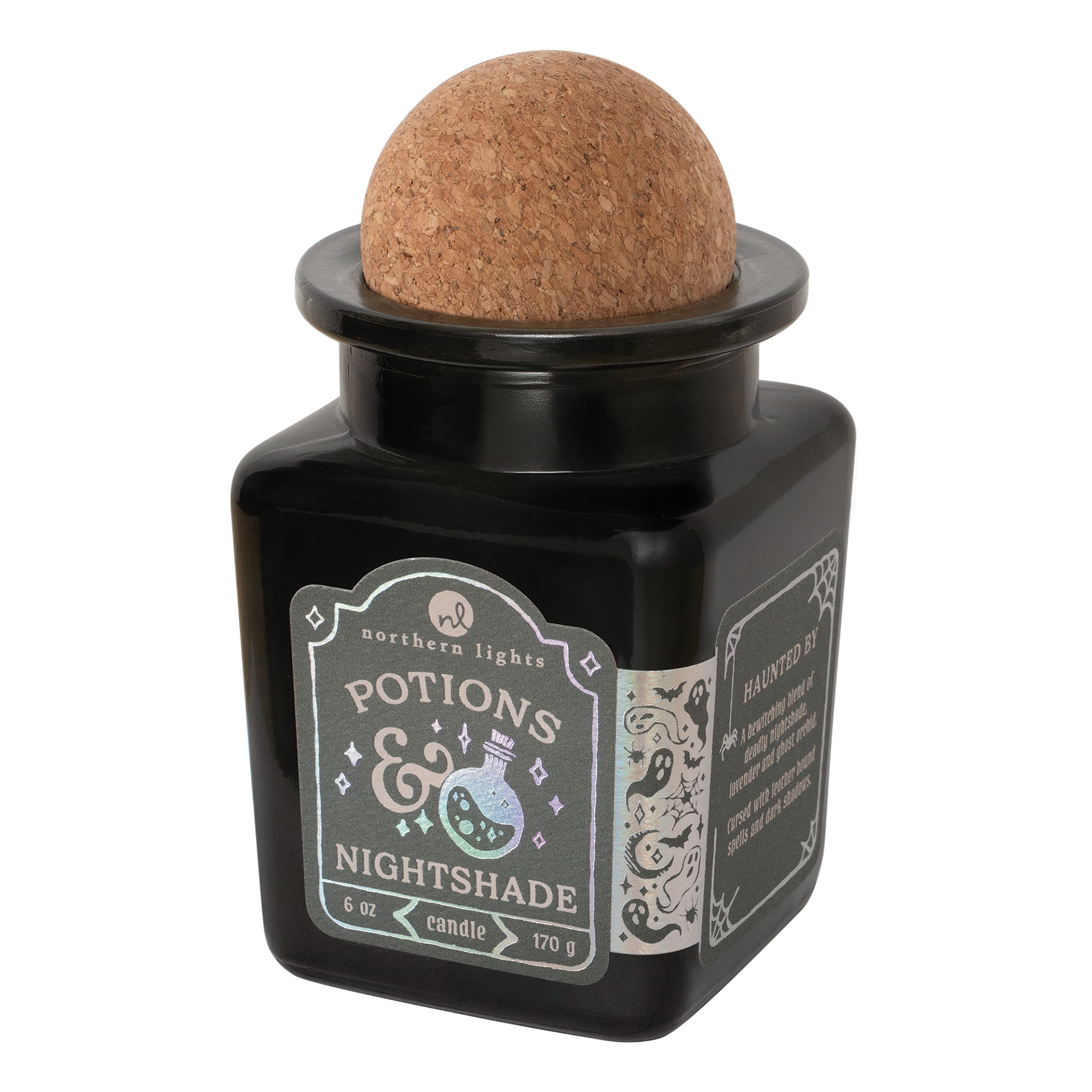
Only the Cauldron & Crabapple label at the shoot was a true representative sample of our final product, so once we got real samples of all of the labels, I had to shoot them in our studio at similar angles and blend them into this photo. I did have to enhance and fake the iridescent finish on the labels.
ORIGINAL A
ORIGINAL B
ORIGINAL C

FINAL
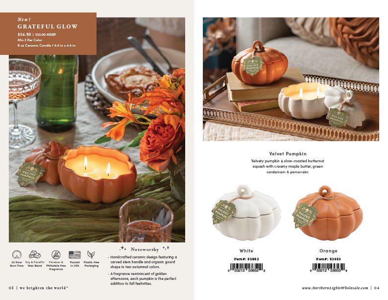
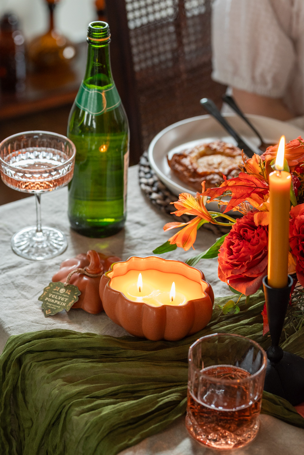
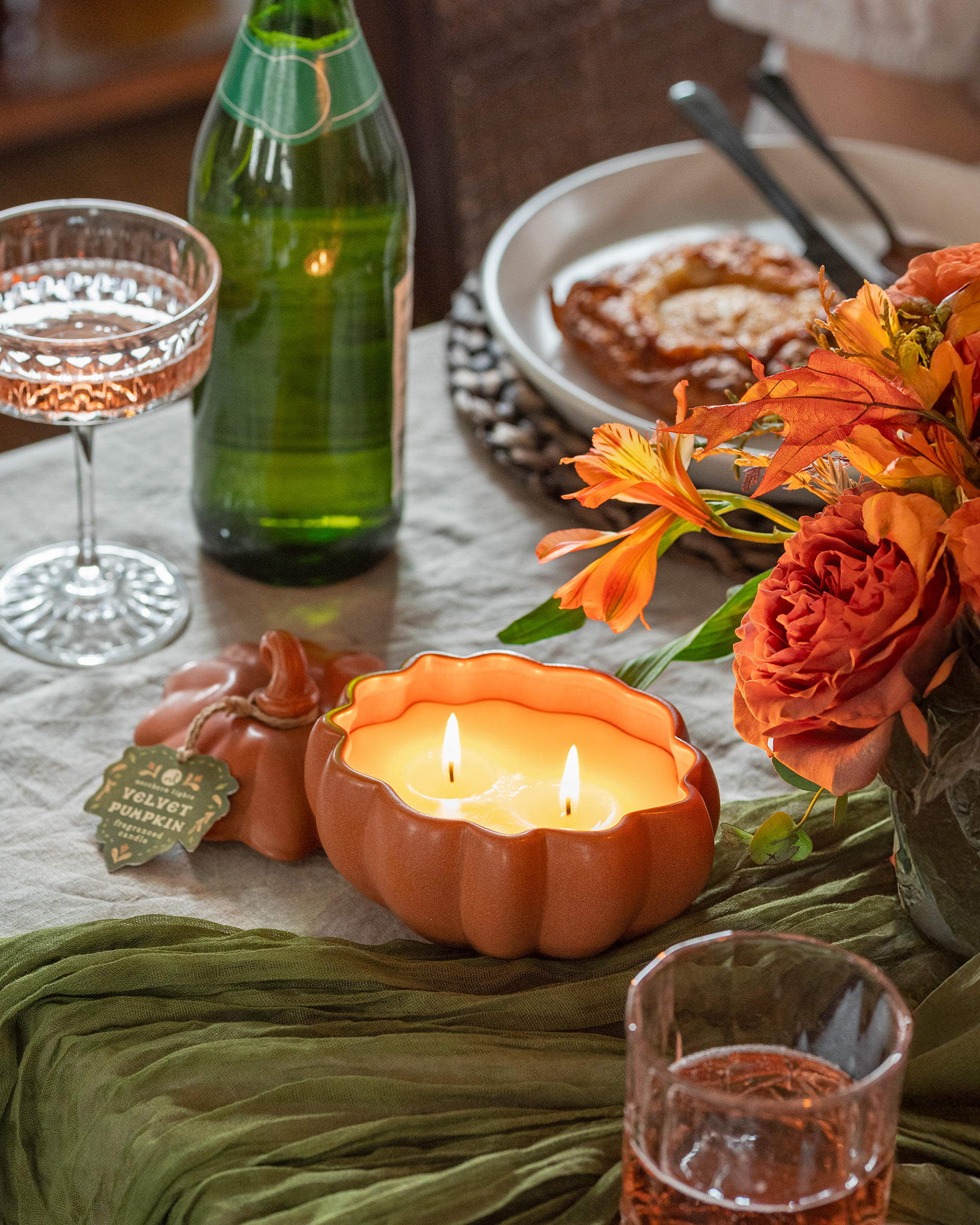
Grateful Glow Photo
This photo was pretty straightforward to edit. All I had to do was adjust some of the reds to lean more yellow and desaturate & lighten some greens.
We decided to crop out the taper. Since it's so close to the edge of the photo, it wasn't adding enough to keep. We found more value in getting closer to the candle than keeping the Taper in the crop.
ORIGINAL
FINAL
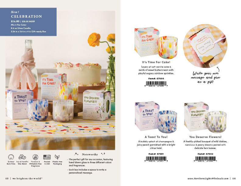
Celebration Collection Photo
This was a fun one! This was a more youthful and playful territory that we haven't really explored before in all of NL products, so we really got to play around. There are many photos from this series, but ultimately this was the shot for the catalog.
Edits included evening out the color on the window shade, making the cake appear a little taller and grander, and updating the fragrance notes listed on the front of the "You Deserve Flowers!" box.
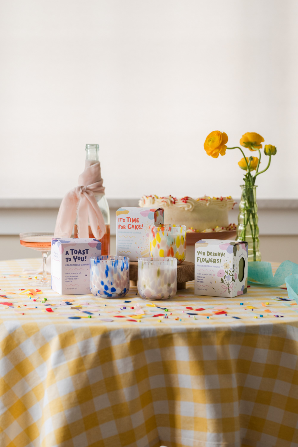
ORIGINAL
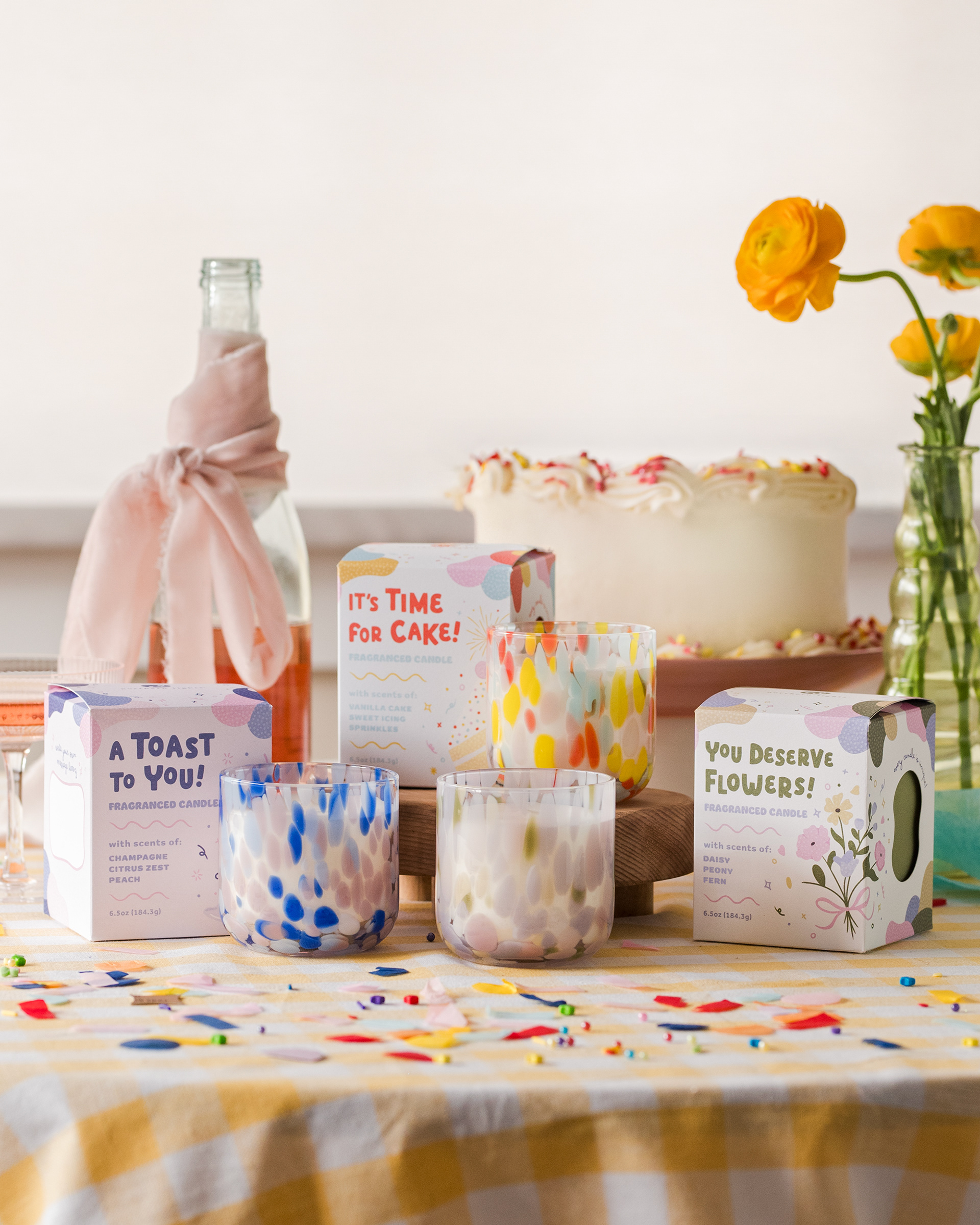
FINAL
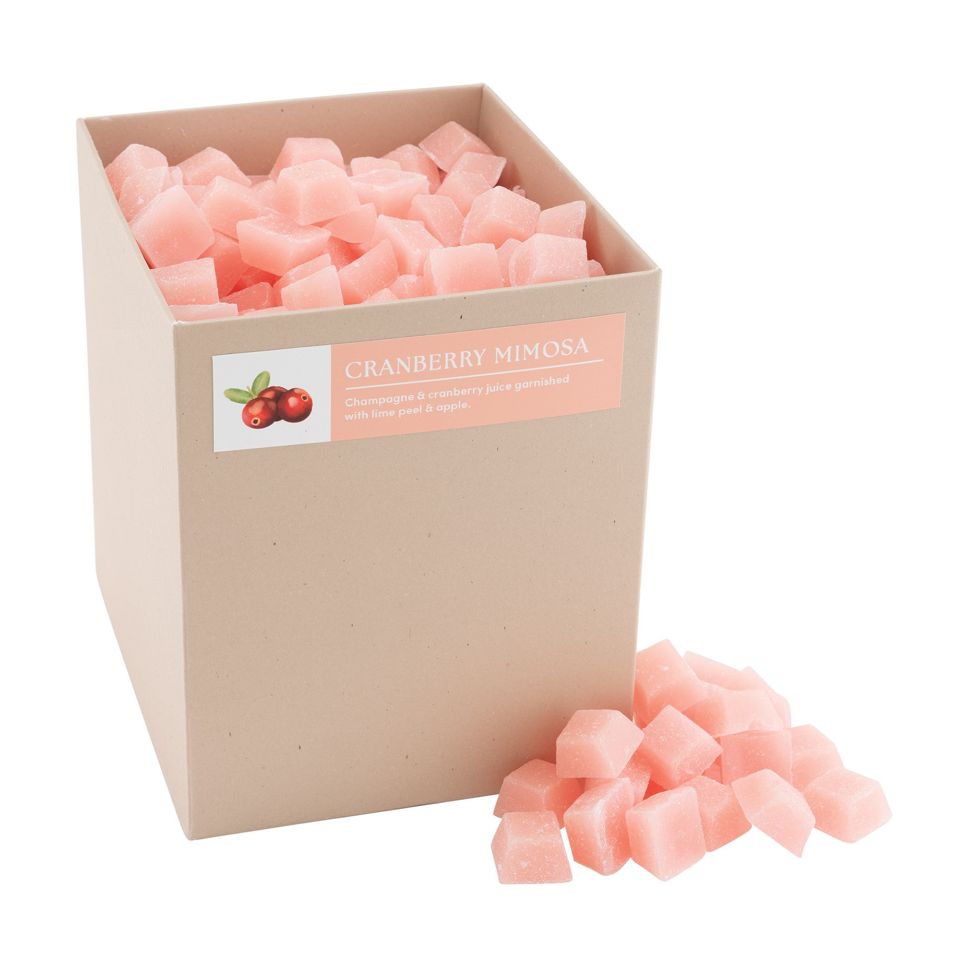
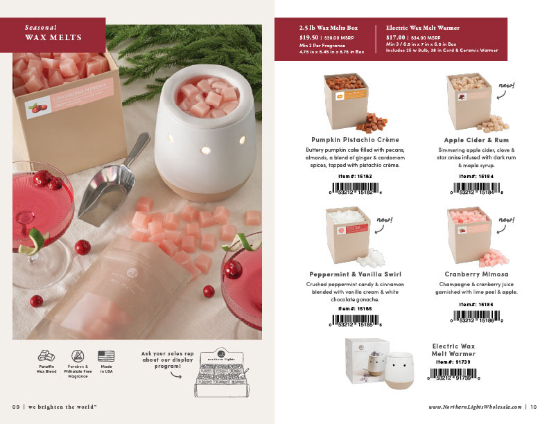
Wax Melts Photo
When we got back from the photoshoot and started adding photos to the catalog draft, we quickly realized that we hadn't been able to fit a Wax Melts photo into the shoot. I was able to cook this whole photo up in our studio.
I wanted to tell a wax melt story in a way that NL had never done before, including wholesale and retail configurations of them. I searched wax melts on Etsy and Pinterest and found an angle that I really liked and thought we could accomplish in house. I set all this up, photographed, and edited all in one day.
The main edit on this one was getting rid of that hotspot on the box label created by the light from the wax melter.
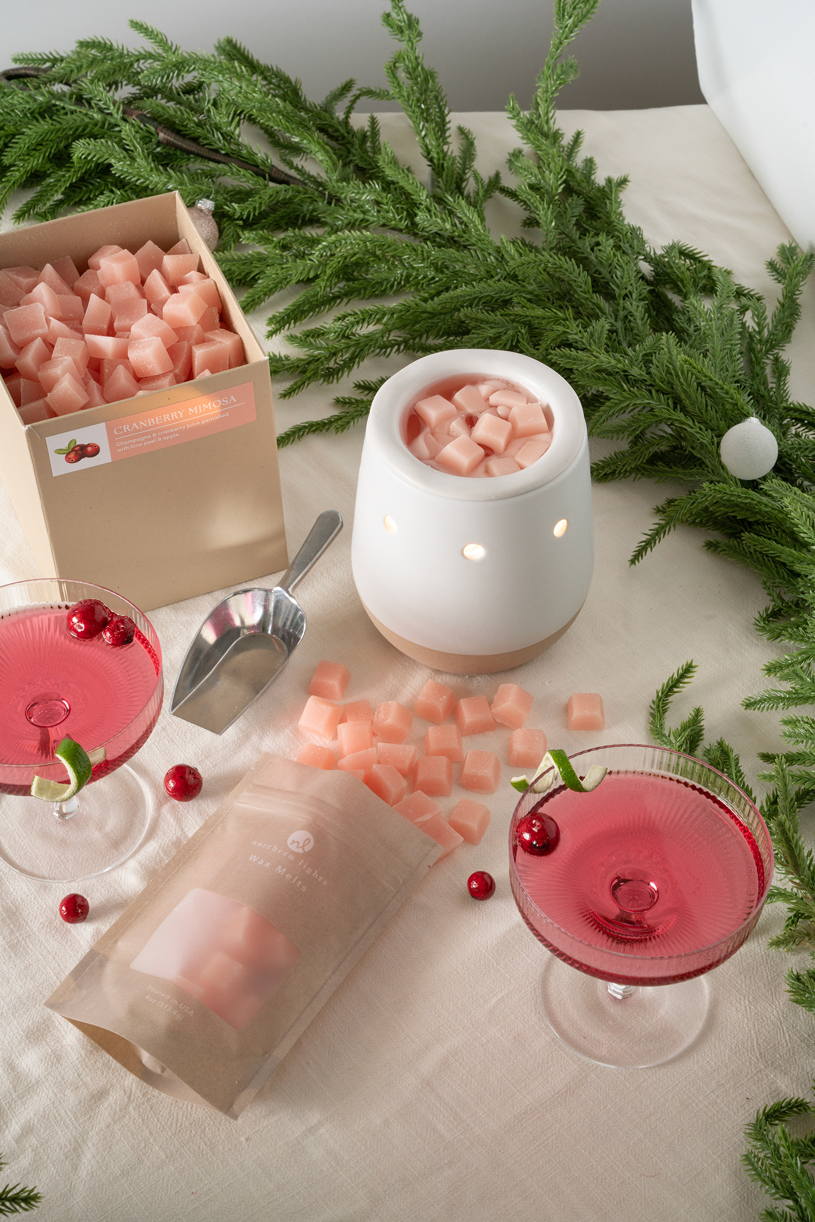
ORIGINAL

FINAL
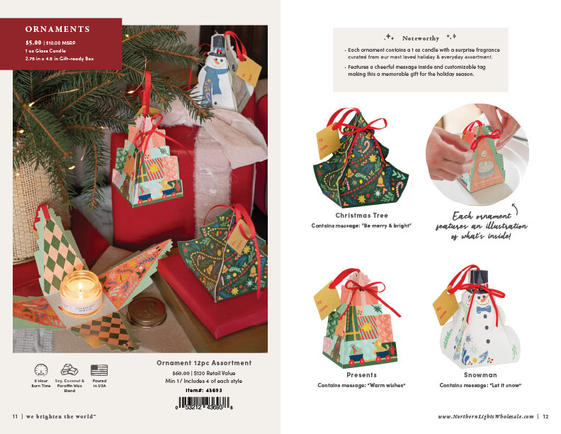
Ornaments Photo
When I saw the team setting up this scene, I noticed that they were only trying to focus on one ornament at a time with the intention for social media. I jumped in and said "PLEASE let's include all three so that we can update our catalog photo of these!" and I'm so glad that I spoke up. We ended up with a much more interesting and dynamic photo than we featured in last year's seasonal catalog!
I edited this one to be warmer, desaturated the green on the pine branches to feel a little more grounded, filled out some weird shapes created by the gifts, and straightened out the ornament hanging in the middle.
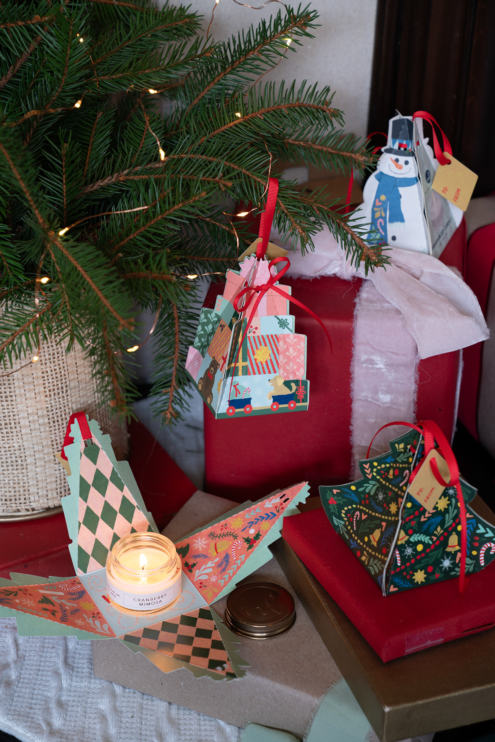
ORIGINAL
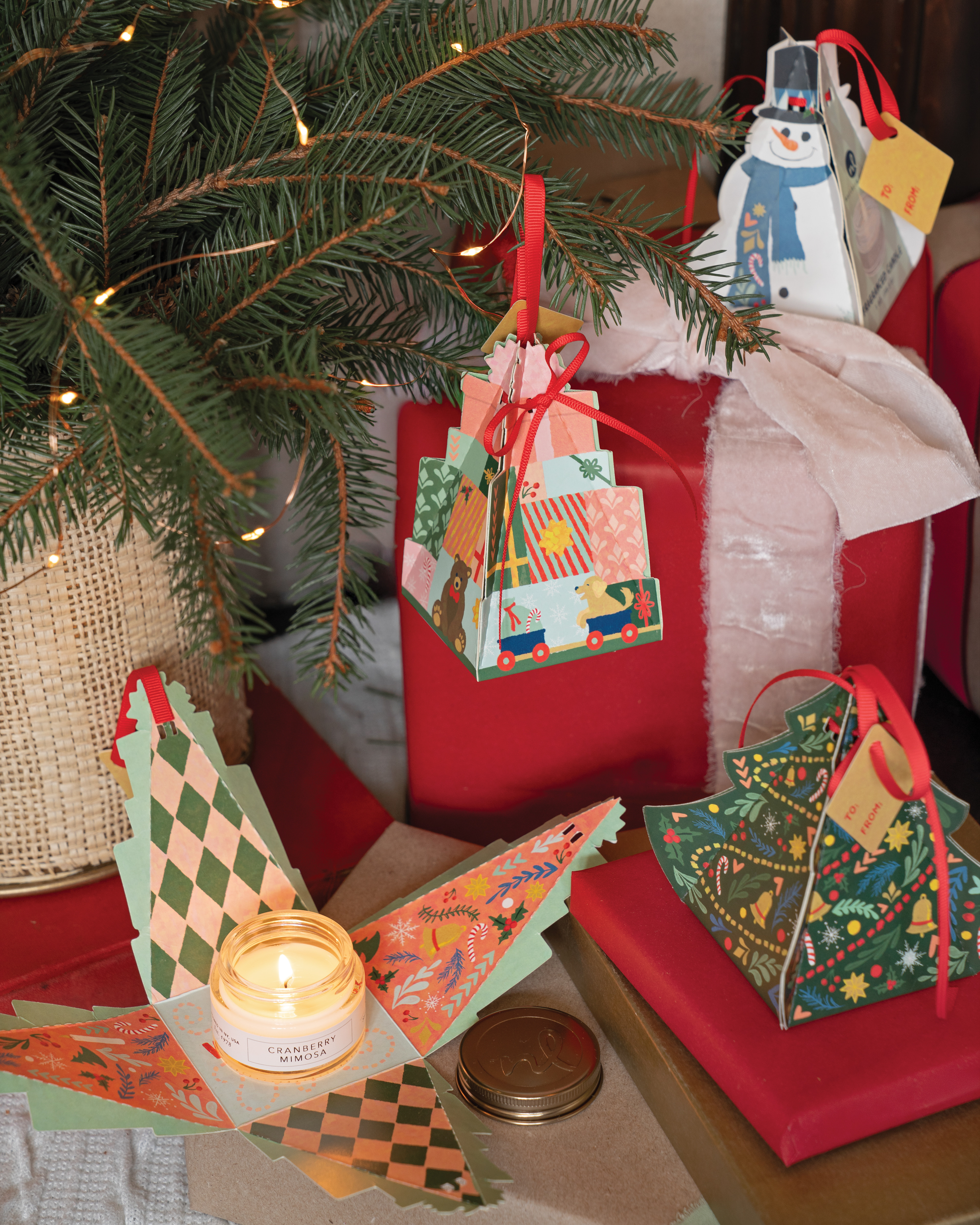
FINAL
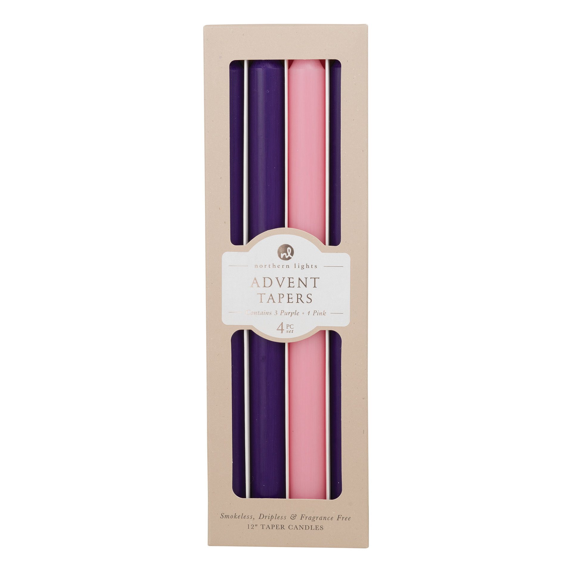
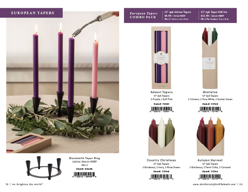
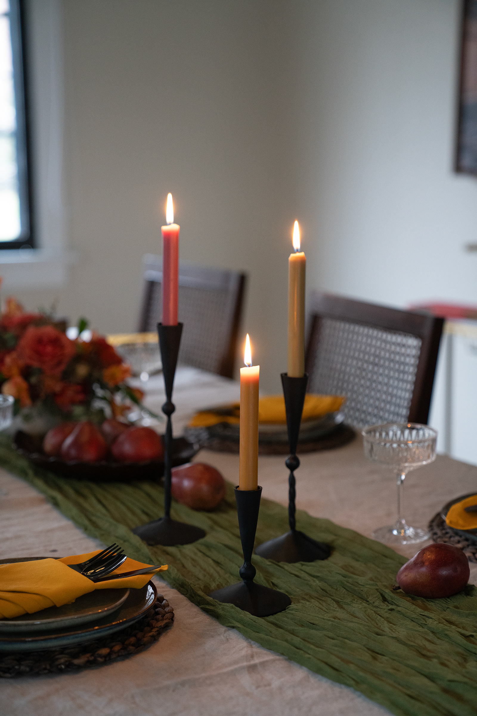
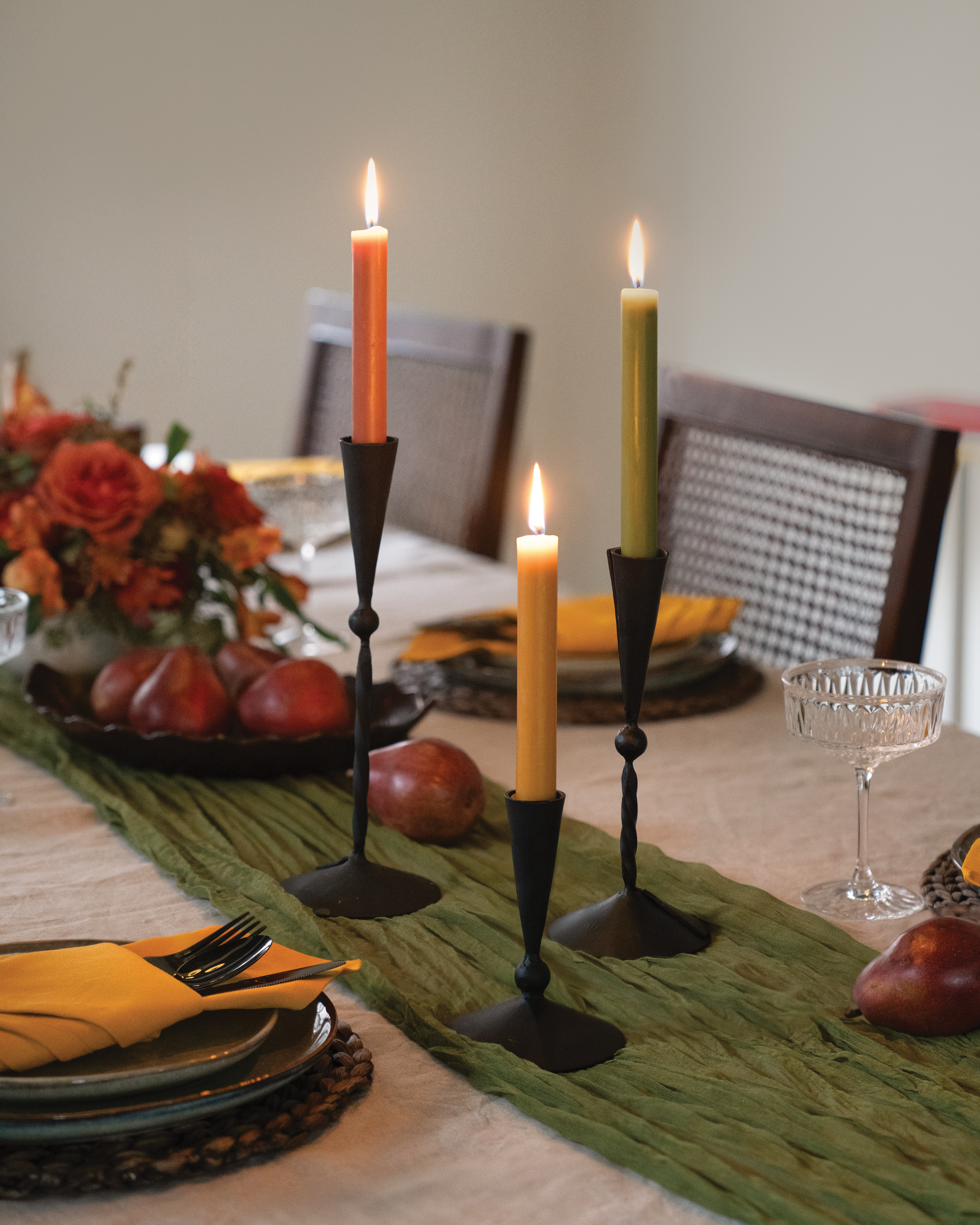
Advent Taper Photo
When planning shots for the photo shoot, we noticed that Advent Taper photos were definitely a hole in our library. I directed and edited this shot, and that's also my hand!
On site, our Soft Pink taper was not cooperating, so I substituted a Petal taper, knowing that it was make for an easy color adjustment in post. We also found that we were short one Purple taper, so I slipped a Midnight Blue taper into the far left slot of the box shown in the corner, knowing that it would make for an easy color adjustment in post. I also edited the lighter color to be brighter and evened out the color of the window shade.
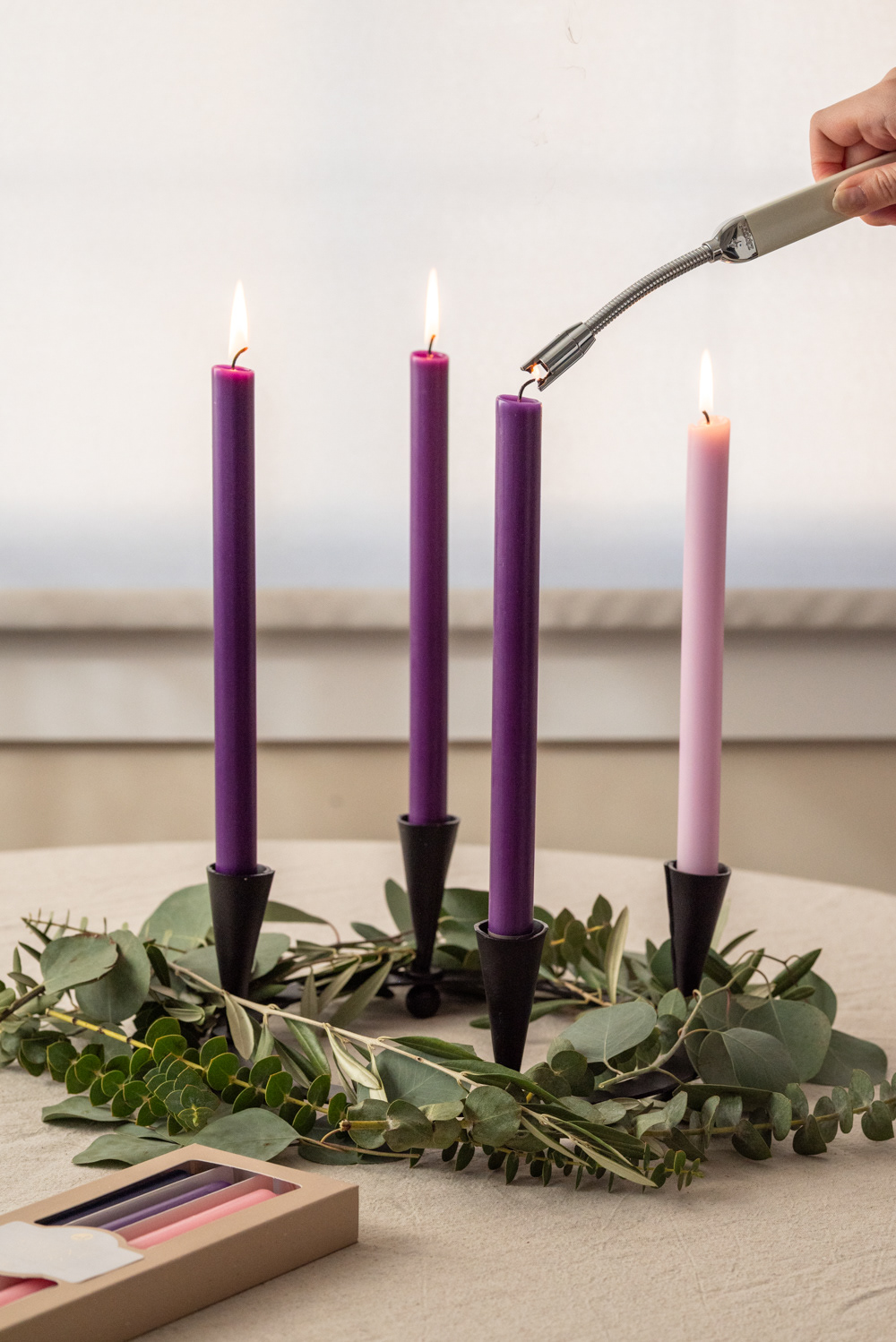
ORIGINAL
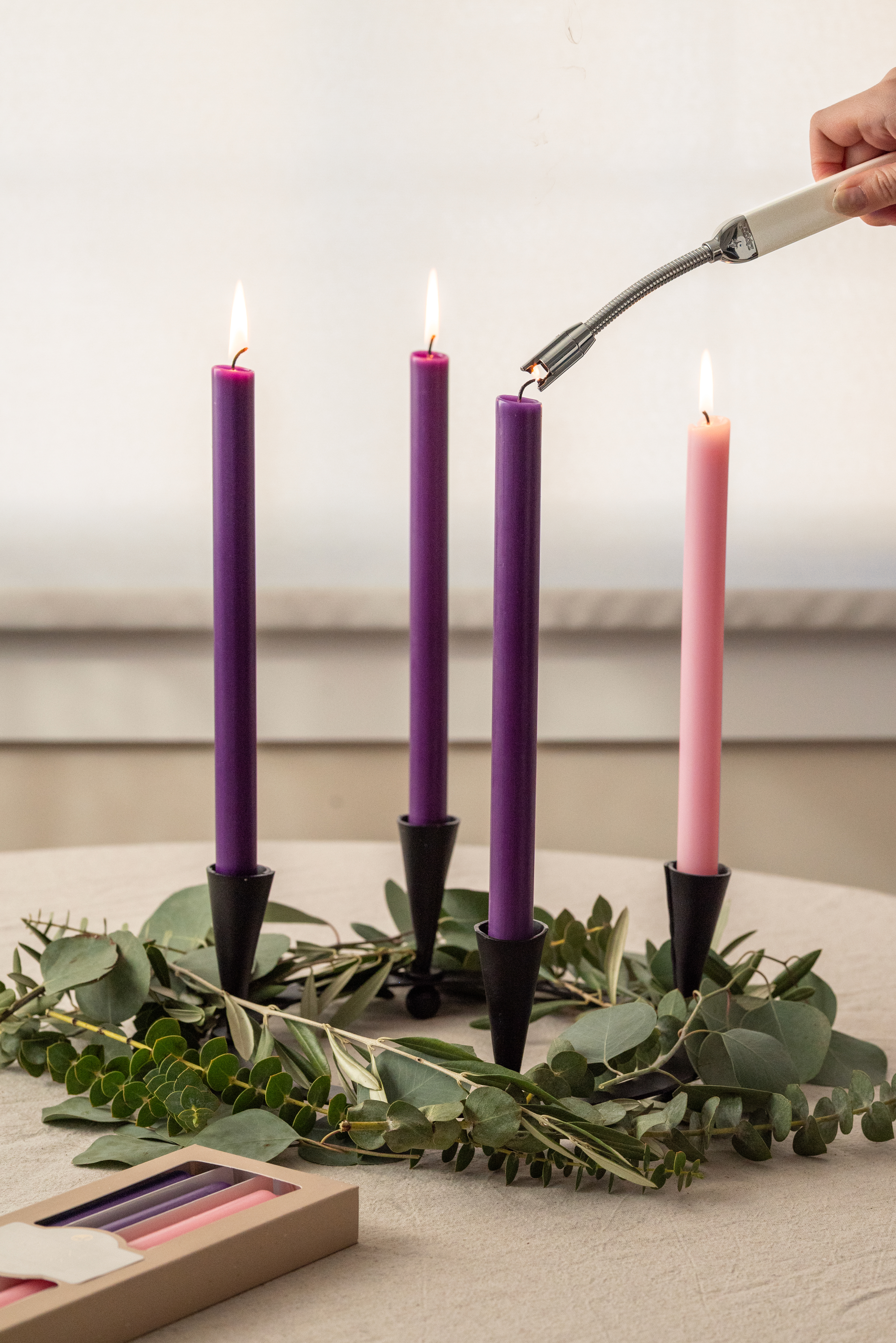
FINAL
Back Cover Photo
I had to composite all three original photos to get all products in focus for this one. I also added some fake iridescent effects on the Curiosity label and toned down some of the white on the Grateful Glow candle.
We decided to go out with the blown-out smoking photo on the back cover because of the spooky element, but also because it made for what felt like an "ending" of the catalog.
ORIGINAL A
ORIGINAL B
ORIGINAL C
FINAL
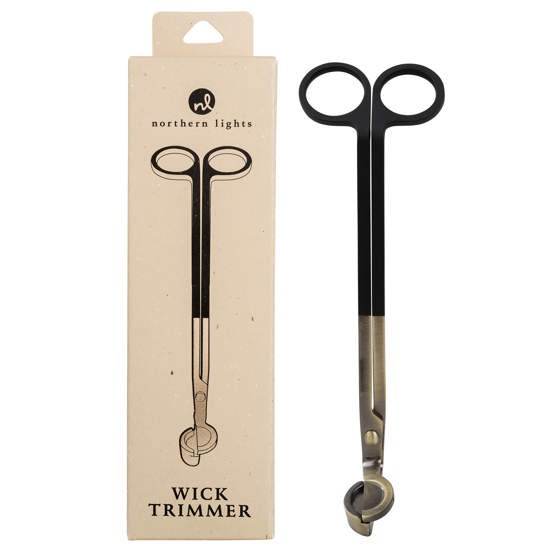
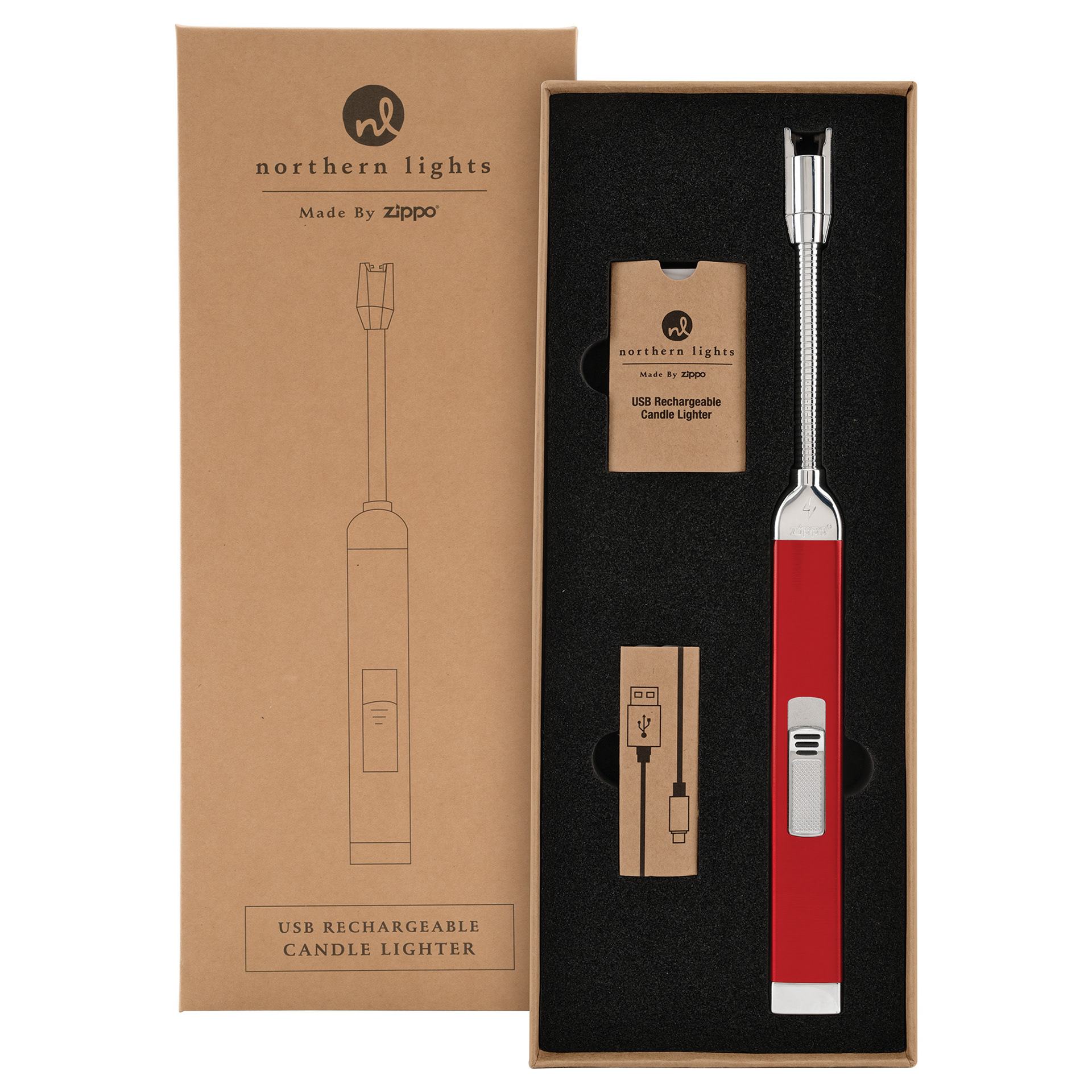
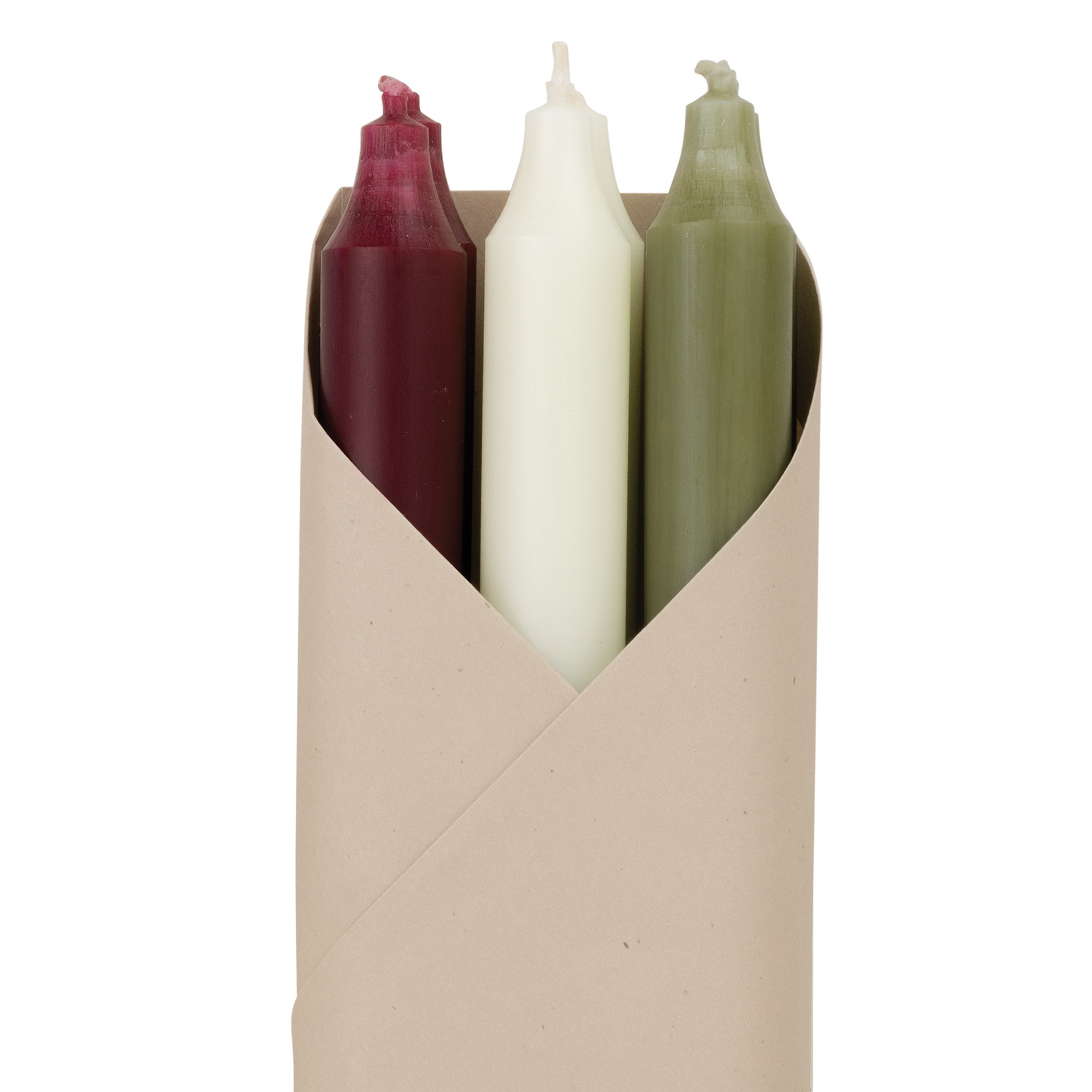
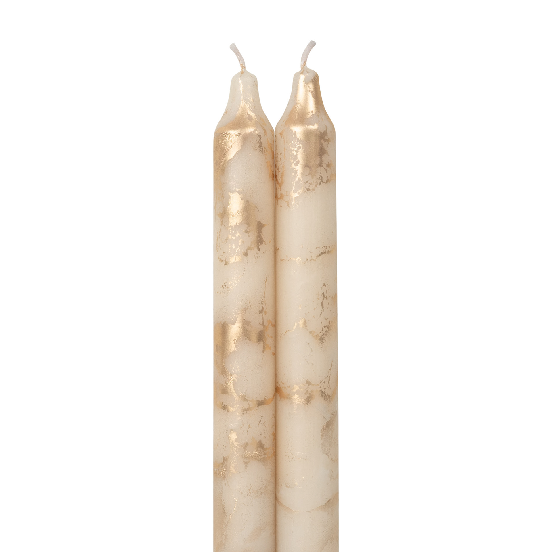
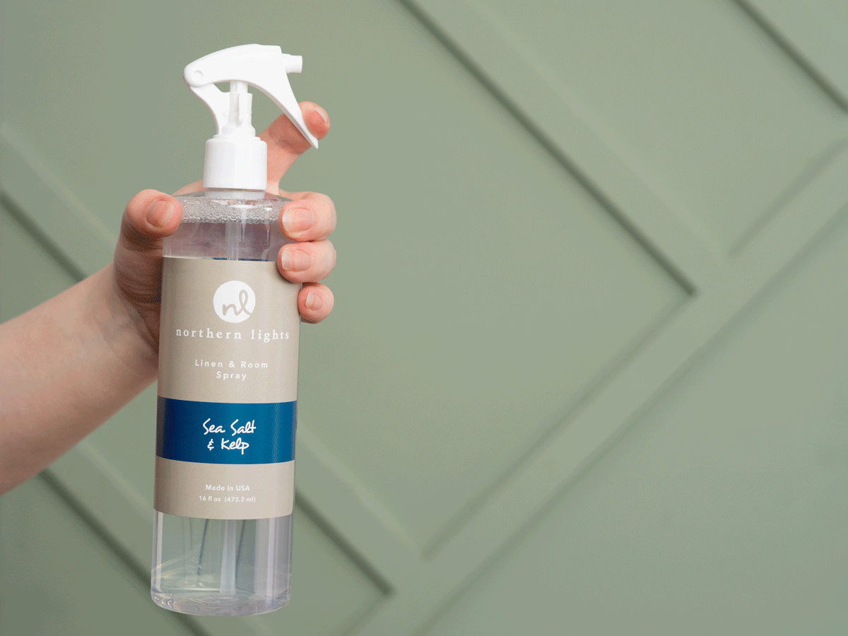
Product Photos
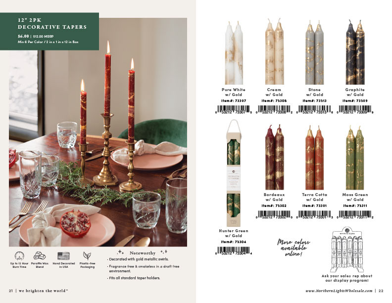
After almost four years photographing for Northern Lights, I can say that almost every clipped product photo shown in the catalog is a photo that I have taken, edited and formatted. These photos receive meticulous attention to detail. I personally choose the best products to shoot to represent the item, choose the best angle to show and edit for color accuracy and ideal product representation (ex. label alignment, wick alignment, etc).